Using Bricks Ultra – Woo Add to Cart element, you can display the Add to Cart button on any page of your website. It allows users to add products to the cart in just one click. This element provides a complete customization option to design your Add to Cart button.
There’s also a “View Cart” button; you can control how it looks and what’s shown. You can even see how your “View Cart” button will look while designing it using the Preview View Cart option, which will work in editor mode only to ensure it fits your style.
Now, let’s talk about stock details. You’ve got three options: Custom, Default, and None. Default grabs the stock info from your WooCommerce products settings. If you choose Custom, you can provide your stock values right here. You can even use shortcodes to display stock quantity and customize your stock details.
This element will help you to design landing pages, pop-up boxes, and sidebars where you want to customize the product’s default layout.
The Woo Add to Cart element features the following controls:
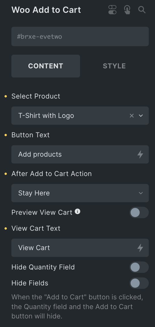
Content
Note: The Woo Add To Cart element will only work for Simple Products.
- Select Product: Select your WooCommerce simple product to add to the cart.
- Button Text: Enter the text for the button.
- After Add to Cart Action: Choose the appropriate available option you want, and clicking the “Add to Cart” button will take you there.
- Preview View Cart: Enable the option to preview the View Cart button style(work in editor mode only).
- View Cart Text: Enter the text for the View Cart button.
- Hide Quantity Field: Enable the option to hide the quantity field.
- Hide Fields: Activate the feature to hide fields such as the Quantity field and the Add to Cart button upon clicking the “Add to Cart” button.
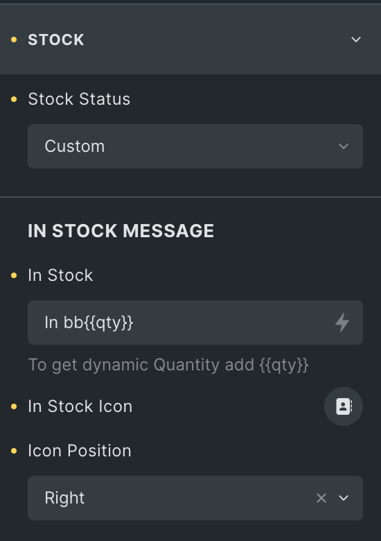
Stock
Note: If you opt for the “Default” option, the value will be fetched from your WooCommerce product settings. With the “Custom” option, you can input your own stock value. If you wish to show a dynamic value, you can use the “{{qty}}” shortcode.
- Stock Status: Select from Custom, Default, or None.
- Custom
In Stock Message
- In Stock: Enter your personalized In stock message or use a shortcode to display dynamic value.
- In Stock Icon: Choose the icon from the icon library.
- Icon Position: Select the position of the icon.
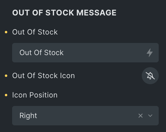
Out of Stock Message
- Out of Stock: Enter your personalized Out of stock message.
- Out of Stock icon: Choose the icon from the icon library.
- Icon Position: Select the position of the icon.
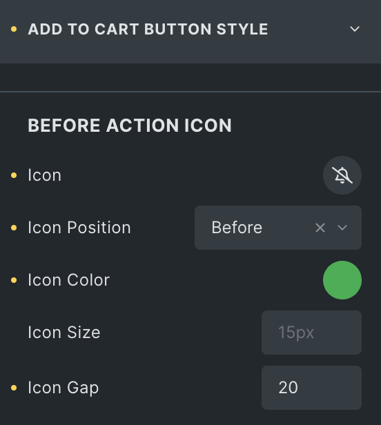
Add to Cart Button Style
Before Action Icon
- Icon: Choose the icon you want to appear before clicking the Add to Cart button.
- Icon Position: Select the position of icon.
- Icon Color: Select the color of icon.
- Icon Size: Set the icon size.
- Gap: Specify the gap between button text and an icon.
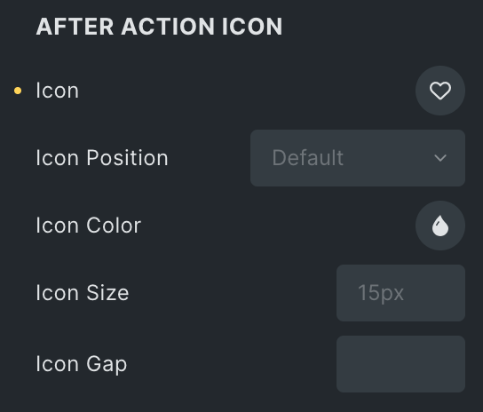
After Action Icon
- Icon: Choose the icon you want to appear after clicking the Add to Cart button.
- Icon Position: Select the icon position.
- Icon Color: Select the icon color.
- Icon Size: Set the size of icon.
- Gap: Specify the gap between button text and an icon.
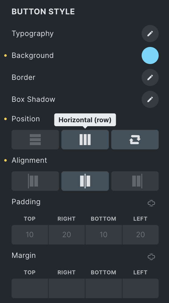
Button Style
- Typography: Set the typography of button.
- Background: Set the background of button.
- Border: Select the border type.
- Box Shadow: Set the box shadow properties.
- Position: Select from vertical, horizontal, or reverse.
- Alignment: Choose the alignment of button.
- Padding: Set the padding.
- Margin: Set the margin.
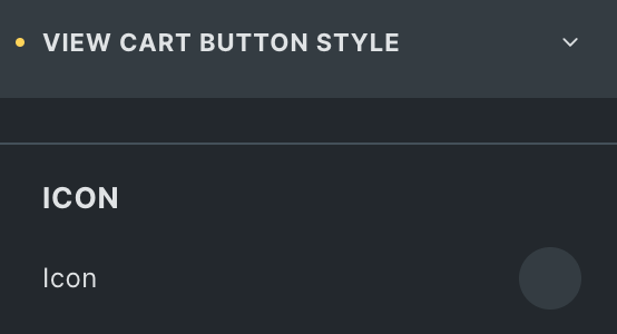
View Cart Button Style
- Icon: Select the view cart icon from available icon libraries.
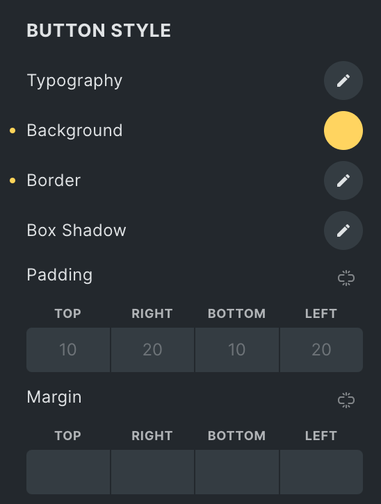
Button Style
- Typography: Set the typography.
- Background: Set the background of button.
- Border: Select the border type.
- Box Shadow: Set the box shadow properties.
- Padding: Set the padding.
- Margin: Set the margin.
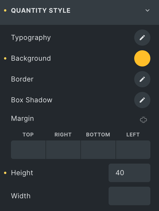
Quantity Style
Note: This option is applicable when the “Hide Quantity Field” option is disabled.
- Typography: Set the typography.
- Background: Set the background of quantity style box.
- Border: Select the border type.
- Box Shadow: Set the box shadow properties.
- Margin: Set the margin.
- Height: Enter the height for quantity style box.
- Width: Enter the width for quantity style box.
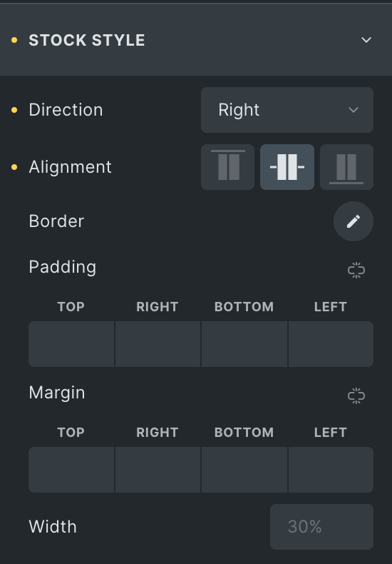
Stock Style
- Direction: Select the direction of stock value.
- Alignment: Choose from Start, Center, or End.
- Border: Select the border type.
- Padding: Set the padding.
- Margin: Set the margin.
- Width: Enter the width of Stock box.
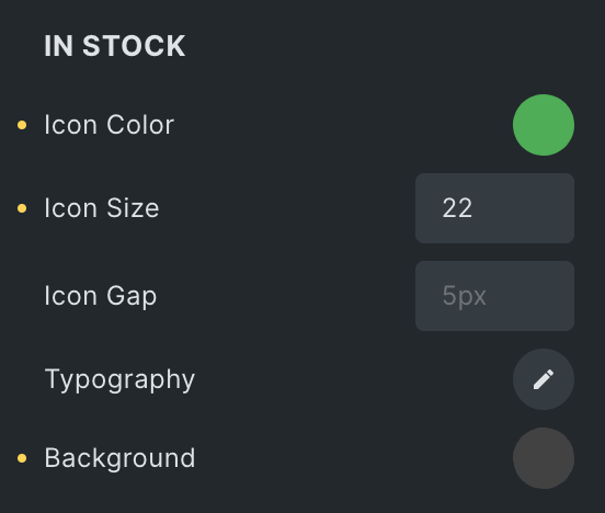
In Stock
- Icon Color: Select the color of In stock icon.
- Icon Size: Set the icon size.
- Gap: Specify the gap between icon and value.
- Typography: Set the typography.
- Background: Select the background of In stock box.
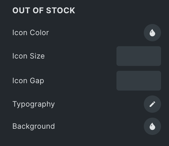
Out of Stock
- Icon Color: Select the color of Out of Stock icon.
- Icon Size: Set the icon size.
- Gap: Specify the gap between icon and value.
- Typography: Set the typography.
- Background: Select the background of Out of Stock box.
Explore our detailed article on “Creating Your Own ‘Add to Cart’ Button in WooCommerce with the Woo Add to Cart Element.”