The Lottie element is a valuable tool for adding dynamic animations to your webpage, enhancing its interactivity and uniqueness. It provides flexibility by allowing you to trigger Lottie animations based on different events, such as entering the viewport, clicking, hovering, or scrolling.
One unique feature is the ability to add links to Lottie animations to various sources, creating a seamless experience for users who can open specific pages with a click. Additionally, the option to display Lottie animations in reverse order adds a creative touch to your website.
Lottie supports rendering animations as SVG or Canvas, giving you the freedom to choose the format that best suits your design needs. This feature also opens up opportunities for applying custom styles to your animations, enhancing the overall visual appeal.
The Lottie element features the following controls.
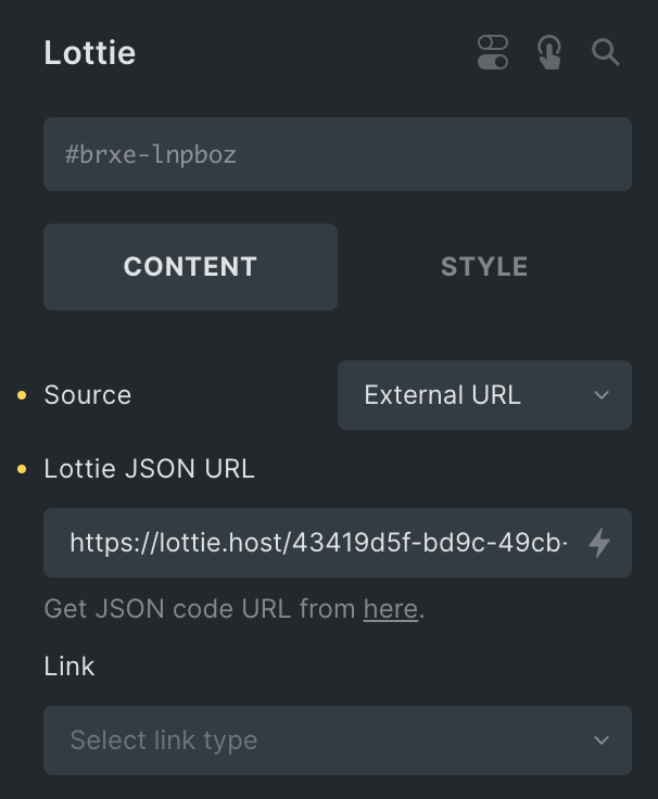
Content
- Source: Choose the source of your Lottie animation, either Medis File or External URL.
- External URL
- Lottie JSON URL: Enter the link of the JSON file.
- Media File
- Upload JSON File: Click the option to upload the JSON file.
- External URL
- Link: Select the appropriate option to link with Lottie.
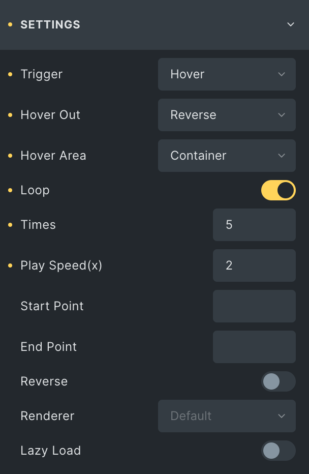
Settings
Note: Ensure the viewport’s top value is more than the bottom value. Enabling the loop option for the viewport and scroll triggers option removes the reverse option. However, for Hover, the reverse option is available under the Hover Out section.
- Trigger: Select how you want the animation to start. Select from Scroll, Click, Hover, and Viewport.
- Effects Relative To: Choose if the scroll position is based on the Entire page or Viewport(applicable for Scroll Trigger Type)
- Loop: Enable the option to display animation continuously(applicable for Hover, Click, and Viewport Trigger Type)
- Times: Enter the number of how many times you want the animation to repeat before it stops.
- Viewport Bottom: Enter the position value from the bottom(applicable for Scroll and Viewport Trigger Type).
- Viewport Top: Enter the position value from the top(applicable for Scroll and Viewport Trigger Type).
- Hover Out: Choose whether the animation pauses or reverses when you move the mouse away(applicable for Hover Trigger Type).
- Hover Area: Choose where you want the animation to appear when you hover. Pick from column, section, container, or animation(applicable for Hover Trigger Type).
- Play Speed(x): Enter the speed to play the animation(Max Value is 5).
- Start Point: Choose the start point from where the animation start.
- End Point: Choose the end point from where the animation end.
- Reverse: Enable the option to play the animation in reverse direction.
- Renderer: Choose either SVG or Canvas to render the graphics.
- Lazy Load: Enable the option to lazy load this element.
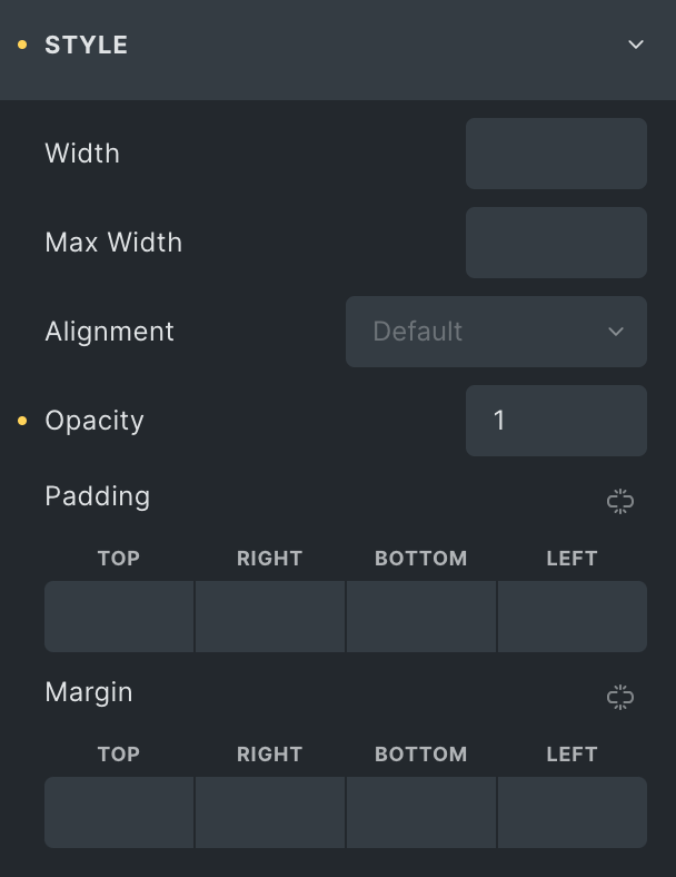
Style
- Width: Enter the width of the box.
- Max Width: Enter the max width of the box.
- Alignment: Select alignment from Left, Center, or Right.
- Opacity: Enter the opacity value.
- Padding: Set the padding.
- Margin: Set the margin.
Check out the Demo page of Lottie element.