This versatile element enhances your website’s content presentation with engaging and interactive infographics. Info Circle offers a multipurpose solution by including multiple items within a single element. It delivers concise information to users through focus or hover effects, creating a clear and immersive experience. Moreover, it optimizes webpage space by efficiently consolidating all items together.
Items
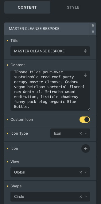
- Title: Enter the title of an item. You can choose it dynamically too.
- Content: Enter the description of an item. You can choose it dynamically too.
- Custom Icon: Enable the custom icon option, To customize icons individually.
- Icon type: Select from the given icon options like Icon, image, text, SVG.
- View: Set the view of Icon, you can select from global, stacked and default.
- Shape: Choose the shape of the image, global, circle or square.
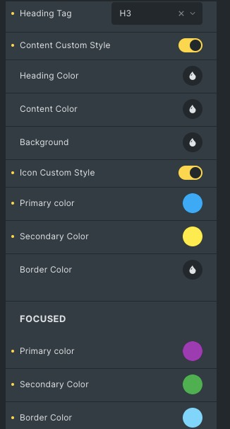
- Heading Tag: Choose from a heading tag suitable for your title.
- Content Custom Style: Enable custom style, to customize content and headings individually.
- Heading Color: Set the heading color.
- Content Color: Set the content color.
- Background: Set the background color or image of the content.
- Border Color: Change the border color.
- Focused: Styling controls for the focused state are available under this section.
- Icon Custom Style: Enable custom style, to customize icons individually.
- Primary Color: Set the icon color.
- Secondary Color: Set the background color of the Icon.
- Border Color: Set the border color of Icon.
- Focused: Styling controls for the focused state are available under this section.
These icon settings will apply to all the icons of the Info Circle.
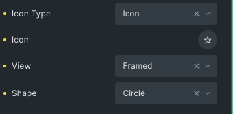
- Icon Type: Select from the given icon options like Icon, image, text, SVG.
- Icon: Choose the icon from the libraries.
- View: Set the view of Icon, you can select from global, stacked and default.
- Shape: Choose the shape of the image, global, circle or square.
Content style
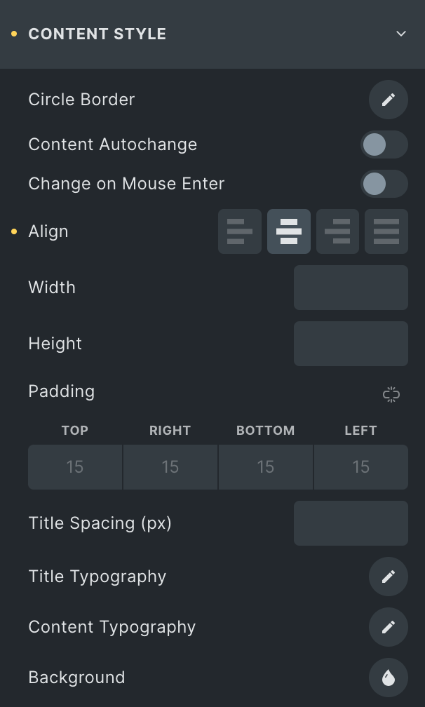
- Circle Border: Apply borders on the circle. You can choose the border type width and radius of the border.
- Content auto change: Enable to change content automatically in a given time.
- Auto change Delay: Set the time to change content automatically.
- Change on mouse enter: Enable this option to change items on mouse enter. Will only display when content auto change is displayed.
- Align: Set the alignment of items from the left, right, Center and Justify.
- Title Typography: Set the typography settings for a title like font size, family etc.
- Content Typography: Set the typography settings for content like font size, family etc.
- Background: Set the background color or image for the content.
Icon style
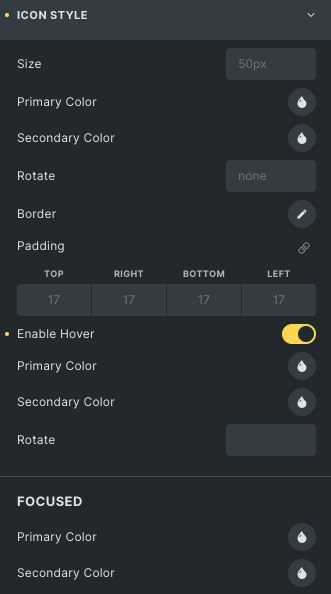
- Size: Set the icon size.
- Primary Color: Set the icon color.
- Secondary Color: Set the background color of the Icon.
- Rotate: Rotate the icon either clockwise or anticlockwise.
- Enable Hover: Enable to apply hover properties. Styling controls for the hover state are available under this section.
- Focused: Styling controls for the focused state are available under this section.
Click here to check out a demo page of Info Circle element