An “Image Stack” is a dynamic gallery type element that helps you display your pictures, text, icons, or Lottie in a fun and interactive way on your website or app. It lets you stack your images like a deck of cards and unfold them upon hover, making your website look cool and engaging. It’s a great way to make your content more exciting and catch the eye of your visitors!
You also have the option to display helpful tooltips when you hover over the items. You can even pick where you want the tooltips to appear on the items. So, if you have a lot of images or content to display, consider using an Image Stack to make it look amazing!
The Image Stack Element features the following controls:
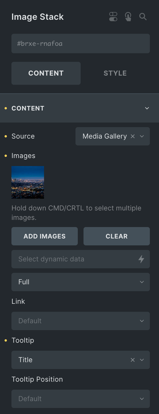
Content
- Source: Choose either from Media Gallery or Repeater.
- Media Gallery
- Images: Select the image you want to display.
- Image Size: Select the size of an image.
- Link: Enter the URL to link with the image.
- Tooltip: Select the option from Title, Caption, or Custom to display a tooltip.
- Tooltip Position: Select the position of the tooltip.
- Media Gallery
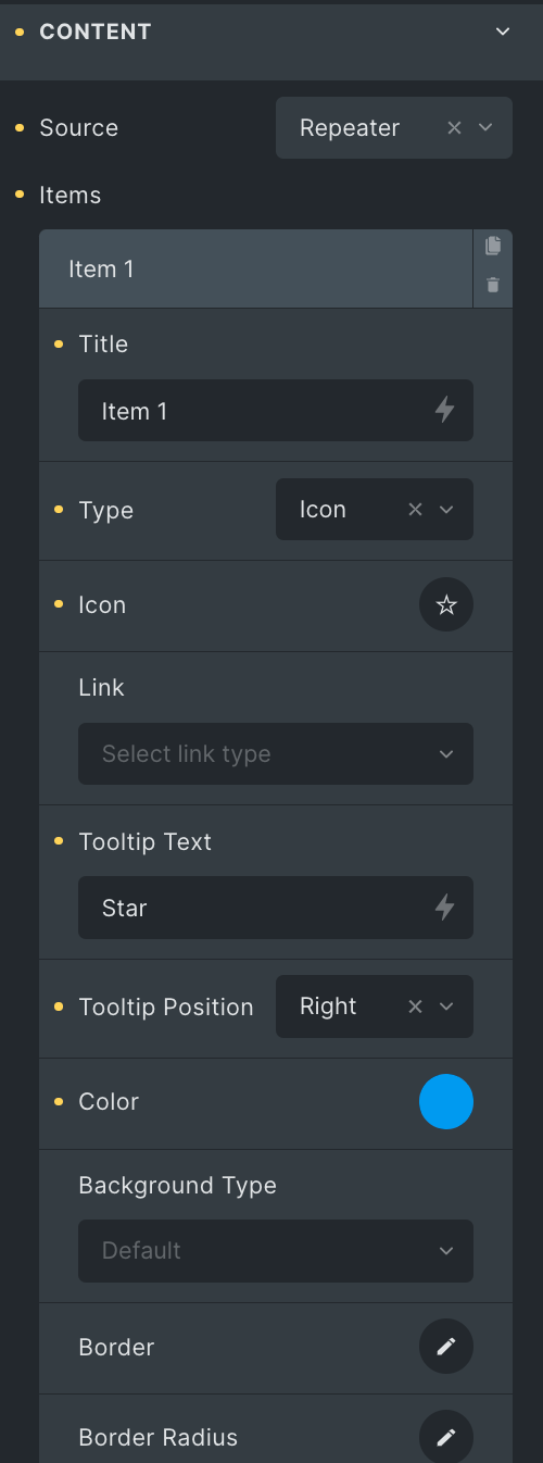
- Repeater
Note: Only the user administrator can add Lottie animations.
- Items
- Title: Enter the title.
- Type: Choose what you want to display from Image, Icon, Text, and Lottie.
- Image: Select the image.
- Image Size: Select the size of an image.
- Link: Enter the URL to link with the item.
- Tooltip Text: Enter the text for the tooltip.
- Tooltip Position: Select the position for the tooltip.
- Color: Select the text color of the tooltip.
- Background Type: Choose either Image/Color or Gradient.
- Border: Select the border.
- Border Radius: Set the border radius.
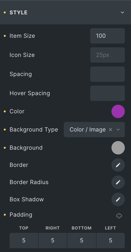
Style
- Item Size: Select the size of the item.
- Icon Size: Set the size of an icon.
- Spacing: Set the spacing between items.
- Hover Spacing: Enter the hover spacing between items.
- Color: Select the color (applicable for the repeater source only)
- Background Type: Select from Color/Image or Gradient.
- Border: Set the border.
- Border Radius: Set the border radius.
- Box Shadow: Set the box shadow.
- Padding: Set the padding.
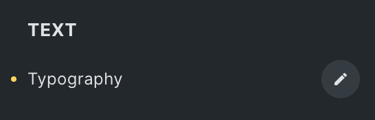
Text
- Typography: Set the typography of text.
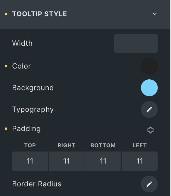
Tooltip Style
- Width: Set the width of a tooltip.
- Color: Select the color of the tooltip text.
- Background: Select the background color of the tooltip.
- Typography: Set the typography.
- Padding: Set the padding.
- Radius: Set the border radius.
Check out the Demo page of Image Stack element.