Filterable Gallery is going to help you design & display a beautiful gallery layout for your website. It allows you to group images into categories, and you can easily access them using clickable filters. This gallery widget comes with various advanced features through which you can represent and style your portfolios with ease.
Filters
By default, it comes with three items; you can add more as per your need.
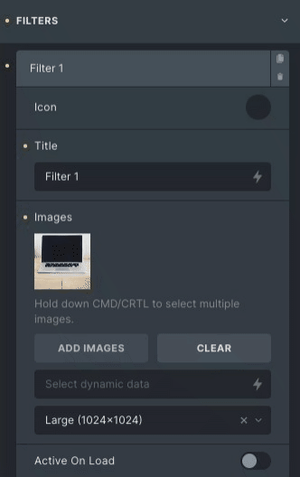
- Icon: Select the library and choose any icons among the given options.
- Title: Set the title of the Filter you select.
- Image: Select one or multiple photos and adjust their size.
- Active On load: Toggle the switch to set the tab active on load.
* Note: Click on the ADD Item button to add more filters. Give the filter a proper name and then add multiple images to the filter item.
Settings
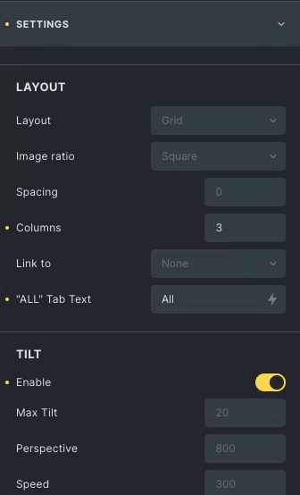
Layout
- Layout: Select the layout from the grid and masonry.
- Spacing: Adjust the space between two images.
- Columns: Set how many columns will be displayed per row.
- Link to: link the images as per your need.
- All tab: Enter the desired label, “ALL” is default.
Tilt
- Enable: Enable to get a tilted effect on hover
- Max tilt: Set the value, how much you want to tilt.
- Perspective: Set the transform perspective, the lower the more extreme the tilt gets.
- Speed: Adjust the speed of the enter/exit transition
- Axis: Set the axis option from the x-axis, y-axis or both, It will tilt from that direction.
- Glare: Enables glare effect on the image.
Hover
- Enable: Enable overlay to give overlay effect.
- Show overlay: Choose between three options, On Hover, Always or Hide on hover.
- Enable: Enable caption to give captions on hover
- Caption: Set caption from the title, caption, or image description.
- Icon: Set the Icon which will display on the image.
- Enable: Enable hover direction aware to change the direction.
- Overlay speed: Set the speed of the overlay effect.
- Enable: Enable scale to give scaling effect.
- Scale: scale images on hover effect.
Filter Style
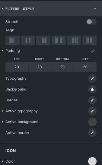
- Stretch: Stretch filter header to full width
- Align: Align the filters.
- Typography: Set the typography of the filter.
- Background: Choose the background color or image of the filters.
- Border: Apply border and border radius on filters.
- Active Color: Choose color on the active filter state.
- Active Background: Choose the background color or image of the Filters in an active state.
- Active Border: Set border and border radius on the active state.
Icon
- Size: Set the icon size.
- Color: Set the color of the Icon from the options.
- Spacing: Add space between the title and Icon.
- Rotate: Rotate the icon either clockwise or anticlockwise.
Image Style
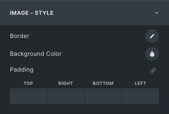
- Border: Set the border and border-radius.
- Background color: Set the background color on image.
- Padding: Adjust Padding for the image
Overlay style
* Note: Overlay style will be shown only when Overlay enables in the settings section.
- Color: Set the color of the overlay.
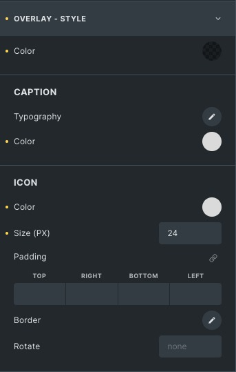
Caption
- Typography: Set the typography of the caption.
- Color: Set the color of the caption.
- Size: Adjust the size of the Icon.
Icon
- Color: Set the color of the Icon.
- Size: Set the size of the Icon.
- Rotate: Rotate the Icon either clockwise or anticlockwise.
- Border: Set the border and border radius.
Click here to check out a demo page of Filterable Gallery element.