A Content Switcher is like a handy element that lets you switch between two or more different content on your page. You can use it in various ways, like switching between different product pictures, price lists, lists of features, or organized information.
With this element, you have three layout options to pick from. You can choose any of them and then put your own content on it or use a template to showcase your information. It’s a flexible way to present content on your website.
Content
Layout: Set the layout from the preset layout Options: Layout 1, Layout 2, and Layout 3.
* Note: Layout 2 and Layout 3 require only two items. and you can add multiple items in Layout 1.
Primary
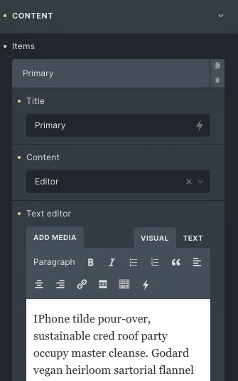
- Title: Set the title of the primary tab.
- Content: Choose between text editor or template.
- If the text editor is selected, then a description box appears.
Text editor: Set the description of the primary tab. - If the template option is selected, you can choose from the available templates.
Template: Choose the appropriate template.
- If the text editor is selected, then a description box appears.
- Icon: Place the icon along with the primary tab title.
- Icon position: Set the icon position either left or right.
- Active: Toggle the switch to set the content active on load.
Secondary
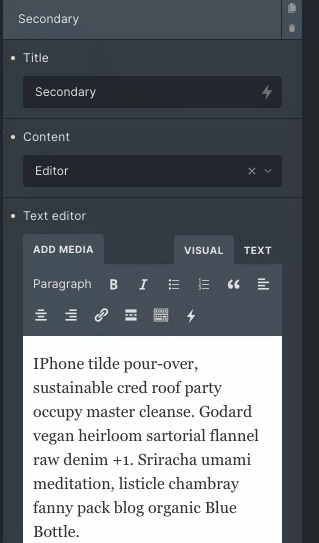
- Title: Set the title of the Secondary tab.
- Content: Choose between text editor or template.
- If the text editor is selected, then a description box appears.
- Text editor: Set the description of the primary tab.
- If the template option is selected, you can choose from the available templates.
- Template: Choose appropriate template.
- Icon: Place the icon along with the primary tab title.
- Icon position: Set the icon position either left or right.
- Active: Toggle the switch to set the content active on load.
Display
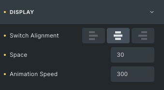
- Switch alignment: Set the alignment of both tabs from left, centre or right.
- Space: Set the space between the Content Switcher title and description.
- Animation speed: Set the animation speed for switching between the primary and secondary tab.
Switch style
Title typography: Set the title typography like font style, size, family, etc.
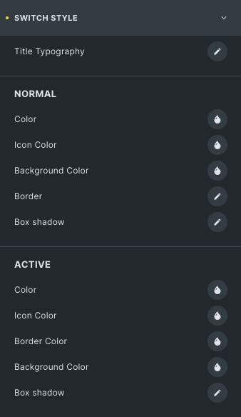
Normal
- Color: Choose the color of the primary switch tab.
- Icon Color: Choose the icon color of the primary tab.
- Background Color: Choose the background color for the primary and secondary tab.
- Border Color: Choose the border color of the switch.
- Box shadow: Apply the shadow effect to the primary and secondary tab.
Active
Styling controls for the Active state are available under this section.
- Icon Space: Set the space between the title and icon.
- Label Space: Add space to labels.
- Equal Width: Enable to apply equal width (This is available in only Layout 1)
- Min Width: Set the minimum width.
Box
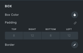
- Box Color: Choose the color of the box.
- Padding: Set the padding for the box.
- Border: Set the border and border radius of the box.
Switch bar
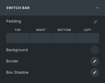
- Padding: Set the padding for the box.
- Background: Set the background color or background image on the switch bar.
- Border: Set the border and border radius of the box.
- Box shadow: Apply the shadow effect to the switch bar.
Switcher control
* Note: Switcher Control works only for Layout 2 and Layout 3.
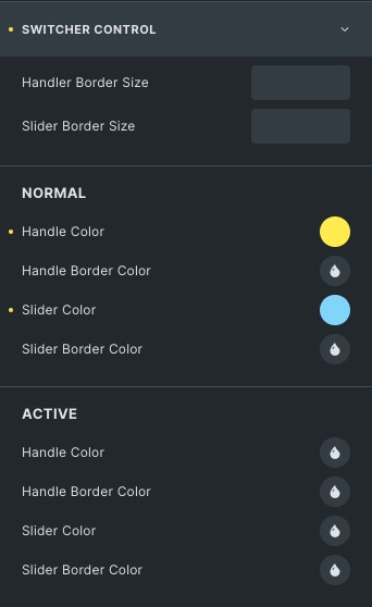
- Handler border size: Set the Handler’s border size.
- Slider border size: Set the slider’s border size.
Normal
- Handle Color: Choose the color of the Switcher handle.
- Handle Border Color: Choose the color of the Switcher border.
- Slider Color: Choose the slider color.
- Slider Border Color: Choose the border color of the slider.
Active
Styling controls for the Active state of the Switcher handle are available under this section.
Content style
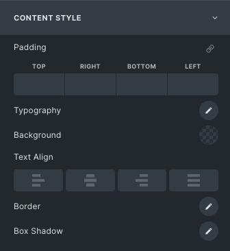
- Typography: Set the title typography like font style, size, family, etc.
- Background: Set background color or background image of the content.
- Text align: Align your content to the left, right, or centre.
- Border: Set the border and border radius of the content.
- Box shadow: Apply the shadow effect to the content.
Click here to check out a demo page of Content Switcher element.