This is a super useful element for showing videos from different sources all at once. It can handle videos from YouTube, Wistia, Vimeo, and even ones you host yourself. It’s great because you can mix and match videos from various sources. It’s super handy because it lets you use different types of video playlists, like your own videos, YouTube playlists, or YouTube channels.
What makes it even cooler is that you can organize your videos into categories. So, if you have different kinds of videos, people can easily find what they’re looking for. And guess what? There’s a special feature that makes the videos pop up in a big window when you click on them, making it even more fun for people to watch.
The Video Gallery element features the following controls.
Content
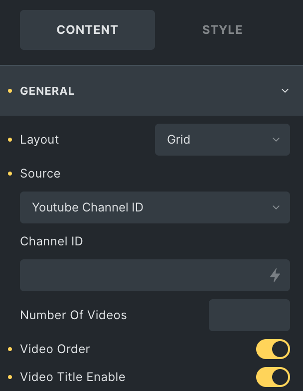
General
- Layout: Choose a layout from Grid or Carousel.
- Source: Select source from Custom List, YouTube Playlist ID, or YouTube Channel ID Videos.
YouTube Channel ID / YouTube Playlist ID
- Channel ID: Enter the channel ID of YouTube (applicable for YouTube Channel ID).
- Playlist ID: Enter the playlist ID of YouTube(applicable for YouTube Playlist ID)
- Number Of Videos: Enter the number of videos you want to display.
- Video Order: Enable the option to order the videos(applicable for YouTube Channel ID)
- Video Title Enable: Activate the option to display the video title.
Note: To utilize the YouTube playlist and YouTube channel video sources, you must enter the YouTube API key you generated earlier. You can find the path to enter the API key by clicking on the “Settings” option within the relevant section.
Please check our detailed doc on “How to Generate YouTube API Key“
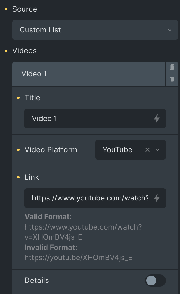
Custom List
- Title: Enter the title.
- Video Platform: Choose from YouTube, Vimeo, Wistia, or Self-Hosted.
- Link: Enter the video link.
- External URL: If you have an external URL of the video, you can enable this option(applicable for Self hosted)
- URL: Insert a URL of the video
- Choose File: Upload the video(applicable for Self hosted)
- Details: Enable the option to display video details.
- Title: Enter the title of video.
- Description: Enter the description of video.
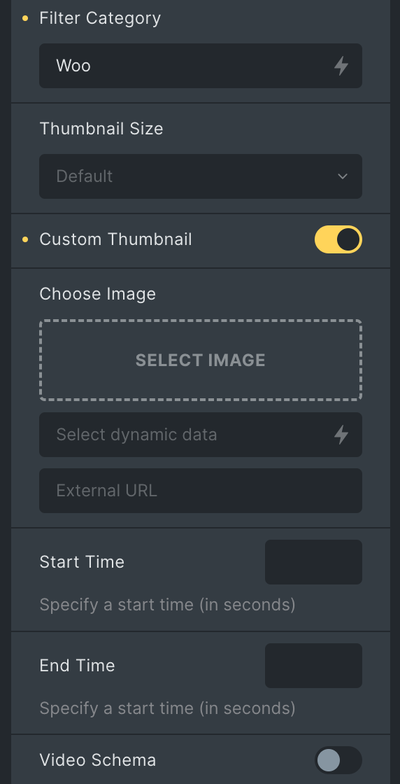
- Filter Category: Enter the name of the category for a particular video.
- Thumbnail Size: Specify the thumbnail size.
- Custom Thumbnail: Enable the option to set the custom thumbnail.
- Choose Image: Upload an image for a thumbnail.
- Start Time: Set the start time of the video(applicable for YouTube, Self hosted, and Vimeo)
- End Time: Set the end time of the video(applicable for YouTube and Self hosted)
- Video Schema: Enable the option to set schema for video.
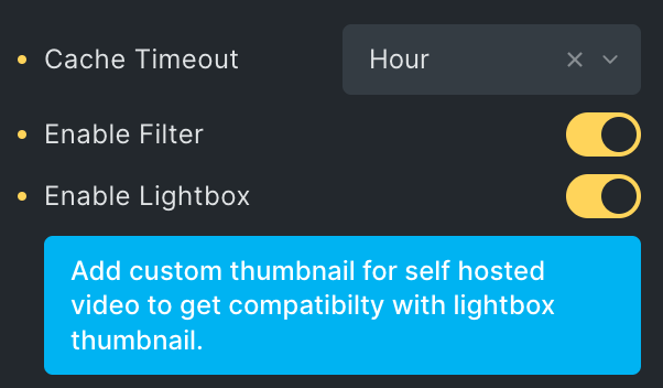
- Cache Timeout: Select the option for timeout.
- Enable Filter: Enable to show filters(applicable for Grid Layout and Custom List).
- Enable Lightbox: Enable it to open video in Lightbox.
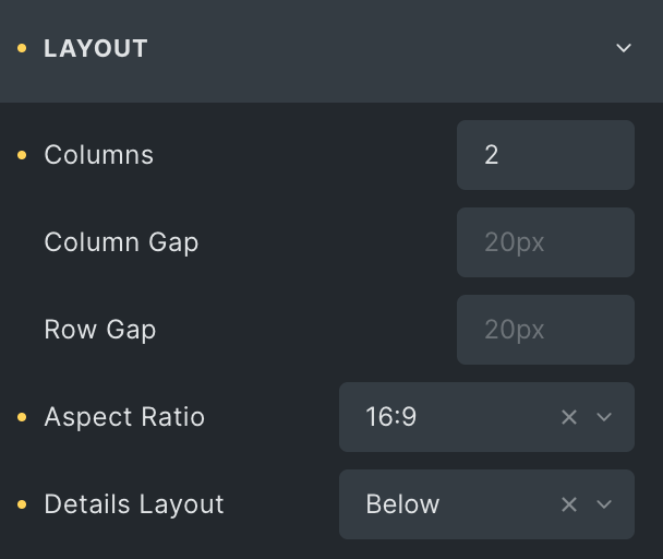
Layout
- Columns: Specify the number of columns(applicable for Grid Layout type).
- Column Gap: Specify the gap between columns(applicable for Grid Layout type).
- Row Gap: Specify the gap between rows(applicable for Grid Layout type).
- Aspect Ratio: Set the aspect ratio of videos.
- Details Layout: Choose the specific time at which you would like to showcase your video information.
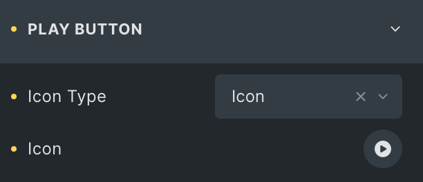
Play Button
- Icon Type: Choose from a list of Icons, Images, or Lottie animations.
- Icon
- Icon: Select from the Font Awesome icon library or upload an SVG image.
- Image
- Image: Either upload an image or select a dynamic tag for display.
- Lottie Animation
- Source: Choose the source of the Icon by either adding an External URL or selecting a media file.
- Loop: Enable the loop option to display the animation continuously.
- Reverse: Activate the reverse option to display the animation in reverse order
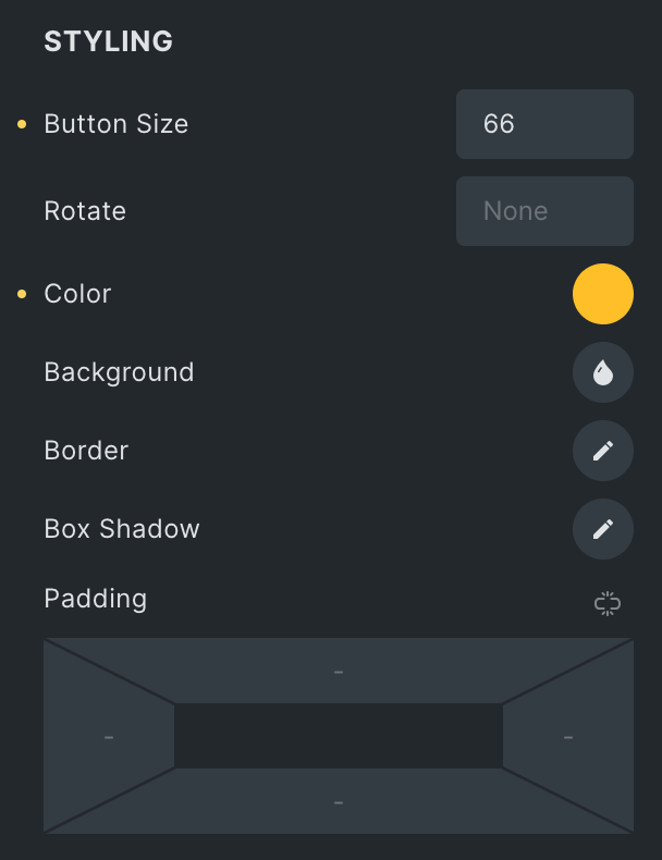
Styling
- Button Size: Specify the size of button.
- Rotate: Specify the rotate properties.
- Color: Select the icon color.
- Background: Select the background color of icon.
- Border: Set the border.
- Box Shadow: Set the box shadow.
- Padding: Set the padding.
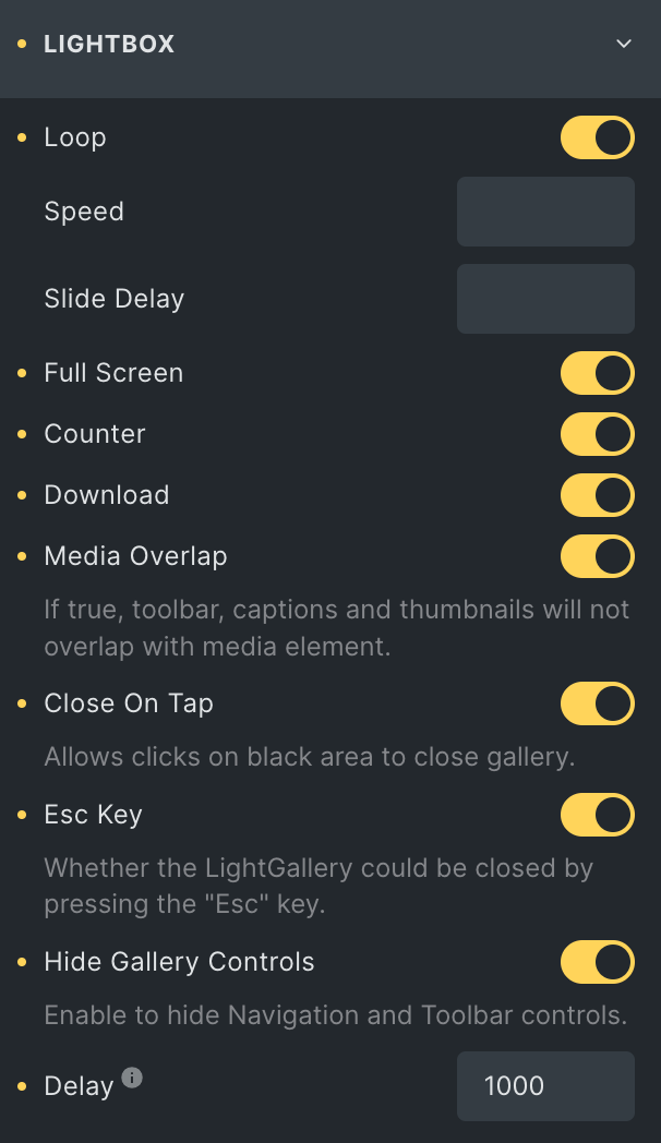
Lightbox
Note: This option is applicable when Lightbox is enabled in the General section.
- Loop: Enable the option to display posts in a loop upon the lightbox.
- Speed: Set the speed.
- Slide Delay: Specify the value to delay the slide.
- Full Screen: Activate the option to display lightbox in fullscreen.
- Zoom: Enable the option to show lighbox in zoom mode upon page load.
- Counter: Enable the option to display counter.
- Download: Activate the option to enable download.
- Media Overlap: Activate the option to enable the overlap.
- Close On Tap: Enable the option to close the gallery while tap on black area.
- Esc Key: Enable the option to close the LightGallery by pressing the “Esc” key.
- Hide Gallery Controls: Enable the option to hide Navigation and Toolbar controls.
- Delay: Set the hide gallery controls delay duration.
Video
- Autoplay: Enable the option to autoplay the video on slide change.
Navigation
- Navigation: Enable the option to display the navigation.
- Enable Arrows: Activate the option to enable arrows.
- Enable Drag: Activate the option to enable dragging.
- Enable Swipe: Activate the option to enable swipe(only for screen touch devices).
- Keyboard: Activate the option to enable keyboard control.
- Mouse Wheel: Activate the option to enable mouse wheel feature.
- Next: Enter the text for navigation next icon.
- Previous: Enter the text for navigation previous icon.
Thumbnail
- Thumbnail: Enable the option to activate the features.
- Alignment: Select the alignment of thumbnail.
- Toggle Thumb: Enable the option if needed(not applicable if Media Overlap is false).
- Width: Set the width of thumbnail.
- Height: Set the height of thumbnail.
- Margin: Set the margin.
Hash URL
Note: Custom Slider Name will work as URL if Hash Url plugin is installed.
- Hash URL: Enable the option to activate the feature.
- Custom Slider Name: Enable the option to give a unique name.
- Gallery ID: Enter the unique id.
- Custom Slider Name: Enable the option to give a unique name.
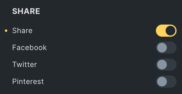
Share
- Share: Enable the option to display the share buttons.
- Facebook:
- Facebook Text: Enter the text for Facebook share.
- Twitter:
- Twitter Text: Enter the text for Twitter share.
- Pinterest:
- Pinterest Text: Enter the text for Pinterest share.
- Facebook:
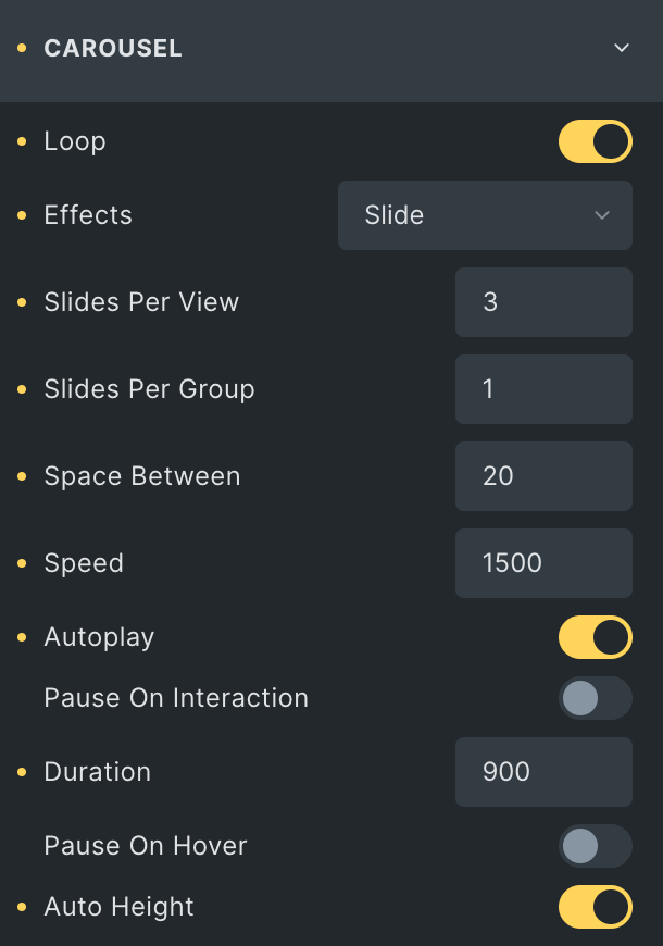
Carousel
Note: This option is applicable if Layout is selected as Carousel in General Section.
- Loop: Enable the option to display posts in loop.
- Effects: Select the effect from given options.
- Slide Per View: Specify the number of slides to display per view.
- Slide Per Group: Specify the number of slides to display per group.
- Space Between: Specify the space between slides.
- Speed: Set the speed.
- Autoplay: Enable the option to play carousel automatically.
- Pause On Interaction: Activate the option to pause slides on interaction.
- Duration: Set the duration.
- Pause On Hover: Activate the option to pause slides on hover.
- Auto Height: Enable the option if needed.
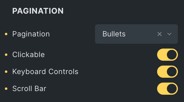
Pagination
- Pagination Type: Select the type of pagination from Bullets, Progress Bar, and Fraction.
- Clickable: Enable the option to make pagination clickable(applicable for Bullets Pagination type).
- Keyboard Control: Activate the option to enable keyboard control on pagination.
- Scroll Bar: Enable the option to display scroll bar.
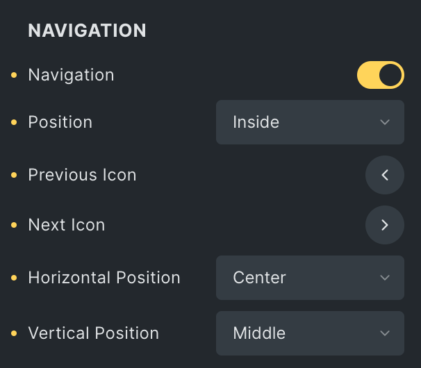
Navigation
- Navigation:
- Position: Select either inside or outside.
- Previous Icon: Select the icon for previous navigation.
- Next Icon: Select the icon for Next navigation.
- Horizontal Position: Select the horizontal position of navigation(applicable if position is selected as inside).
- Vertical Position: Select the horizontal position of navigation(applicable if position is selected as inside).
Carousel Style
Note: This option is applicable if Layout is selected as Carousel in General Section.
Navigation
- Color: Select the color of navigation icon.
- Background: Select the background color of navigation icon.
- Border: Set the border.
- Box Shadow: Set the box shadow.
- Size: Specify the size of navigation.
- Horizontal Offset: Set the horizontal offset properties.
- Vertical Offset: Set the vertical offset properties.
- Padding: Set the padding.
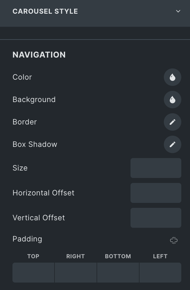
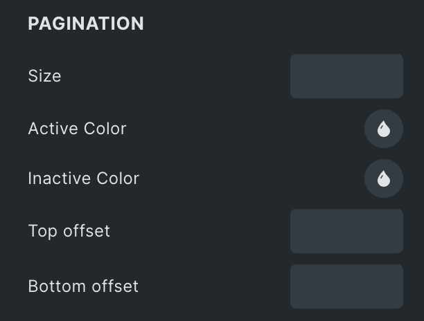
Pagination
- Size: Specify the size of pagination.
- Active Color: Select the pagination color in active state.
- Inactive Color: Select the inactive state pagination color.
- Top Offset: Specify the top offset properties.
- Bottom Offset: Specify the bottom offset properties.
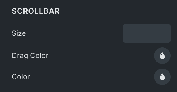
Scrollbar
Note: Only applicable when Scroll bar is enabled in the Carousel section.
- Size: Specify the size of scrollbar.
- Drag Color: Select the scrollbar drag color.
- Color: Select the color of scrollbar.
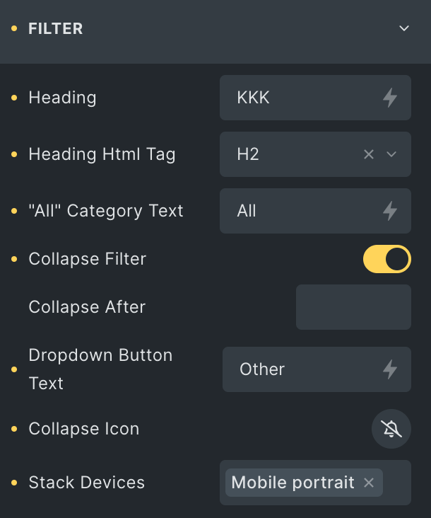
Filter
Note: This option is applicable when Filter is enabled in the General section.
- Heading: Enter the heading of the filter.
- Heading HTML Tag: Select the HTML tag for heading.
- All Category Text: Enter the text of all categories.
- Collapse Filter: Enable the option to collapse the filter.
- Collapse After: Specify the number indicating how many items will collapse after it.
- Dropdown Button Text: Enter the text for the dropdown.
- Collapse Icon: Select the icon.
- Stack Devices: Specify the devices on which you want to stack the devices.
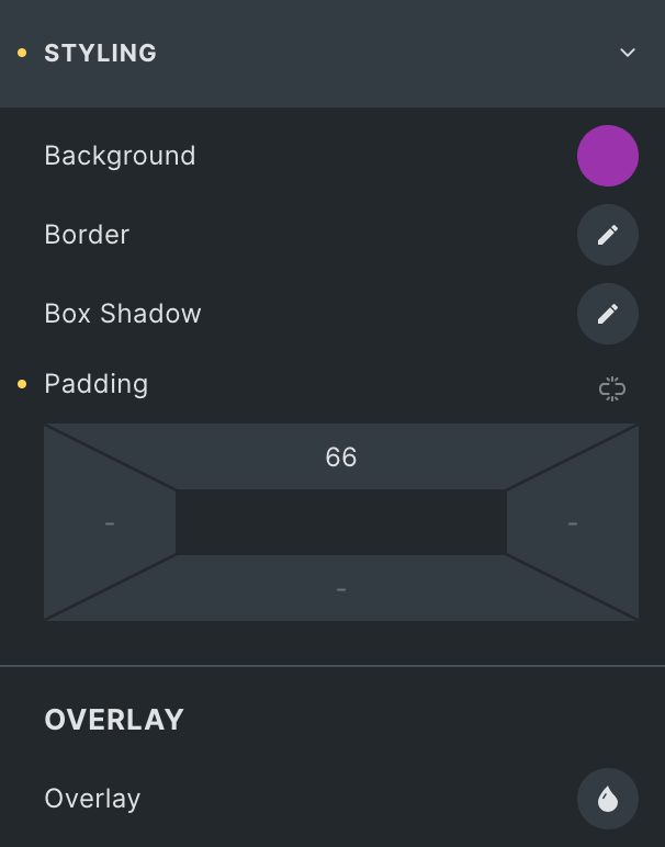
Styling
- Background: Select the background of video.
- Border: Set the border.
- Box Shadow: Set the box shadow.
- Padding: Set the padding.
Overlay
- Overlay: Specify the overlay properties.
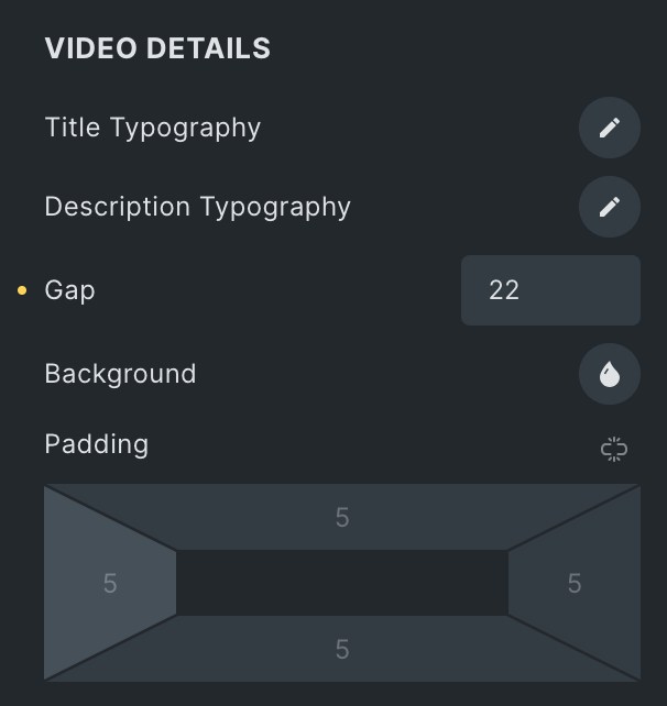
Video Details
- Title Typography: Set the typography of title.
- Description Typography: Set the typography of description.
- Gap: Specify the gap between content.
- Background: Select the background of video details.
- Padding: Set the padding.
Filter Styling
Note: This option is applicable when Filter is enabled in the General section.
- Heading Typography: Set the typography of heading.
Filter Buttons
- Button Gap: Specify the gap between buttons.
- Typography: Set the typography.
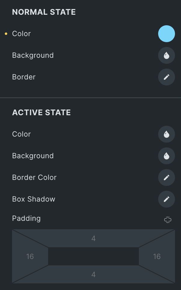
Normal State
- Color: Select the text color of the filter in normal state.
- Background: Select the background color of the filter.
- Border: Set the border.
Active State
- Color: Select the text color of filter in active state.
- Background: Select the background color of filter in active state.
- Border Color: Select the border color.
- Box Shadow: Set the box shadow.
- Padding: Set the padding.
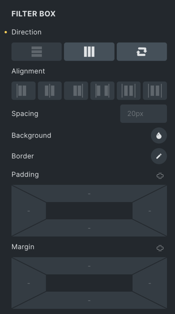
Filter Box
- Direction: Select the direction of filter.
- Spacing: Specify the spacing between filters.
- Background: Select the background color of filters.
- Border: Set the border.
- Padding: Set the padding.
- Margin: Set the margin.
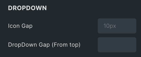
Dropdown
- Icon Gap: Specify the gap of icons.
- Dropdown Gap(From Top): Specify the dropdown gap.
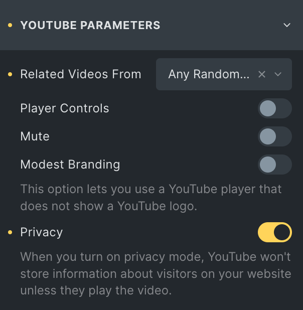
YouTube Parameters
- Related Videos From: Select either the Current Video Channel or Any Random Video.
- Player Controls: Enable the option to display player controls like play, pause, volume, and more.
- Mute: Allow the option to mute the video.
- Modest Branding: Enable the option to disable the YouTube logo from displaying in the control bar.
- Privacy: Enabling this feature prevents YouTube from storing visitor information on your website until they play the video.
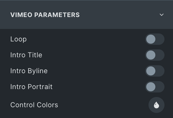
Vimeo Parameters
- Loop: Enable the option to display video continuously.
- Intro Title: Display the video’s Title.
- Intro Byline: Display the video’s author’s name.
- Intro Portrait: Display the author’s profile image.
- Controls Color: Select the color for video player controls.
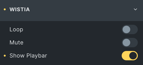
Wistia Parameters
- Loop: Enable the option to display video continuously.
- Mute: Allow the option to mute the video.
- Show Playbar: Enable the option to display the progress bar of the video.
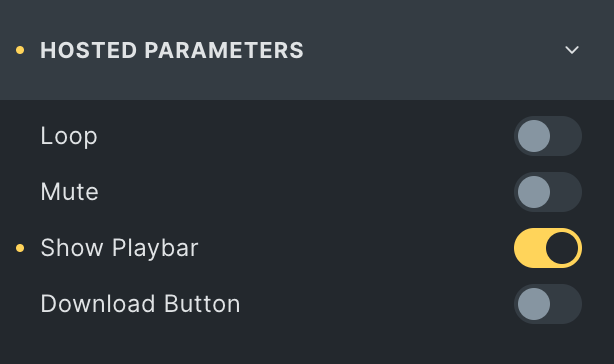
Hosted Parameters
- Loop: Enable the option to display video continuously.
- Mute: Allow the option to mute the video.
- Show Playbar: Enable the option to display the progress bar of the video.
- Download Button: Enable the option to display the download button.
Check out the Demo page of Video Gallery element.