Flip Box is one of the powerful and attractive elements of the Bricks Ultra plugin. It is a beautifully designed element that allows you to customize both sides of your information box. You can simply switch the side of the element and can even customize individual parts from icons, text, images, and buttons for both sides without hassle!
General
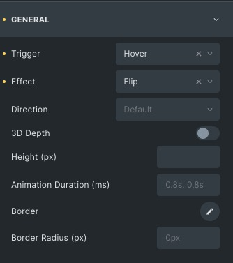
- Trigger: Select how to trigger the Flip Box and choose among hover or click options.
- Effect: Choose from many effects like Flip alt, slide, push etc.
- Direction: Change the order of the Flip Box to up, down, right and left.
- 3D Depth: Enable to give it a 3D view. It gives you a three-dimensional effect while rotating the Flip Box.
- Height: Set the size of the Flip Box in pixels.
- Animation duration: Set the time for the front and back Flip Box while animating.
Front Box
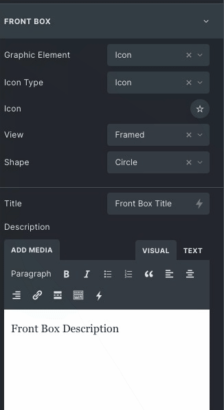
- Graphic element: Set the visible part which will appear on the box, like Icon or image.
- Icon Type: choose icon type as Icon, image, SVG or text.
- Icon: Choose the Icon of your choice for the front box from the available options.
- View: Set the view of the icon default. Stacked or framed, it will change the Icon’s appearance.
- Title: Enter the text to change the heading of the front box.
- Description: Enter the content to be added to the front box.
Back Box
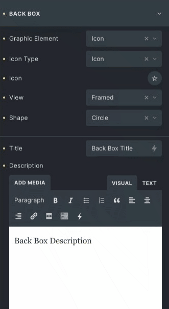
- Graphic Element: Choose the visual part that will appear on the box, like an Icon or image.
- Icon Type: Choose icon type as Icon, image, SVG, or text.
- Icon: Choose the Icon of your choice for the front box from the available options.
- View: Set the view of the icon default. Stacked or framed, it will change the Icon’s appearance.
- Title: Enter the text to change the heading of the Back box.
- Description: Enter the content to be added to the back box.
Button
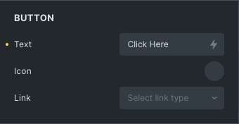
- Text: Enter the title of the button present on the back box.
- Icon: Choose the icon for the button from the libraries available.
- Link: Select the link type for the button to which it will link.
Front Box Style
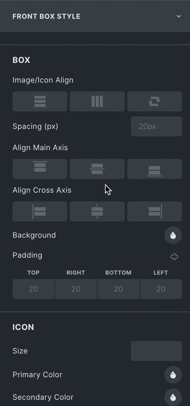
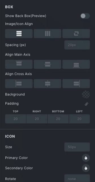
Box
- Horizontal Position: Set the horizontal position of the front box from start, Center and end.
- Vertical Position: Set the Vertical position of the front box from start, Center and end.
- Background: Choose the background color/image of the Flip Box.
Icon
- Spacing: Add the space between the Icon and the content of the Flip Box.
- Size: Set the icon size.
- Primary Color: Set the icon color from the options.
- Rotate: Rotate the icon either clockwise or anticlockwise.
- Enable Hover: Enable to set color and rotate properties on the mouse hover.
Title
- Spacing: Add the space between the Title and Description of the front box.
- Color: Set the color of the title of the front box.
- Typography: Set the typography of the Title, its font family, size etc.
Description
- Color: Set the color of the description of the front box.
- Typography: Set the typography of the Description, its font family, size etc.
Back Box Style
Box
- Horizontal Position: Set the horizontal position of the back box from start, Center and end
- Vertical Position: Set the Vertical position of the back box from start, Center and end.
- Background: Choose the background color/image of the Flip Box.
Icon
- Spacing: Add the space between the Icon and the content of the Flip Box.
- Size: Set the icon size.
- Primary Color: Choose the icon color
- Rotate: Rotate icon either clockwise or anticlockwise.
- Enable Hover: Enable to set color and rotate properties on the mouse hover.
Title
- Spacing: Add the space between the title and Description of the front box.
- Color: choose the color of the title of the back box.
- Typography: Set the typography of the Title, its font family, size etc.
Description
- Color: Set the color of the description of the Back box.
- Typography: Set the typography of the description, its font family, size etc.
Button
- Icon Position: Set the icon position either left or right.
- Icon Size: Set the icon size.
- Icon Spacing: Set the space between the icon and the content.
- Text Color: Choose color of the button on the back box.
- Typography: Set the typography of the button, its font family, size etc.
- Background: Set the button’s background, either choose color or image.
Button Hover
Styling controls for the back box button’s hover state are available under this section.
Border: Set the Border and border radius of the button.
Box Shadow: Add a shadow effect around the button box.
Click here to check out a demo page of Flip Box element.