The Chart element helps you create eye-catching charts to showcase your data in a visually appealing way. You can choose from different chart types, including line, vertical, and horizontal charts. The element also supports animations, making your charts dynamic and engaging.
You can customize the charts to fit your needs and add helpful features like a legend and tooltips to make the information easier to understand. It’s perfect for presenting data in a clear and attractive way.
The “Chart” element features the following controls.
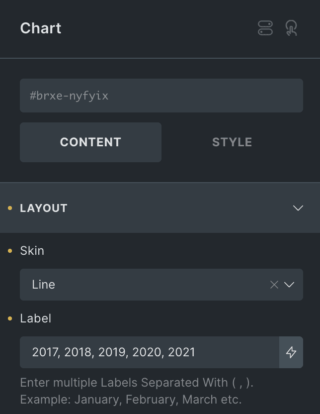
Content
Layout
- Skin: Choose from vertical, horizontal, or line chart.
- Label: It allows you to give every set of bars a separate name. You must separate the names with a ( , ) if there is more than one set.
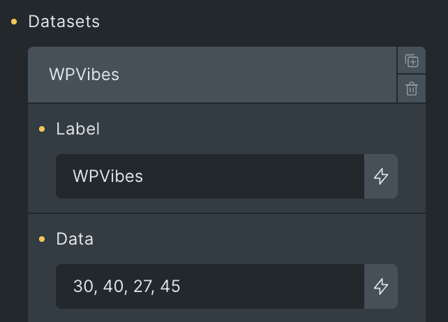
- Datasets: Add the data to compare in the chart(applicable for individual dataset).
- Label: Enter the label.
- Data: Add the data for specific dataset.
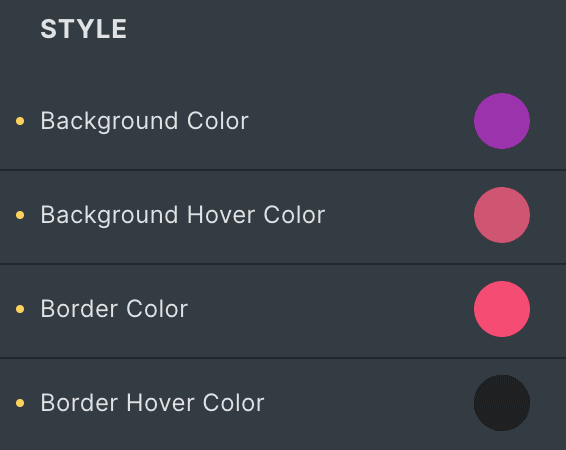
Style(applicable for individual datasets)
- Background Color: Select the background color of individual bar.
- Background Hover Color: Select the background color of individual bar for hover state.
- Border Color: Choose the border color.
- Border Hover Color: Choose the border color for hover state.
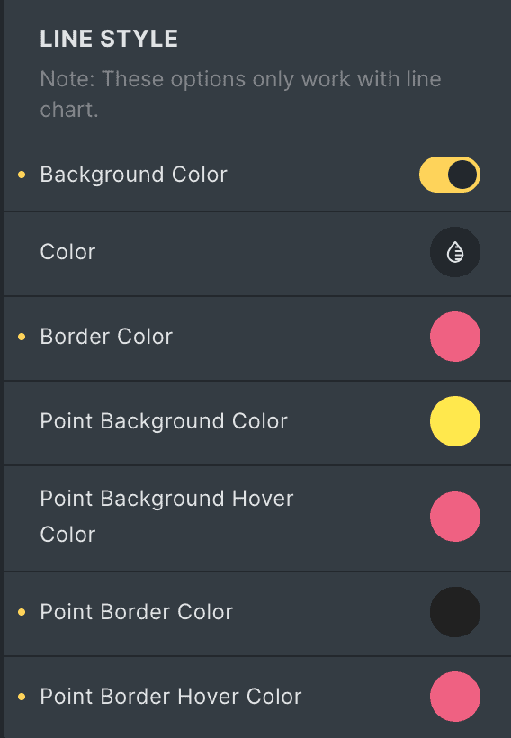
Line Style(applicable for Line Chart only)
- Background Color: Enable the option to set the background in line chart.
- Color: Select the background color.
- Border Color: Choose the border color.
- Point Background Color: Select the background color for the line chart point.
- Point Background Hover Color: Select the hover background color for the line chart point.
- Point Border Color: Choose the border color of point.
- Point Border Hover Color: Choose the border color of point for hover state.
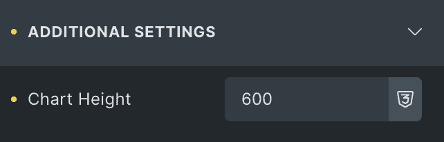
Additional Settings
- Chart Height: Specify the height of chart.
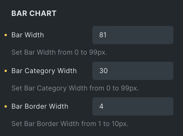
Bar Chart
Note: These options are applicable when you select Vertical or Horizontal bar as skin type.
- Bar Width: Specify the width of bar.
- Bar Category Width: Specify the bar category width.
- Bar Border Width: Select the width of bar’s border.
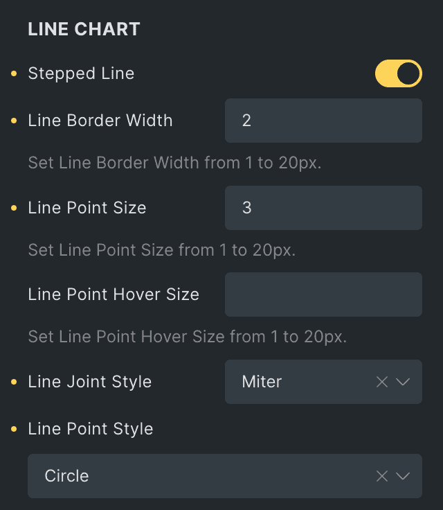
Line Chart
Note: These options are applicable when you select Line as skin type.
- Stepped Line: Enabled the option to display the stepped line in chart.
- Line Border Width: Specify the width of line’s border.
- Line Point Size: Specify the point size.
- Line Point Hover Size: Specify the size of point for hover state.
- Line Joint Style: Select the joint style from Miter, Round, or Bevel(applicable when stepped line option is enabled).
- Line Point Style: Select the line chart point style.
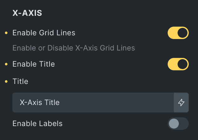
X-Axis
- Enable Grid Lines: Enable the option to display the grid lines.
- Enable Title: Enable the option to display the title in X-Axis.
- Title: Enter the title.
- Enable Labels: Activate the option to display the label on the X-axis.
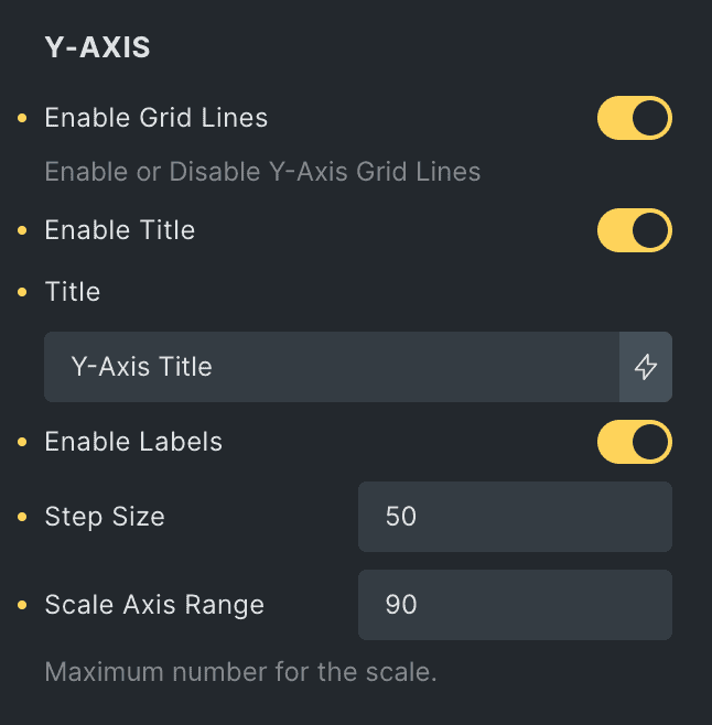
Y-Axis
- Enable Grid Lines: Enable the option to display the grid lines.
- Enable Title: Enable the option to display the title in Y-Axis.
- Title: Enter the title.
- Enable Labels: Activate the option to display the label on the Y-axis.
- Step Size: Set the interval between the labels.
- Scale Range: Set the maximum value for the Y-axis scale.
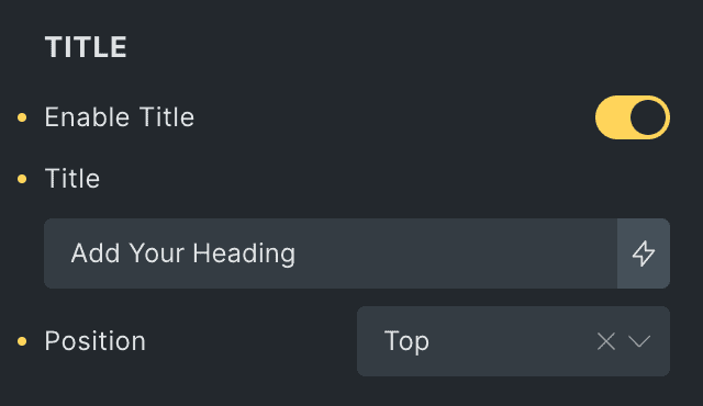
Title
- Enable Title: Enable the option to display the chart title.
- Title: Enter the title.
- Position: Select the position of title.
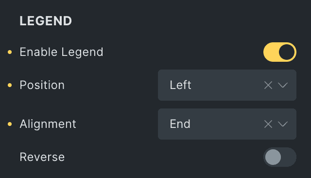
Legend
- Enable Legend: Enable the option to display the legend in chart.
- Position: Select the position of legend.
- Alignment: Choose the alignment of legend.
- Reverse: Enable the option to display the legend in reverse format.
Tooltip
- Enable Tooltip: Enable the option to display the tooltip.
- Mode: Select the mode of tooltip from index or point.
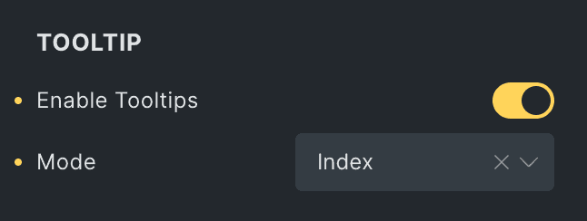
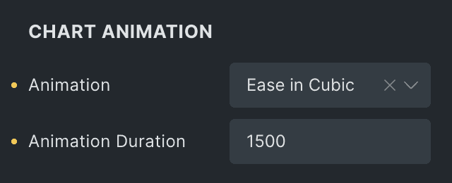
Chart Animation
- Animation: Add the animation to the chart. Select from the different options available.
- Animation Duration: Set the duration of animation.
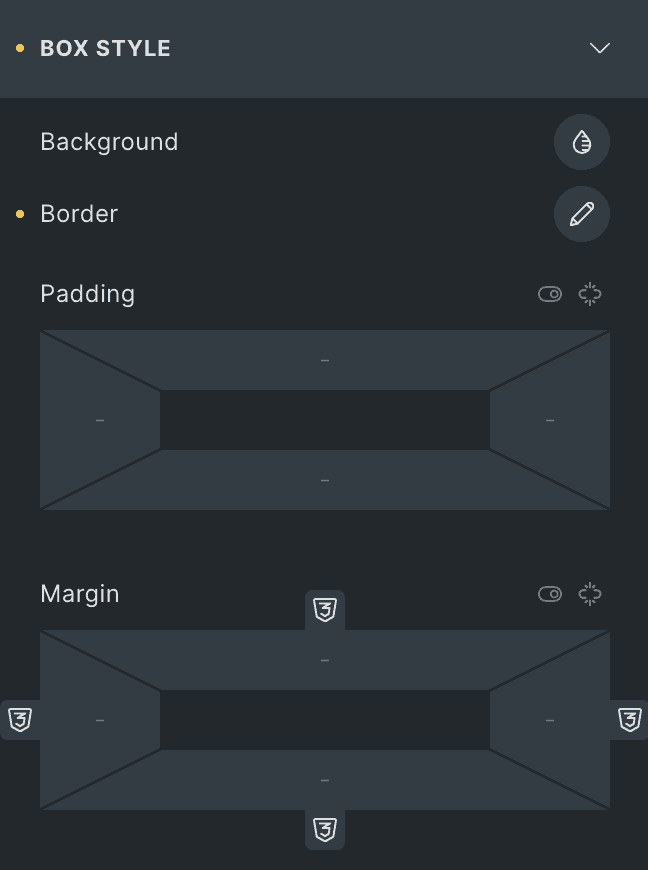
Box Style
- Background: Select the background of chart box.
- Border: Set the border.
- Padding: Set the padding.
- Margin: Set the margin.
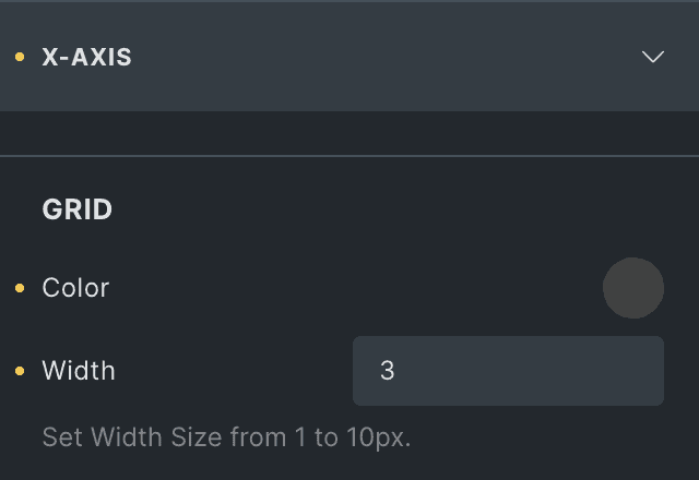
X-Axis
Grid
- Color: Select the color of X-Axis grid lines.
- Width: Specify the width of grid lines.
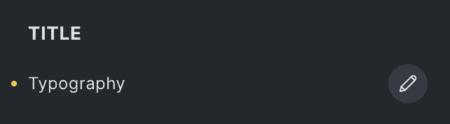
Title
- Typography: Set the typography of X-Axis title.
Labels
- Typography: Set the typography of labels.
- Padding: Set the padding.

Y-Axis
Grid
- Color: Select the color of Y-Axis grid lines.
- Width: Specify the width of grid lines.
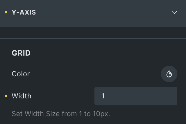
Title
- Typography: Set the typography of Y-Axis title.

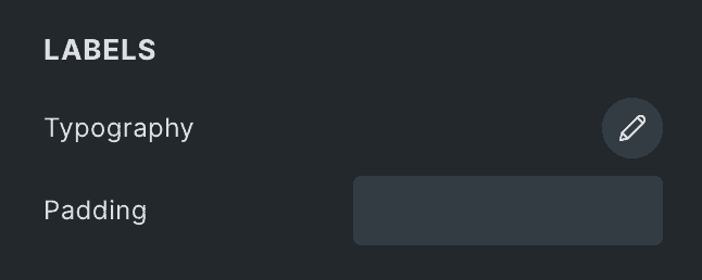
Labels
- Typography: Set the typography of labels.
- Padding: Set the padding.
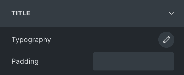
Title
- Typography: Set the typography of chart title.
- Padding: Set the padding.
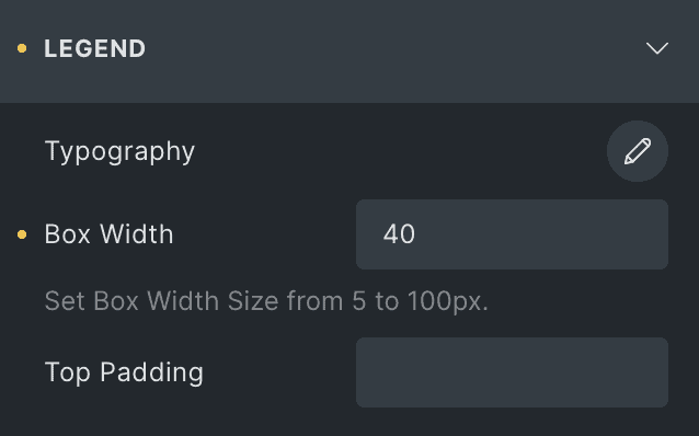
Legend
- Typography: Set the typography of legend.
- Box Width: Specify the legend box width.
- Top Padding: Specify the padding from top in legend.
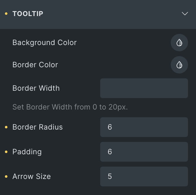
Tooltip
- Background Color: Select the background color of tooltip.
- Border Color: Set the border color of tooltip.
- Border Width: Set the border width.
- Border Radius: Set the border radius.
- Padding: Set the padding.
- Arrow Size: Specify the arrow size in tooltip.
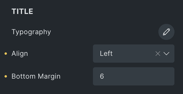
Title
- Typography: Set the typography of tooltip title.
- Align: Select the alignment of tooltip content.
- Bottom Margin: Specify the margin from bottom.
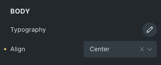
Body
- Typography: Set the typography of tooltip’s body content.
- Align: Select the alignment of tooltip’s body content.
Check out a demo page for the Charts element.