The Testimonial Slider is an element that helps you create an appealing and organized display of multiple customer reviews. This can be a powerful way to boost your business’s credibility and persuade potential buyers to make a purchase. The slider offers different styles of presets, each with its customization features to make your testimonials look engaging and effective.
To give the testimonials more authenticity, you can include details about the reviewers, such as their avatar, name, designation, and more. Additionally, you have the flexibility to arrange the testimonials in the order you prefer, making it easy to showcase the most impactful ones first.
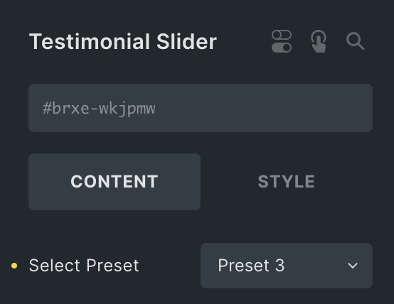
The Testimonial Slider element features the following controls:
Content
Note: Each Preset comes with its unique customization features.
- Select Preset: Select the preset from available styles.
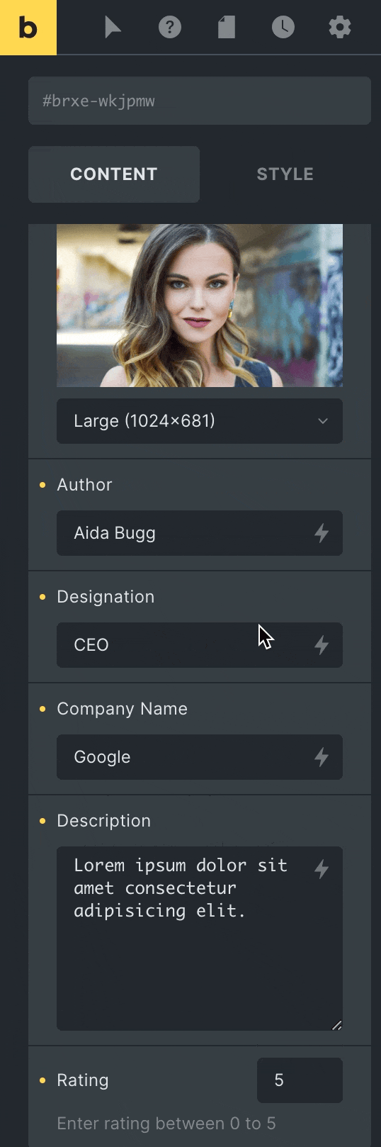
Testimonial Details
- Avatar: Upload the avatar of the user.
- Avatar Size: Select the size of an avatar.
- Image: Upload the image of the user(applicable for presets 2 & 3).
- Image Size: Select the size of an image(applicable for presets 2 & 3).
- Author: Enter the name of the author.
- Designation: Enter the designation of author.
- Company Name: Enter the name of company.
- Description: Enter the description, if any.
- Rating: Specify the rating number.
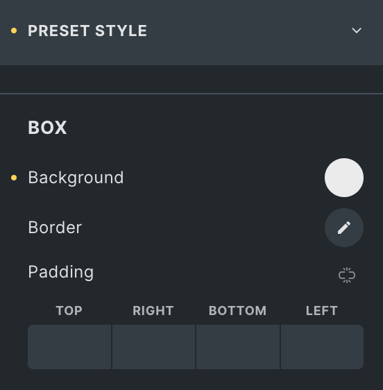
Preset Style
Box
- Background: Select the background color of box.
- Alignment: Select alignment from Left, Center, or Right(applicable for Preset 1).
- Border: Set the border.
- Padding: Set the padding.
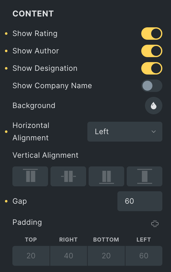
Content
Note: These options are only applicable for Preset 2 & 3.
- Show Rating: Enable the option to show rating(applicable for preset 3)
- Show Author: Enable the option to show author name(applicable for preset 3)
- Show Designation: Enable the option to show designation(applicable for preset 3)
- Show Company Name: Enable the option to show company name(applicable for preset 3)
- Background: Select the background color of content box.
- Horizontal Alignment: Select horizontal alignment from Left, Center, or Right.
- Vertical Alignment: Select vertical alignment from Start, Center, End, or Stretch.
- Gap: Specify the gap between Content box and the Image.
- Padding: Set the padding.
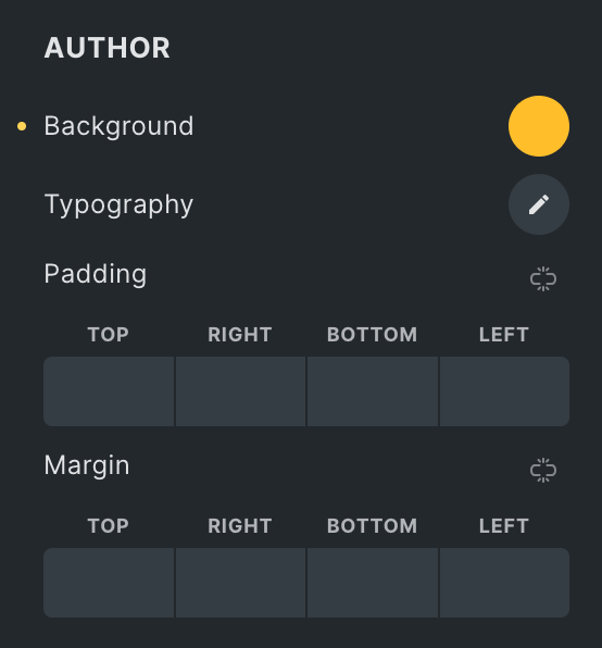
Author
- Background: Select the background color of author.
- Typography: Set the typography.
- Padding: Set the padding.
- Margin: Set the margin.
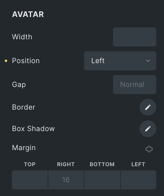
Avatar
- Width: Specify the width of an avatar.
- Position: select avatar position from Left or Right(applicable for Preset 2 & 3)
- Gap: Specify the gap between avatar to content(applicable for Preset 2 & 3)
- Border: Set the border.
- Box Shadow: Set the box shadow.
- Margin: Set the margin(applicable for Preset 2).
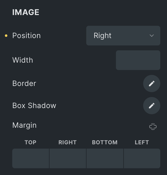
Image
Note: Some options apply to preset 3, while others apply to preset 2
- Hide Image Below: Choose the device where you want to hide the image.
- Position: Select the position of image from left or Right.
- Width: Specify the width of image.
- Alignment: Select the alignment of image.
- Border: Set the border
- Box Shadow: Set the box shadow.
- Margin: Set the margin.
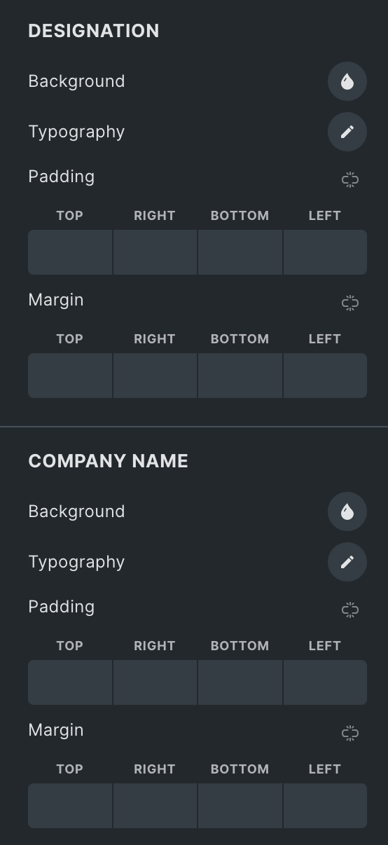
Designation
- Background: Select the background color of designation.
- Typography: Set the typography.
- Padding: Set the padding.
- Margin: Set the margin.
Company Name
- Background: Select the background color of company name.
- Typography: Set the typography.
- Padding: Set the padding.
- Margin: Set the margin.
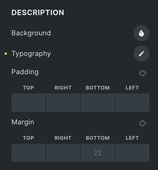
Description
- Background: Select the background color of description.
- Typography: Set the typography.
- Padding: Set the padding.
- Margin: Set the margin.
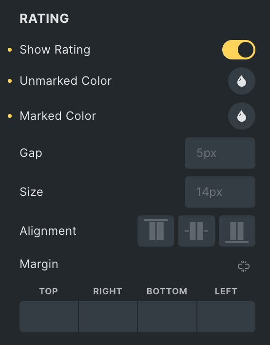
Rating Style
- Marked Icon: Select the marked icon from icon library.
- Half Marked Icon: Select the half marked icon.
- Unmarked Icon: Select the unmarked icon.
- Size: Specify the size of an icon.
- Marked Color: Select the color of a marked icon.
- Unmarked Color: Select the color of an unmarked icon.
- Gap: Specify the gap between rating icons.
- Margin: Set the margin.
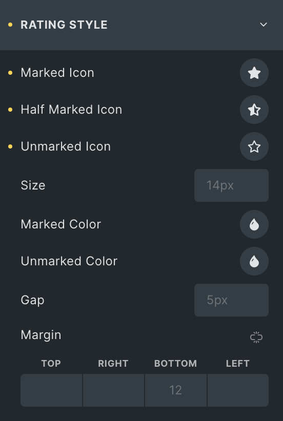
Image Overlay
These options are applicable for Preset 3 only.
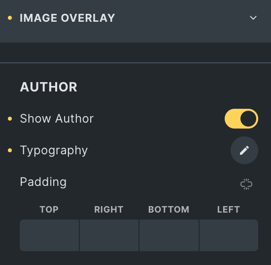
Author
- Show author: Enable the option to display the author name.
- Typography: Set the typography.
- Padding: Set the padding.
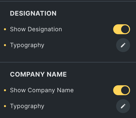
Designation
- Show designation: Enable the option to display Designation.
- Typography: Set the typography.
Company Name
- Company name: Enable the option to display name of company.
- Typography: Set the typography.
Rating
- Show rating: Enable the option to display the rating.
- Unmarked Color: Select the color of an unmarked icon.
- Marked Color: Select the color of a marked icon.
- Gap: Specify the gap between rating icons.
- Size: Specify the size of icon.
- Alignment: Select alignment from Start, Center, or End.
- Margin: Set the margin.
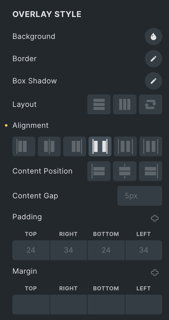
Overlay Style
- Background: Select the background color of overlay.
- Border: Set the border.
- Box Shadow: Set the box shadow.
- Layout: Select layout from Vertical, Horizontal, or Reverse.
- Alignment: Select the alignment of overlay content.
- Content Position: Select a content position from Start, Center, or End.
- Content Gap: Specify the gap between content.
- Padding: Set the padding.
- Margin: Set the margin.
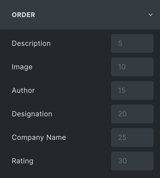
Order
Choose the order of displaying individual elements, such as
- Description
- Image(for P1)
- Author
- Designation(for P1)
- Company Name(for P1)
- Rating
Note: If any of these elements have a lower priority than others, they can be placed first on the webpage. This feature gives you greater control over the visual hierarchy of your webpage.
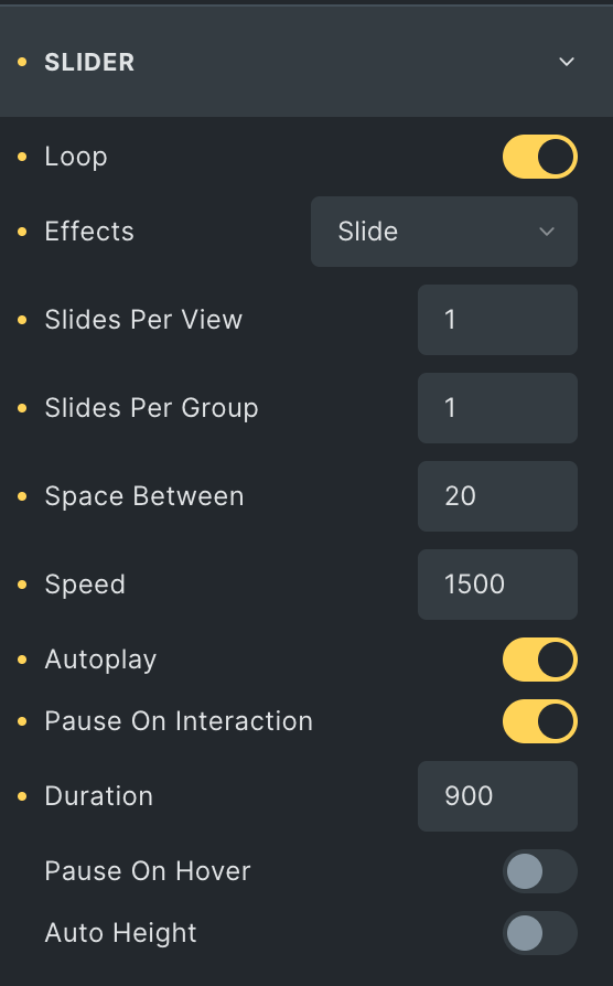
Slider
- Loop: Enable the loop option to display the slides continuously.
- Effects: Select effects from Slide, Coverflow, Fade, or Flip.
- Slides Per View: Specify the number of slides to be displayed in a row.
- Slides Per Group: Specify how many slides should move together when navigating through the slider.
- Speed: Set the transition speed when moving one slide to the next.
- Autoplay: Activate the option to enable autoplay while onload.
- Pause On Interaction: Enable the option to pause slides during interaction.
- Duration: Set the duration for transition.
- Pause On hover: Enable the option to pause slides during hover.
- Auto Height: Enable the option to set the auto height.
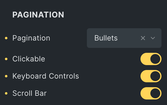
Pagination
- Pagination: Set the pagination type.
- Clickable: Enable the option to make arrows clickable(only applicable for Bullets Pagination type).
- Keyboard Control: Activate the option to enable keyword control.
- Scroll bar: Enable the option to display the scroll bar.
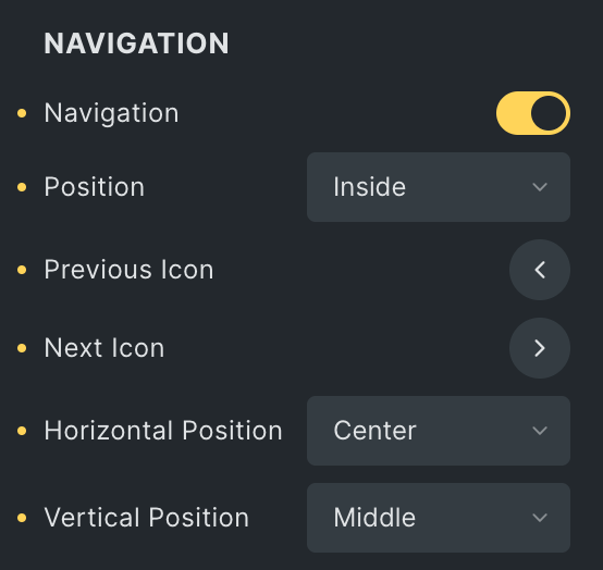
Navigation
- Navigation: Enable the option to display navigation.
- Position: Choose either from Outside or Inside.
- Previous Icon: Set the previous icon from available icons.
- Next Icon: Set the next icon from available icons.
- Horizontal Position: Select the horizontal position of navigation.
- Vertical Position: Select the vertical position of navigation.
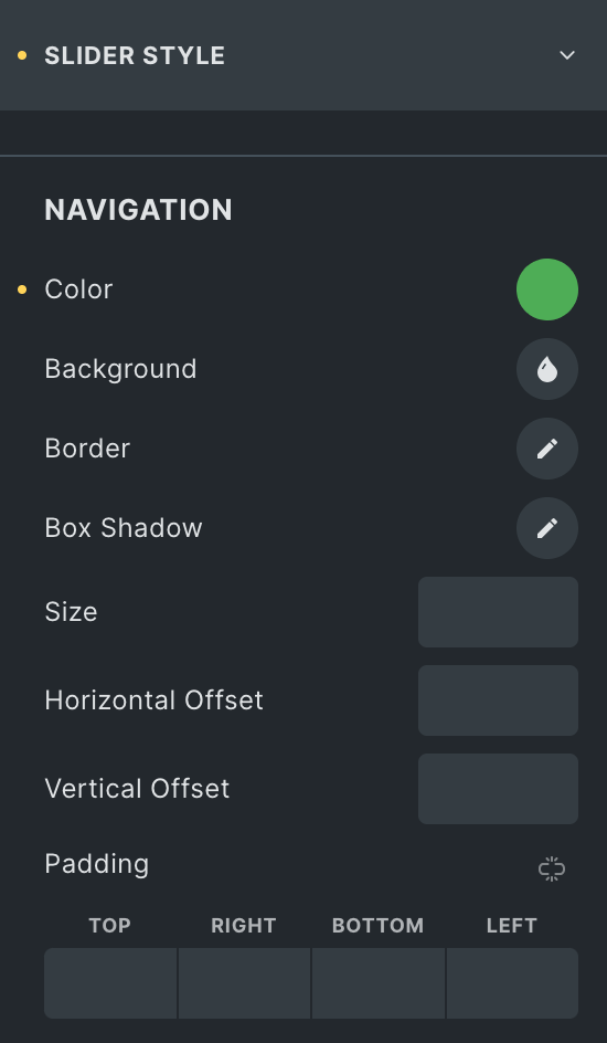
Slider Style
Navigation
- Color: Select the color of navigation icon.
- Background: Select the background color of navigation icon.
- Border: Set the border.
- Box Shadow: Set the box shadow.
- Size: Specify the size of icon.
- Horizontal offset: Enter the horizontal offset value.
- Vertical Offset: Enter the vertical offset value.
- Padding: Set the padding.
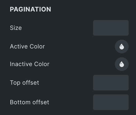
Pagination
- Size: Specify the size of pagination.
- Active Color: Select the pagination active color.
- Inactive Color: Select the pagination inactive color.
- Top Offset: Specify the top offset value.
- Bottom Offset: Specify the bottom offset value.
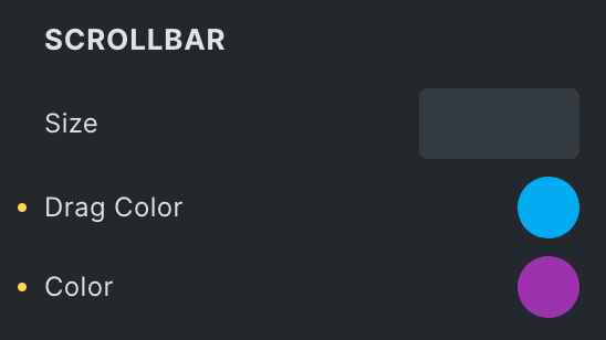
Scroll Bar
- Size: Specify the size of scroll bar.
- Drag Color: Select the drag color of scroll bar.
- Color: Select the color of scroll bar.
Check out the Demo page of Testimonial Slider element.