Timeline is a powerful and flexible element of the Bricks Ultra plugin. You can create an attractive vertical layout to showcase your blog posts in a tiled manner, and it contains customization options to enhance your timeline experience. In addition, you can use this element to fetch data from posts and categories and display custom events.
Timeline
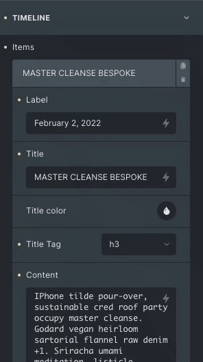
By default, there are three items added to the timeline. You can add/edit more items according to your needs.
- Label: Use the label according to your need. This is a text field and you can also select labels dynamically.
- Title: Write the suitable title to be displayed on the card. You can again dynamically choose the title of the timeline.
- Title Color: Choose the title color.
- Title Tag: Select your title heading like, <h1> <h2> etc.
- Content: Provide more information about the event, either write manually or get dynamically.
- Image: Choose an image of your own choice or get it dynamically.
- Custom Icon: Enable to use icon individually on each card.
- Icon type: Select icon type from image, icon, text or SVG to display on each card in the timeline.
- View: Set the view of the icon.
- Shape: Set the shape of the icon.
- Link: Select the link option according to your need.
Global icon
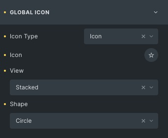
It gives a default icon to all the timeline cards.
- Icon Type: Select icon type from image, icon, text or SVG to display.
- Icon: Choose the icon from the given libraries.
- View: Set the view of the icon.
- Shape: Set the shape of the icon.
- Link: Select the link option according to your need.
Layout
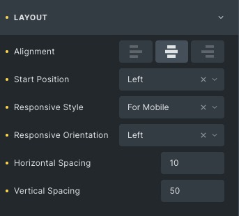
- Alignment: Align the timeline from left, center or end.
- Start Position: Set the position either left or right.
- Responsive Style: Choose a responsive style for mobile and tablet.
- Responsive Orientation: Choose orientation either left or right.
- Horizontal Spacing: Set the horizontal space between the icon and the card.
- Vertical Spacing: Adjust the vertical spacing between the cards
Card
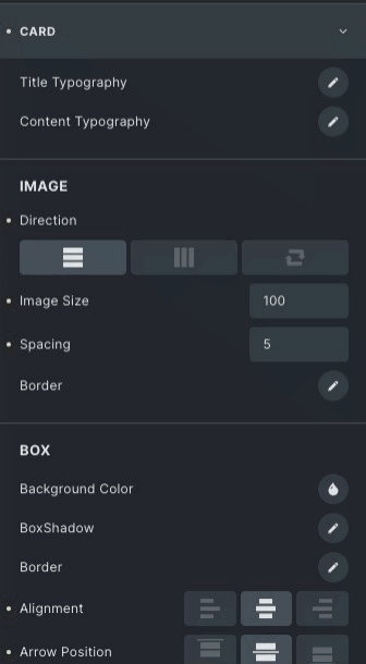
- Title Typography: Set the typography for your title.
- Content Typography: Set the typography for your description.
Image
- Direction: Set the direction of the image from vertical, horizontal or reverse.
- Image Size: Adjust the size of the image.
- Spacing: Adjust the space between content and image.
- Border: Set the border and the border radius.
Box
- Background Color: Choose colors for the box background.
- Box Shadow: Add a box shadow effect around the card.
- Border: Set the border and the border radius.
- Alignment: Align the content inside the card from left, center or end.
- Arrow Position: Set position from left, center or end.
Hover
Styling controls for the hover state are available under this section for the box. Thses settings will be applied when Someone hovers the box.
Focused
Styling controls for the active state are available under this section. These settings will be applied to the active box.
Label
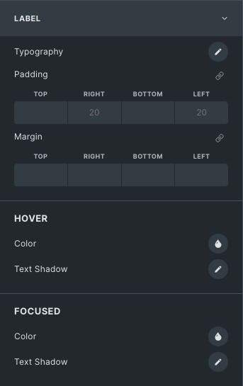
- Typography: Set the typography for the label.
- Text Shadow: Add a shadow effect around the text.
Hover
Styling controls for the hover state are available under this section. These settings will be applied when Someone hovers the label.
Focused
Styling controls for the active state are available under this section. These settings will be applied to the label of the active card in the timeline.
Connector
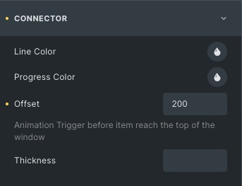
- Line Color: Choose the color of the connector line.
- Progress Color: Set the progress color to be shown when the progress bar moves.
- Thickness: Specify the width of the progress bar.
Icon
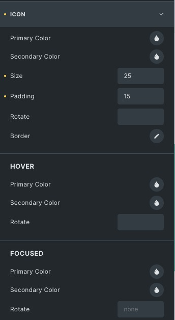
- Primary Color: Choose the icon color.
- Secondary Color: Choose the background color.
- Size and Padding: Adjust the icon size.
- Rotate: Rotate the icon either in the clockwise or anti-clockwise direction.
- Border: Set border on Icon.
Hover
Styling controls for the hover state are available under this section. These settings will be applied when Someone hovers the box.
Focused
Styling controls for the Active state are available under this section. These settings will be applied to the icon of the active card in the timeline.
Click here to check out a demo page of Timeline element.