This element is an ideal solution for those seeking interactive advanced buttons that seamlessly merge headlines and descriptions into a single button. Its versatile features empower users to create visually captivating buttons that immediately grab their attention, and you can effectively convey your message and guide users toward desired results.
Layout
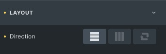
Direction: Set the direction to vertical, horizontal, or reverse.
Content
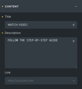
Title: Write the title of the Advance button.
Description: Write the description of the advance button.
Link: Set the link type and add a link.
Icon
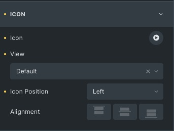
Icon: Choose an icon from the options.
View: Set the view of the icon from default, stacked, or framed.
Icon position: Adjust the icon position to either left or right.
Alignment: Set the alignment from start, center, or end.
Separator
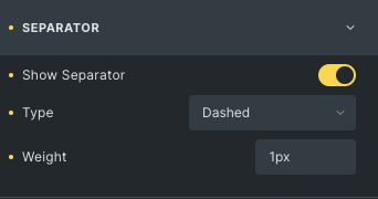
Show Separator: Enable to show a separator
Type: Set separator type from solid, dashed, or dotted.
Weight: Control the width of the separator.
Layout Style
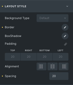
Background Type: Choose the background type, either color or gradient.
Border: Set the border and border radius.
Box Shadow: Add a box shadow effect to the box.
Padding: Set the padding to the box.
Alignment: Set the alignment to start, center or end.
Spacing: Adjust the spacing between the separator and the button’s content.
Content Style
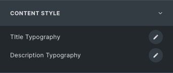
Title Typography: Set the title typography.
Description Typography: Set the description typography.
Icon Style
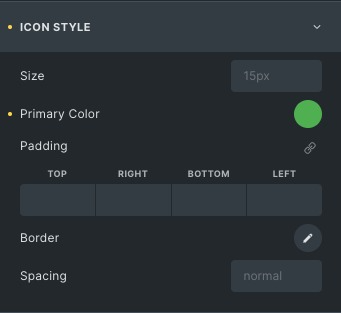
Size: Set the size of the icons according to your choice.
Primary color: Set the primary color of the icon.
Border: Set the border and border radius.
Spacing: Adjust the spacing between the icon and the button’s title.
Separator Style
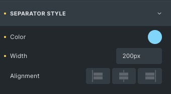
Color: Set the color of the separator.
Width: Set the width of the separator.
Alignment: Align the separator from the start, center, or end.
Click here to check out a demo page of Advanced Button button.