This versatile element is designed to showcase your WooCommerce categories. It offers a range of styles and layouts, each with its own features to present your Woo categories on your website. With this element, you have complete control over how your categories are displayed, including the category title, product count, category description, and a customizable button.
It provides numerous filtering options, allowing you to apply various features to refine the display of categories. You can also include or exclude a specific category, ensuring that you have control over what appears on your website. Additionally, you can specify the number of categories to be shown or exclude child categories if necessary.
To enhance user experience, this element also allows you to hide categories that have no product, ensuring that only relevant and populated categories are presented to your customers. With all these features, you can effectively curate and present your categories to engage your audience and maximize their shopping experience.
The “Woo Category” element features the following controls.
Content
Layout
Note: Each Style Preset in the Style option comes with its own set of features for you to utilize.
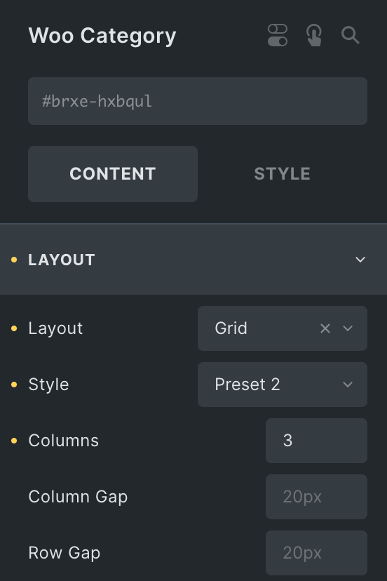
- Layout: Select either Grid or Slider.
- Style: Choose the styles from available options.
- Hover Animation: Select the hover animation(applicable for Style Preset 3 only).
- Columns: Specify the number of columns to display in each row(applicable on Grid Layout).
- Column Gap: Specify the gap between columns(applicable on Grid Layout).
- Row Gap: Specify the gap between rows(applicable on Grid Layout).
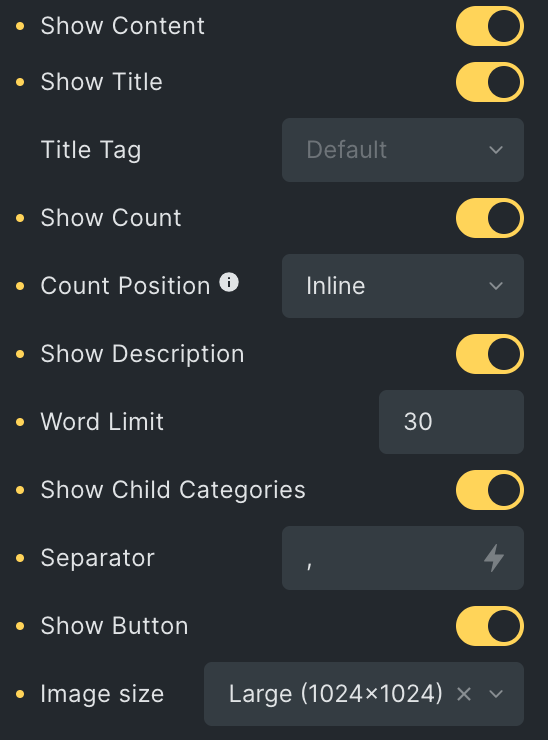
- Show Content: Enable the option to display the category content.
- Show Title: Enable the option to display the title.
- Title Tag: Select the title tag.
- Show Count: Enable the option to display product Count.
- Count Position: Select from inline or Outside.
- Show Description: Enable the option to display a description.
- Word Limit: Enter the number of words to be shown.
- Show Child Categories: Enable the option to display child categories.
- Separator: Enter the separator to be displayed between child categories.
- Show Button: Enable the option to display button.
- Image Size: Select the image size of the category’s featured image.
- Show Title: Enable the option to display the title.
Category Settings
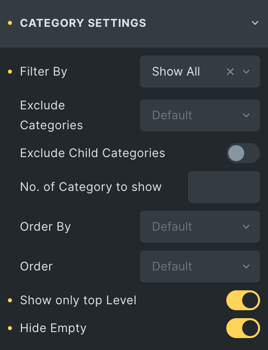
- Filter By: Choose the appropriate option corresponding to the filter you desire to display categories.
- Parent
- Parent: Select the parent category.
- Manual Selection
- Include Categories: Select the categories which you want to include.
- Exclude Categories: Select the categories which you want to exclude to display.
- Exclude Child Categories: Enable the option to exclude the child categories.
- No. Of Category to Show: Specify the number of categories to be shown.
- Order By: Choose the criteria on which you want to perform the “order by” operation.
- Order: Select from Ascending or Descending.
- Show only top Level: Enable the option to display only top level categories.
- Hide Empty: Enable the option to hide an empty category to display.
- Parent
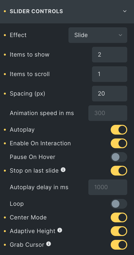
Slider Controls
Note: This option is applicable when Slider layout is selected. Within the Effect option, each effect offers unique features for you to utilize.
- Effect: Select the effect from available options.
- Items to show: Specify the number of items to display first.
- Items to scroll: Specify the number of items to scroll at a single time.
- Spacing: Enter the gap between items in px.
- Animation Speed: Specify the animation speed.
- Autoplay: Enable the option to autoplay the slider.
- Enable On Interaction: Activate the option to stop autoplay while interacting on slider controls.
- Pause On Hover: Enable the option to pause the slider while hovering.
- Stop on Last Slide: Enable the option to automatically stop autoplay on the last slide(This will not work if loop is enabled).
- Autoplay Delay in ms: Specify the value in ms.
- Loop: Enable the option to loop the slider.
- Center Mode: Activate the option to display in center mode.
- Adaptive Height: By enabling this, the slider will adjust height automatically depending on the currently active slide.
- Grab Cursor: Enable the option to display the grab cursor while hovering over the slider.
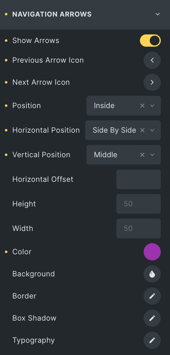
Navigation Arrows
Note: This option is applicable when Slider layout is selected.
- Show arrows: Enable the option to display navigation.
- Previous Arrow Icon: Select the icon for the previous navigation.
- Next Arrow Icon: Select the icon for the next navigation.
- Position: Choose the position of navigation.
- Horizontal Position: Select the horizontal position of navigation.
- Vertical Position: Select the vertical position of navigation.
- Horizontal Offset: Specify the horizontal offset.
- Outside Gap: Specify the gap from the outside(applicable on the outside position).
- Height: Enter the height.
- Width: Enter the width.
- Color: Select the color of the arrows.
- Background: Select the background color of the arrows.
- Border: Select the border properties.
- Box Shadow: Set the box shadow.
- Typography: Set the typography.
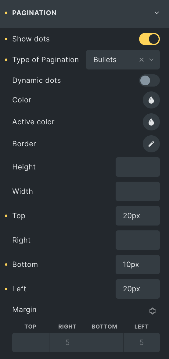
Pagination
Note: This option is applicable when Slider layout is selected.
- Show Dots: Enable the option to display pagination.
- Types of Pagination: Select the pagination style.
- Dynamic Dots: Enable the option to display dynamic dots(applicable on bullets pagination type)
- Typography: Set the typography(applicable on fraction pagination type)
- Color: Select the color of pagination.
- Active Color: Select the active color of pagination.
- Background: Select the background color of pagination(applicable on fraction pagination type)
- Border: Select the border properties.
- Box Shadow: Set the box shadow(applicable on fraction pagination type)
- Height: Enter the height(applicable on bullets pagination type)
- Width: Enter the width(applicable on bullets pagination type)
- Top: Specify the spacing from the top with the suffix.
- Right: Specify the spacing from the right with the suffix.
- Bottom: Specify the spacing from the bottom with the suffix.
- Left: Specify the spacing from the left with the suffix.
- Margin: Enter the margin(applicable on bullets pagination type)
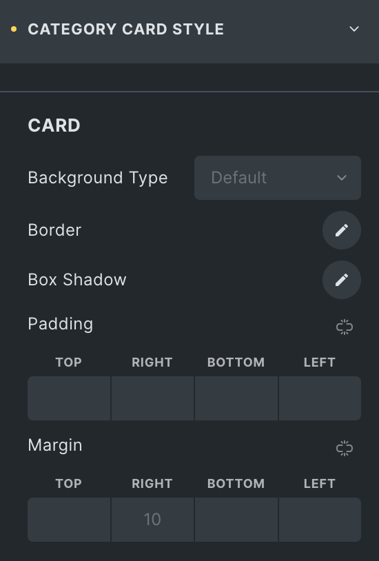
Category Card Style
Card
- Direction: Select the direction of the card.
- Background Type: Choose either Image/Color or Gradient.
- Image/Color
- Background: Upload an image or select the color for the background.
- Gradient
- Apply to: Choose the appropriate option where to apply background.
- CSS Selector: Enter the CSS selector.
- Angle in: Specify the angle value to apply the background.
- Colors: Add multiple colors to make a gradient.
- Image/Color
- Border: Set the border.
- Box Shadow: Set the box shadow.
- Padding: Set the padding.
- Margin: Set the margin.
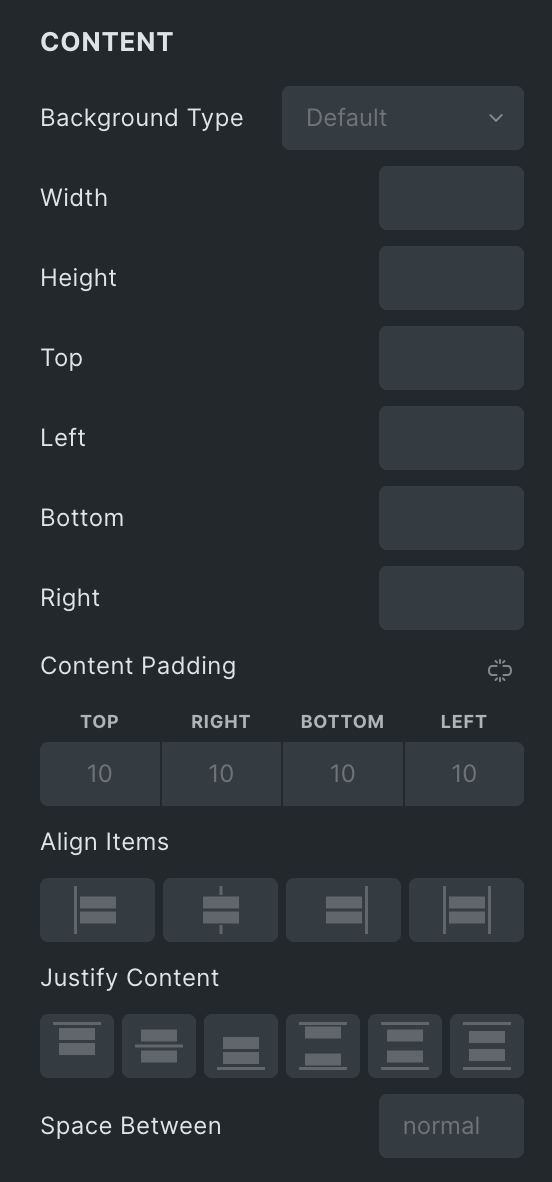
Content
- Background Type: Choose from Image/Color or Gradient. Click Here.
- Width: Enter the width of the content box.
- Height: Enter the height of the content box.
- Top: Specify the position from the top.
- Left: Specify the position from the left.
- Bottom: Specify the position from the bottom.
- Right: Specify the position from the right.
- Content Padding: Set the padding.
- Align Items: Set the align items property.
- Justify Content: Set the justify content property.
- Space Between: Specify the gap between content.
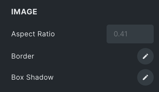
Image
- Aspect Ratio: Enter the aspect ratio of the image.
- Border: Set the border.
- Box Shadow: Set the box shadow.
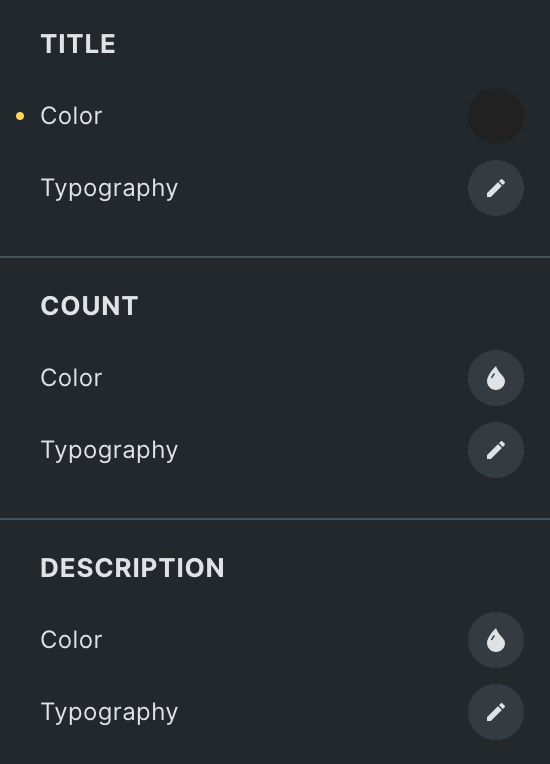
Title
- Color: Select the color of the title.
- Typography: Set the typography.
Count
- Color: Select the color of the product count.
- Typography: Set the typography.
Description
- Color: Select the color of the description.
- Typography: Set the typography.
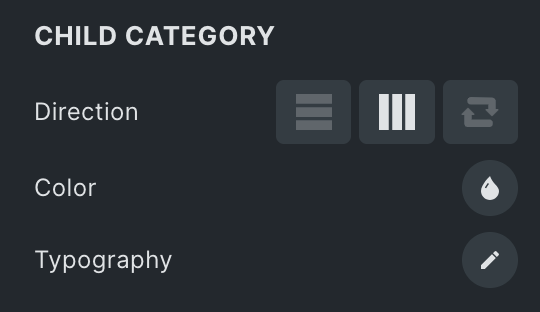
Child Category
- Direction: Select the direction to display child categories.
- Color: Select the color of the child categories.
- Typography: Set the typography.
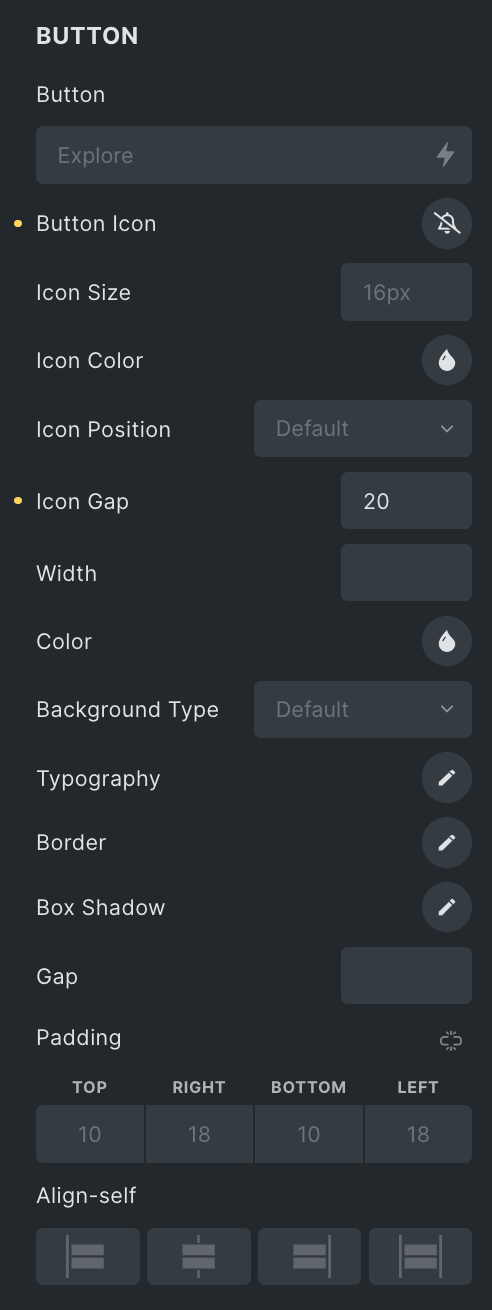
Button
- Button: Enter the text for the button.
- Button Icon: Select the icon for the button.
- Width: Enter the width.
- Color: Select the text color of the button.
- Background Type: Choose from Image/Color or Gradient. Click Here.
- Typography: Set the typography.
- Border: Set the border.
- Box Shadow: Set the box shadow.
- Gap: Specify the gap between text and icon.
- Padding: Set the padding.
- Align Self: Select the appropriate option.
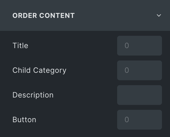
Order Content
Note: If any of these items have a lower priority than others, they can be placed first on the webpage. This feature gives you greater control over the visual hierarchy of your webpage.
Choose the order of displaying individual items, such as
- Title
- Child Category
- Description
- Button