Thumbnail Slider is one of the interactive and powerful features of the Bricks Ultra plugin. It provides an interactive way to create a slider with many functionalities and advanced features. You can customize thumbnail slides and images using this Slider. It contains advanced customization options to make your Slider more catchy and attractive.
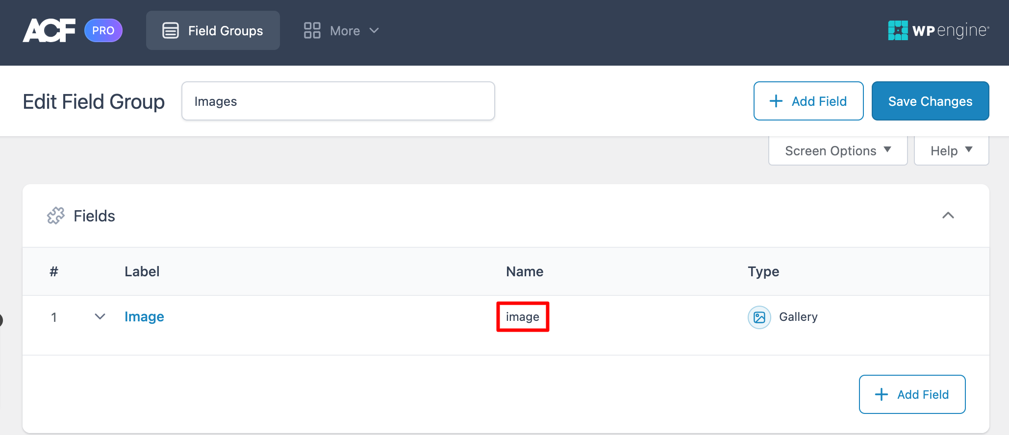
Note: To use the ACF Image Gallery option, you need to have the ACF Pro version.
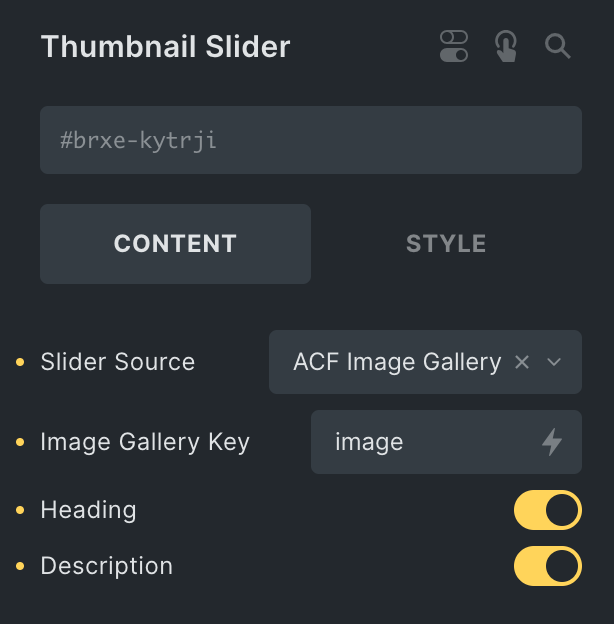
- Slide Source: Choose either Repeater or ACF Image Gallery.
- ACF Image Gallery
- Field Name: Enter the key of your image field.
- ACF Image Gallery
- Heading: Enable the option to display image title.
- Description: Enable the option to display image description.
Slides
Note: These options are only applicable when you select Repeater as Slide Source.
By default, you get four slides to customize. But if you want more, you can add more by clicking on the add item button.
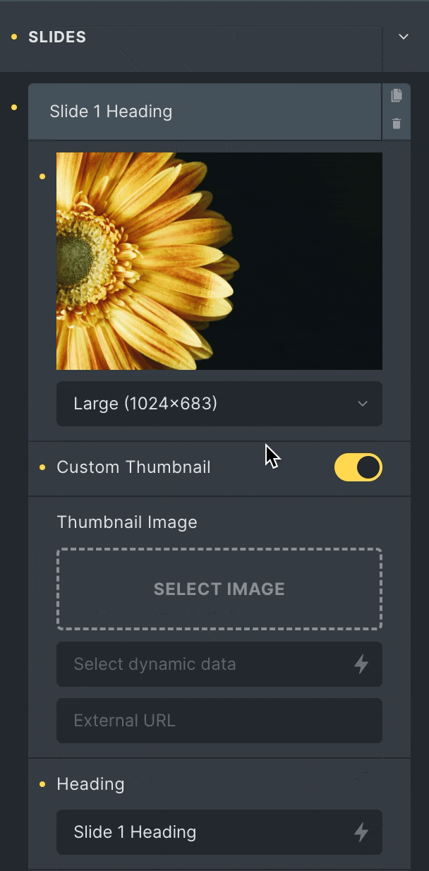
- Image: Add the image to the slider.
- Custom Thumbnail: If you want to customize the thumbnail image, enable this option.
- Thumbnail Image: Add an image to the thumbnail.
- Heading: Enter the heading of the image. You can also use dynamic data here.
- Description: Enter the custom description of the image.
- Button Text: Enter the text for the button you can choose dynamically also.
- Link: Specify the destination for the button’s link.
Thumbnails
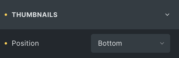
- Position: Set the position of the thumbnail from the top, right, bottom, and left.
Slider Options
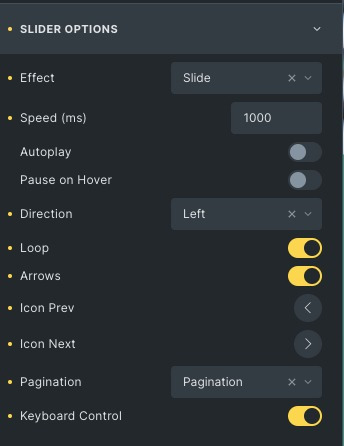
- Effect: Set how each slide transitions, either slide or fade.
- Speed: Set the speed between each slide. By default, it is 1000 (ms). That means 1 second.
- Autoplay: Show or hide autoplay.
- Autoplay Interval: Set the time it takes for each slide to appear.
- Pause on hover: Select whether or not to pause autoplay when a user hovers on the carousel.
- Direction: Set slider direction from the left or right.
- Loop: Show the carousel in a continuous loop, infinitely.
- Arrow: Choose to show or hide the navigation arrows.
- Icon prev: Add the previous icon.
- Icon next: Add the next icon.
- Pagination: Select from none, pagination and progress.
- Keyboard Control: Enable to navigate slides through the keyboard’s previous and next keys.
* Note: The progress option will only work on the Top and Bottom positions of the thumbnails.
Slides Style
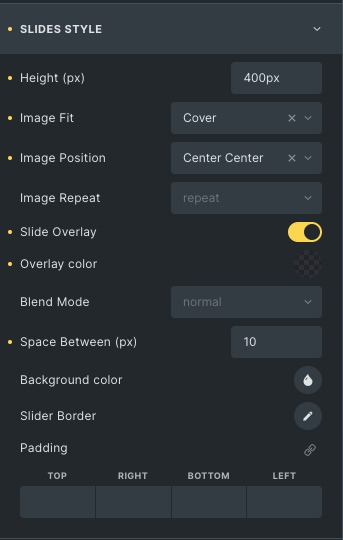
- Height: Adjust the size of the slider by default; the height is 400px.
- Image Fit: Adjust the image fit from cover, contain and auto.
- Image Position: Set the image position.
- Image Repeat: Choose from the options like repeat, no-repeat, x-repeat, and y-repeat.
- Slide Overlay: Enable it to add an overlay effect to the slides.
- Overlay Color: Set the overlay color.
- Blend Mode: Choose blend mode for overlay from normal, multiply, blend, overlay, etc.
- Space Between: Adjust the distance between the current and other slides.
- Background Color: Set the background color of the current slide.
- Slide Border: Add a border and border radius to the Slider.
Content Style
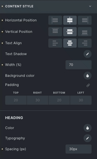
- Horizontal Position: Set the alignment horizontally like start, Center, and end.
- Vertical Position: Set the alignment vertically like start, Center, and end.
- Text Align: Align the text left, right and centre.
- Text Shadow: Set text-shadow effect around the text.
- Width: Set the width of the container.
- Background Color: Set the container’s background color.
Heading
- Color: Choose the color of the heading of the slide.
- Typography: Set the typography of heading.
- Spacing: Adjust the space between the heading and the description.
Description
- Color: Change the color of the description of the slide.
- Typography: Set the typography of the description.
- Spacing: Adjust the space between the description and the container.
Button Style
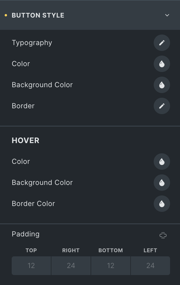
- Typography: Set the typography.
- Color: Choose the color of the Button.
- Background Color: Choose a button’s background color.
- Border Color: Set the border color.
Hover
Styling controls for the Hover state are available under this section.
Navigation style
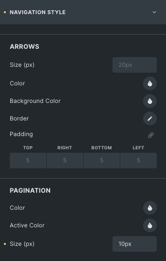
Arrows
- Size: Set the size of the arrows.
- Color: Set the color of the arrows.
- Background Color: Set the background color to the arrows.
- Border Color: Set the border color of arrows.
Pagination
Note: This option will only be visible if you choose pagination in Slider Options ->Pagination.
- Color: Choose the color of the pagination.
- Active Color: Choose the Active color of the pagination.
- Size: Set the size of the pagination.
Progress Bar
*Note: This option will only visible, if you choose progress bar in Slider Options -> Pagination.
- Height: Adjust the height of progress bar.
- Color: Choose the color of progress bar.
- Background Color: Choose the background color of the progress bar.
Thumbnail Style
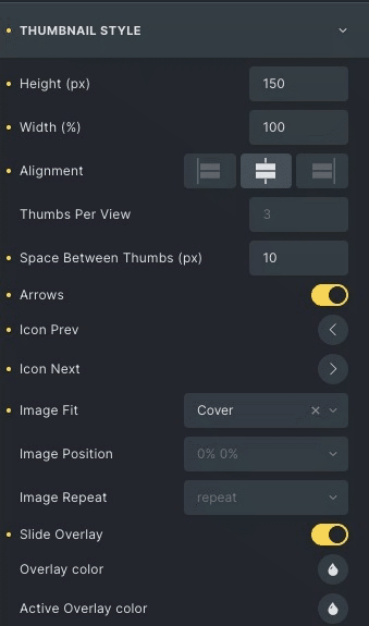
- Height: Set the height of thumbnail slider.
- Width: Set the width of the thumbnail slider.
- Alignment: Select the alignment.
- Thumbs Per View: you can set thumbs per view by default three.
- Space B/W Thumbs: Set the space between two thumbs.
- Arrows: Enable to choose the icons.
- Icon prev: Add the previous icon.
- Icon next: Add the next icon.
- Image Fit: Adjust the image fit from cover, contain, and auto.
- Image Repeat: Choose from the options like repeat, no-repeat, x-repeat, and y-repeat.
- Image Position: Set the image position.
- Slide Overlay: Enable it to add an overlay effect to the thumbnails.
- Overlay Color: Set the overlay color.
- Active Overlay Color: Set overlay color on the active slide’s thumbnail.
Arrows
- Size: Adjust the size of the arrow.
- Color: Choose the color of the arrows.
- Background color: Choose the background color of arrows.
- Border: Set the border and border radius of arrow.
- Padding: Adjust the padding of arrows.
Click here to check out a demo page of Thumbnail Slider element.