The comparison table element helps you to compare your costs and plans and also lets you filter according to your preferences. It contains customization options so that you can give a more attractive look to the comparison table. It helps you to display and set your plans and can provide offers too. In order to use this element, you have to install the Bricks Ultra plugin first.
No. of Plans: By default, it comes with 3 items you can add more by clicking Add Item.
Features
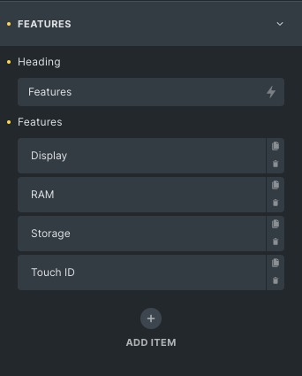
- Heading: Choose the Heading according to you.
- Features: Add a feature list according to your need you can add more features.
Plan
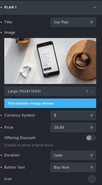
- Title: Provide an appropriate title for your plan.
- Image: Set an image that suits your plan.
- Currency: Set the currency with which you deal.
- Price: It will be considered your original price. if you want to avail offer check the offering discount option.
- Offering Discount: Enable this to display the offering discount option then you can add discounted price.
- Duration: add the period of your plan or service.
- Button Text: Set the button text. If not given button will not be shown.
- Icon: Choose the icon from the given libraries.
- Icon position: Set the icon position left or right.
- Link: Mention the link it can be any external link or any internal post, page.
- Rel attribute: It specifies the relationship between the current and linked document.
- Open in a new tab: If you want to open it in a new tab, then select the open in new tab option.
- Aria label: Aria label is for the users who use assistive technology to specify extra information about the structure.
- Title: Provide the title to the linked page which is opened in the new tab.
- Features: It contains the content which will be associated with the points you included in categories.
Layout
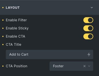
- Enable filter: Enable it for filtering data.
- Enable sticky: Enable it to make the table header sticky.
- Enable CTA: Enable it to use Call to action buttons.
- CTA Title: Enter the title of the CTA button.
- CTA position: Change the CTA position from header, footer, and both.
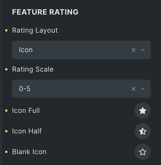
Feature Rating
- Rating Layout: Select the layout of rating.
- Rating Scale: Choose either a 0-5 or 0-10 rating scale.
- Icon Full: Select the icon of a full review.
- Icon Half: Select the icon of the half review.
- Blank Icon: Select the icon of blank review.
Header style
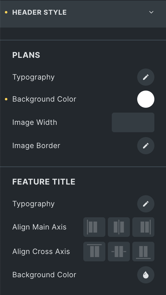
Plans
- Typography: Set the typography of the table header.
- Background Color: Set the background color of the table header.
- Border: Set the border of the table header.
Feature Title
- Typography: Set the typography of the feature title.
- Align Main Axis: Set the alignment of the main axis from left, Center and end.
- Align Cross Axis: Set the cross alignment from left, Center and end.
- Background Color: Set background color.
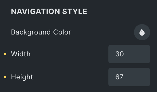
Navigation Style
- Background Color: Select the background color of the navigation.
- Width: Set the width of navigation.
- Height: Set the height of navigation.
Price style
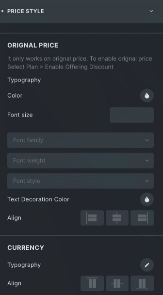
Original price
- Typography: Set the typography of the price title, like font family, size, etc.
- Strike Color: Set the Strike through color for the original price.
- Align: Set the alignment from start, center, or end.
Currency
- Typography: Set the typography of the currency.
- Align: Set the alignment from start, center, or end.
Price
- Typography: Set the typography of the price.
Fractional
- Typography: Set the typography of the price fraction.
- Align: Set the alignment from start, center, or end.
Duration
- Typography: Set the typography of the duration.
Table Style
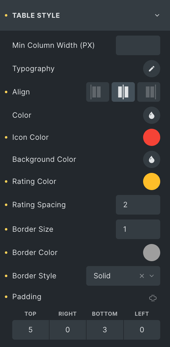
- Min Column width: Set the width of the column of the table.
- Typography: Set the typography of table content.
- Align: Choose from start, center or end.
- Color: Choose the color of the content of the table.
- Icon Color: Select the color of icon.
- Background Color: Apply different colors to the background.
- Rating Color: Select the color of rating icon.
- Rating Spacing: Set the spacing between rating icons.
- Border Size: Set the border size.
- Border Color: Choose a border color.
- Border Style: Choose border style from dotted, solid, underlined, etc.
- Padding: Set the padding.
Alternative row
- Color: Choose the color for an alternate row of the table.
- Icon Color: Select the alternate icon color.
- Background Color: Apply different colors to the background alternative row.
Feature style
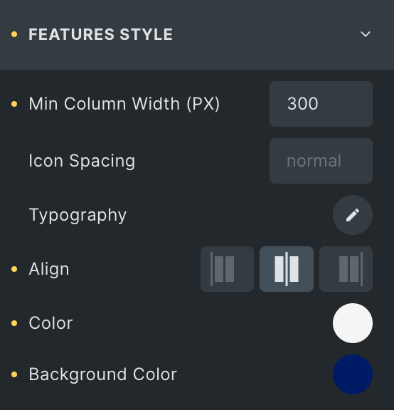
- Min Column Width: Set the column width.
- Icon Spacing: Set the spacing between text and icon.
- Typography: Set the typography on features.
- Align: Align features either start, center or end.
- Color: Choose the color of the content of the table.
- Background Color: Apply different colors to the background.
Alternative row
- Color: Choose the color for the alternate content of the table.
- Background Color: Apply different colors to the background alternatively.
CTA style
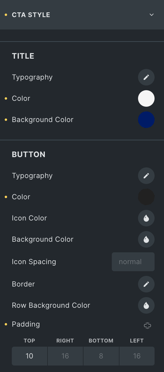
Title
- Typography: Set the font family of title, width and style.
- Color: Choose the color of the content of the table.
- Background Color: Apply different colors to the background.
Button
- Typography: Set the font family of title, width and style.
- Color: Choose the color for the content of the table.
- Icon Color: Set the icon color of the CTA button.
- Icon Spacing: Set the space between icon and title.
- Background Color: Apply different colors to the background.
- Border: Apply the border to the button.
- Row background color: Set the background color of the row for the CTA button.
- Padding: Adjust the padding of the CTA button.
Filter style
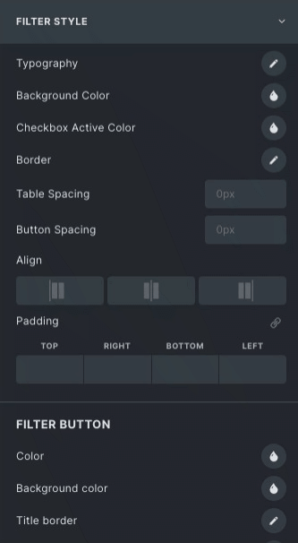
- Typography: Set the font family of filter, width and style.
- Background Color: Apply different colors to the background.
- Checkbox Active Color: Choose the color of the checkbox that is active.
- Border: Apply the border to the container and choose its size, colors and style.
- Table Spacing: Set spacing between filter buttons and table.
- Button Spacing: Set the spacing between the filter and reset buttons.
- Align: Set the alignment start, Center and End.
- Padding: Adjust the padding of the filter.
Filter button
- Color: Choose the color of the button text.
- Background Color: Choose the button’s background color.
- Border: Apply the border on the filter button.
- Active Color: Select the filter button color for active state.
- Active Background Color: Select the filter button background color for active state.
- Active Border Color: Select the filter button border color for active state.
- Padding: Adjust the padding of the filter button.
Reset button
- Color: Choose the color of the button text.
- Background Color: Choose the button’s background color.
- Border: Apply the border to the button.
- Active Color: Select the reset button color for active state.
- Active Background Color: Select the reset button background color for active state.
- Active Border Color: Select the reset button border color for active state.
- Padding: Adjust the padding of the filter.
Click here to check out a demo page of Comparison Table element