The Testimonials element lets you display customer reviews in a neat and appealing way, helping your business look trustworthy and encouraging more people to buy from you. It offers different preset styles that you can customize to make your testimonials shine. You can also choose layouts like grid or masonry and select image types, such as avatars or static images, for a more appealing design.
To make the reviews look genuine, you can include details about the reviewer’s avatar, job title, company name, or other information. You can also arrange the reviews to highlight the most important ones at the top.
The “Testimonials” element features the following controls.
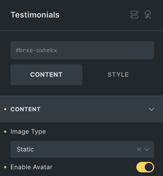
Content
Content
- Image Type: Choose image type from static or avatar.
- Enable Avatar: Enable the option to display the reviewer’s avatar in the testimonial (applicable when you select static as image type).
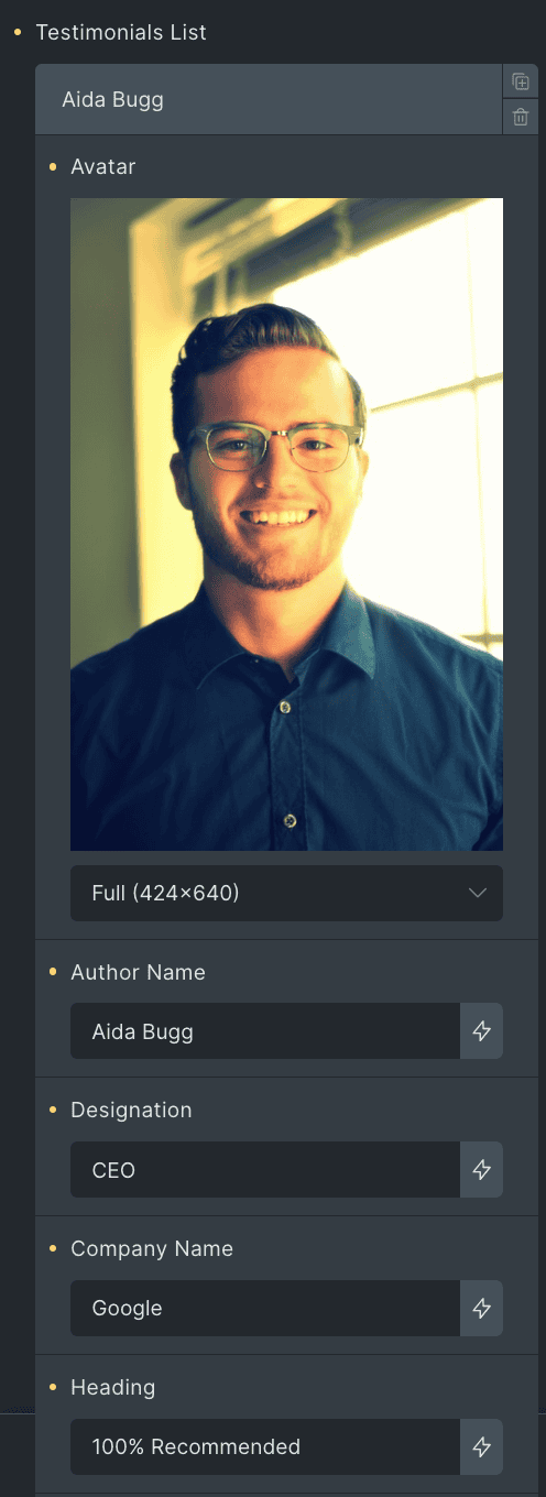
Testimonial List
- Avatar: Upload the avatar of the reviewer.
- Author Name: Enter the author’s name.
- Designation: Enter the author’s designation.
- Company Name: Enter the author’s company name.
- Heading: Enter the heading.
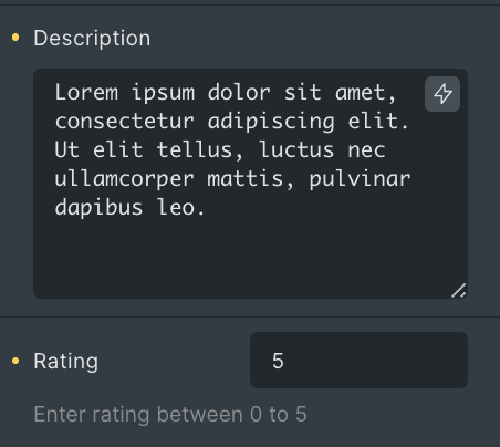
- Description: Enter the description.
- Rating: Specify the rating value.
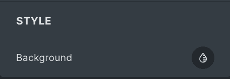
Style(for individual list items)
- Background: Choose the background of an individual item.
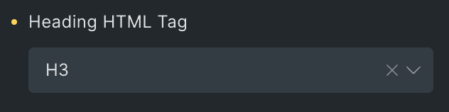
- Heading HTML Tag: Select the HTML tag for heading.
Layout
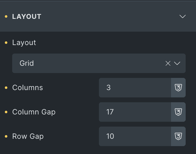
- Layout: Choose layout from Grid or Masonry.
- Columns: Specify the number of columns.
- Column Gap: Specify the gap between columns.
- Row Gap: Specify the gap between rows.
- Presets: Choose presets from various options available.
- Author Detail Position: Select the position to display the author’s details(applicable for preset 1).
- Enable Rating: Activate the option to display the rating in testimonial.
- Rating Icon Position: Select the position to display the rating icon(applicable for preset 1).

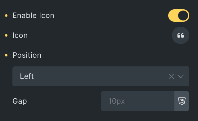
- Enable Icon: Activate the option to display the icon.
- Icon: Select the icon.
- Position: Select the position of icon.
- Gap: Specify the gap between icon & other content (applicable for preset 1).
- Horizontal Offset(%): Specify the horizontal offset of icon (applicable for preset 2).
- Vertical Offset(px): Specify the vertical offset of icon(applicable for preset 2).
Order
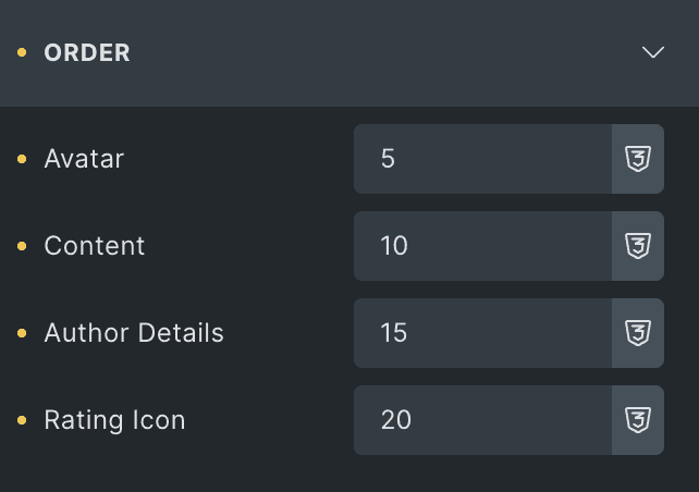
Note: These options are applicable when you select Preset 2 as preset. If any of these elements have a lower priority than others, they can be placed first on the webpage. This feature gives you greater control over the visual hierarchy of your webpage.
Choose the order of displaying individual elements, such as
- Avatar
- Content
- Author Details
- Rating
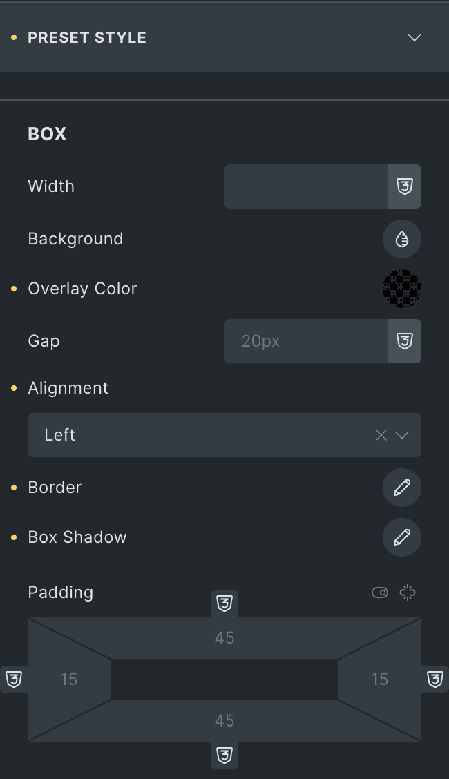
Preset Style
Box
- Width: Specify the width of item box.
- Background: Select the background color of box.
- Overlay Color: Choose the overlay color(applicable when selecting static as Image type).
- Gap: Specify the gap between content.
- Alignment: Select the alignment of content(applicable for Preset 2).
- Border: Select the border.
- Box Shadow: Set the box shadow.
- Padding: Set the padding.
Author
- Typography: Set the typography.
- Background: Select the background of an author’s name.
- Border: Set the border.
- Padding: Set the padding.
- Margin: Set the margin.

Avatar
Note: These options are applicable when you select static as Image type.
- Width: Specify the width of avatar.
- Background: Select the background.
- Border: Set the border properties.
- Background Image Position: Choose the background image position of author.
- Background Repeat: Select the background-repeat properties.
- Background Size: Choose the background size.
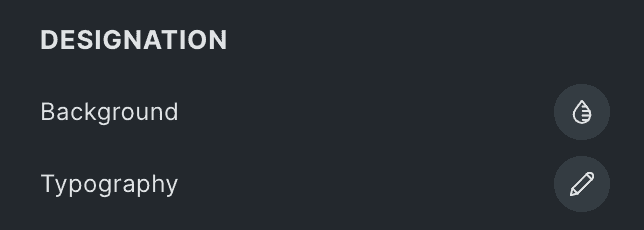
Designation
- Background: Select the background of an author’s designation.
- Typography: Set the typography.
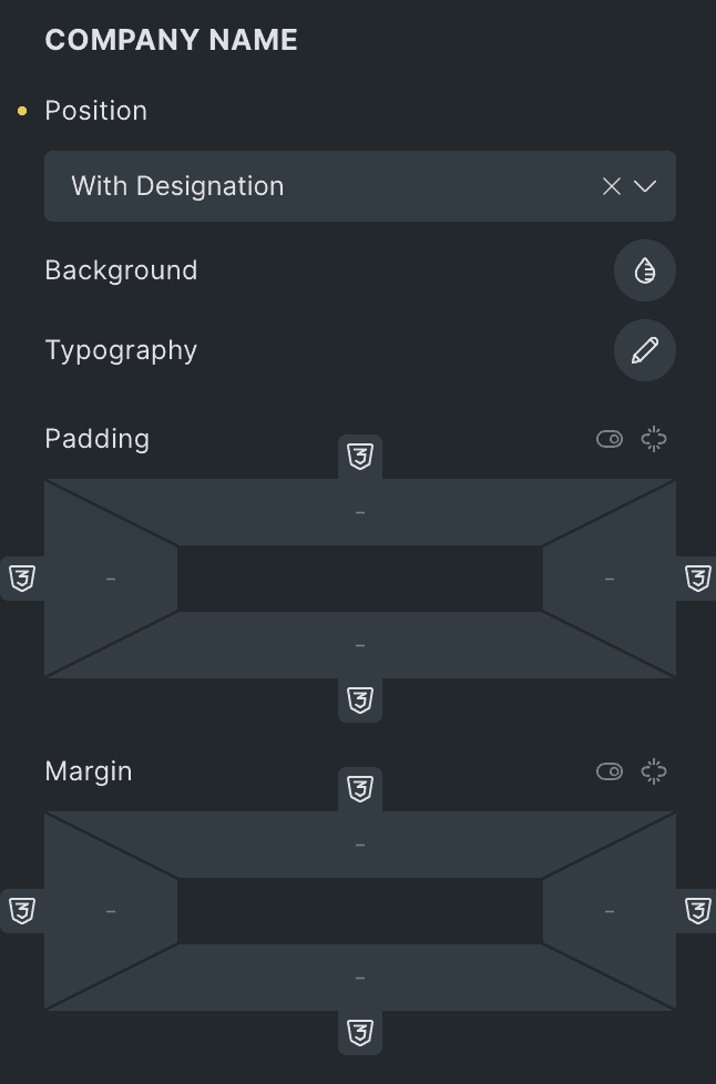
Company Name
- Position: Specify the position to display the company’s name.
- Background: Select the background of a company’s name.
- Typography: Set the typography.
- Padding: Set the padding.
- Margin: Set the margin.
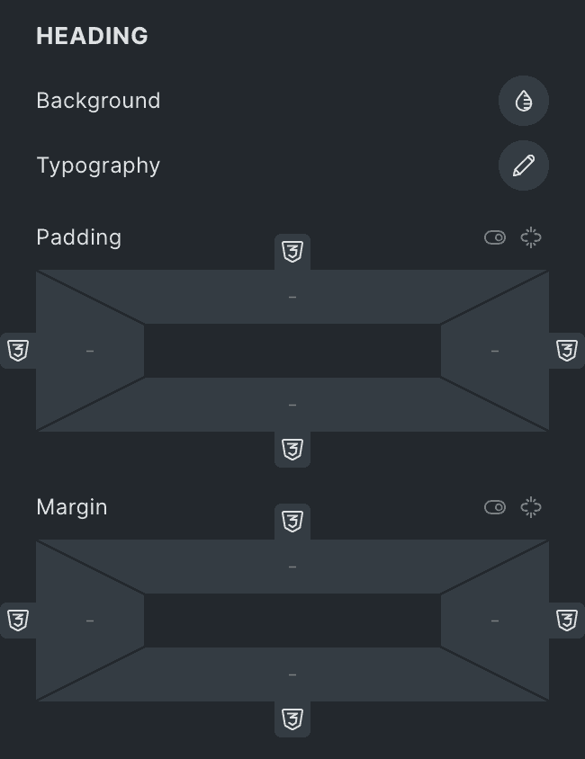
Heading
- Background: Select the background of a heading.
- Typography: Set the typography.
- Padding: Set the padding.
- Margin: Set the margin.
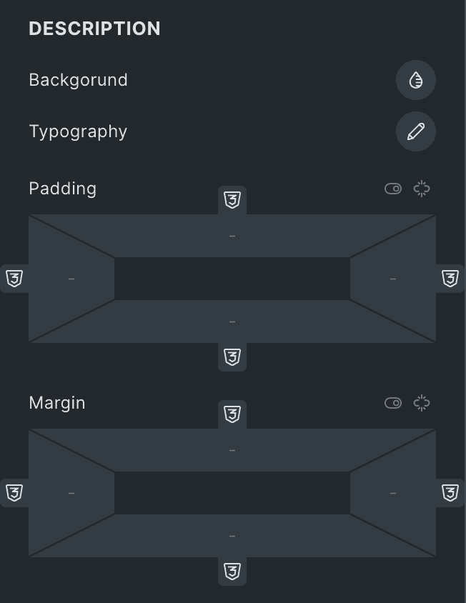
Description
- Background: Select the background of a description.
- Typography: Set the typography.
- Padding: Set the padding.
- Margin: Set the margin.
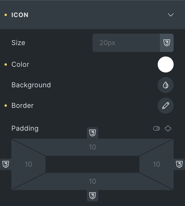
Icon
- Size: Specify the size of icon.
- Color: Select the color of icon.
- Background: Choose the background of icon.
- Border: Set the border
- Padding: Set the padding.
Rating Icon
- Icon: Select the rating icon.
- Size: Specify the size of rating icon.
- Marked Icon Color: Select the color of marked rating icon.
- Unmarked Icon Color: Select the color of unmarked icon.
- Gap: Specify the gap between icons.
- Margin: Set the margin.
Check out a demo page for the Testimonial element.