This element is used to display your WooCommerce products and offers a wide range of layouts with extensive customization options. It supports multiple product layouts and provides various styling presets to present product information effectively.
One of its key strengths is enhancing user experience by allowing filters to showcase products based on their types, such as Featured Products, Sale Products, and more. Additionally, it enables you to present products based on their status, like published, draft, pending review, and schedule. Further, you can filter products based on categories and tags.
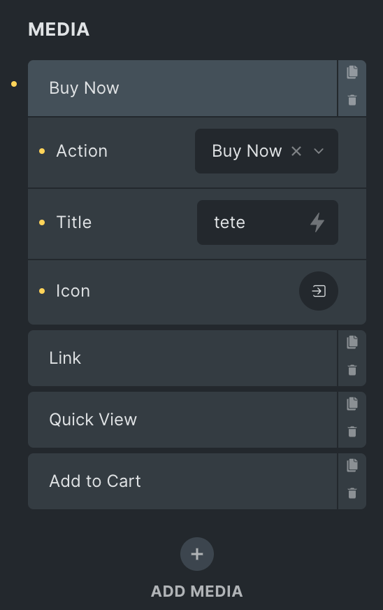
You can include or exclude specific products based on their IDs, providing precise control over what appears in your displays. You can display multiple buttons on the media and the content of the product, like “Add to Cart,” “Buy Now,” “Quick View,” and “Link” buttons. However, it’s important to note that the “Buy Now” button can only be added on Simple Products.
Moreover, you can enrich your product displays with badges in many style presets to highlight special offers and information. Additionally, you can choose whether to show or hide “Out of Stock” or “Sale” badges as per your specific requirements.
The “Woo Product” element features the following controls:
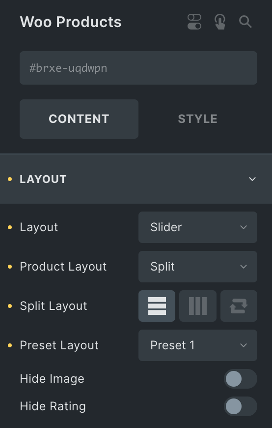
Content
Layout
- Layout: Select either Grid, Masonry, or Slider.
- Product Layout: Choose from Split or Cover.
- Split Layout: Select from Vertical, Horizontal, or Reverse(applicable for Split product layout)
- Preset Layout: Select a preset layout from the available options.
- Columns: Specify the number of columns to display in each row(applicable for Grid Layout).
- Column Gap: Specify the gap between columns(applicable for Grid Layout).
- Row Gap: Specify the gap between rows(applicable for Grid Layout).
- Hide Image: Enable the option to hide the product image.
- Hide Rating: Enable the option to hide the rating.
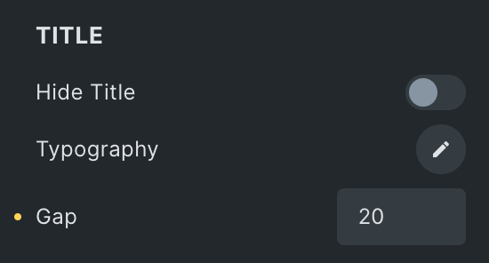
Title
- Hide Title: Enable the option to hide the title.
- Typography: Set the typography.
- Gap: Specify the gap between the title and other items.
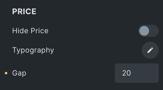
Price
- Hide Price: Enable the option to hide the price.
- Typography: Set the typography.
- Gap: Specify the gap between price and other items.
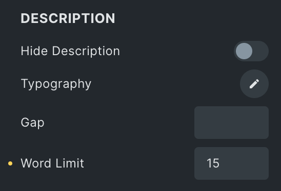
Description
- Hide Description: Enable the option to hide the description.
- Typography: Set the typography.
- Gap: Specify the gap between the description and other items.
- Word Limit: Specify the word limit for displaying the description.
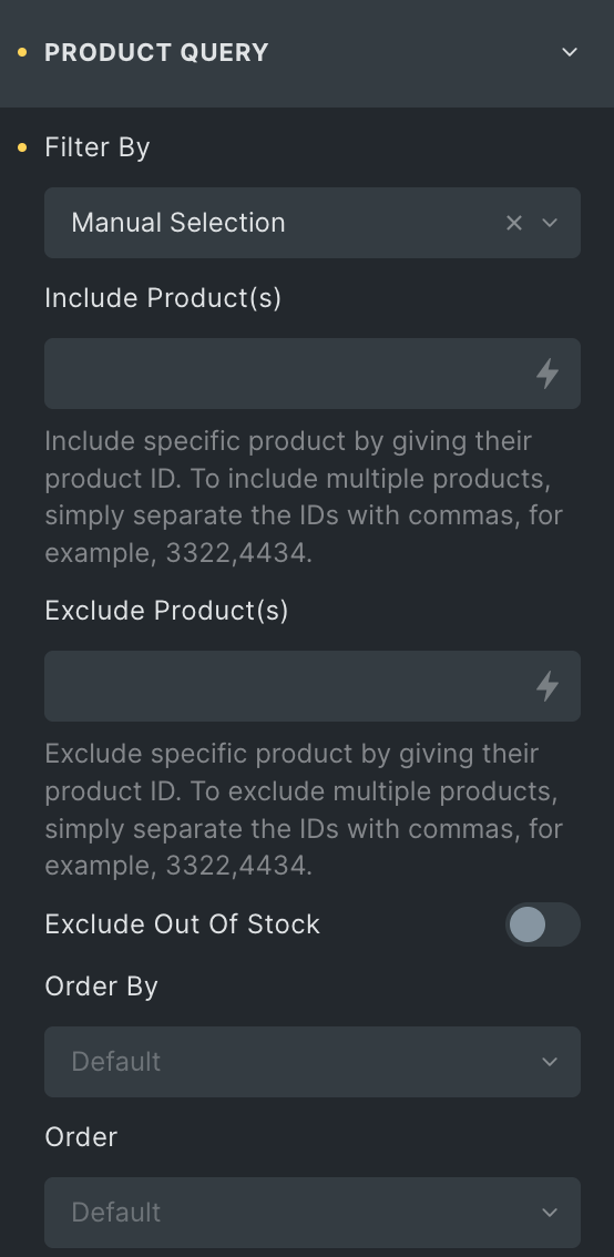
Product Query
Note: To include or exclude multiple products, simply separate their IDs with commas—for example, 2343, 4637, etc. The available options will depend on the filter by option you choose.
- Filter By: Choose the appropriate option corresponding to the filter you desire to display products.
- Include Products: Enter the product ids that you want to display(visible only when manual selection is selected in Filter By option).
- Exclude Products: Enter the product ids that you don’t want to display.
- Exclude Out Of Stock: Enable the option to hide Out of Stock products.
- Order By: Choose the criteria on which you want to perform the “order by” operation.
- Order: Select from Ascending or Descending.
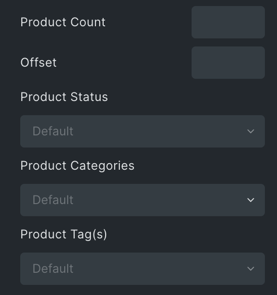
- Product Count: Specify the number of product count to be displayed.
- Offset: Enter the offset value.
- Product Status: Display your products based on their status.
- Product Categories: Display your products as per their categories.
- Product Tags: Display your products based on their tags.
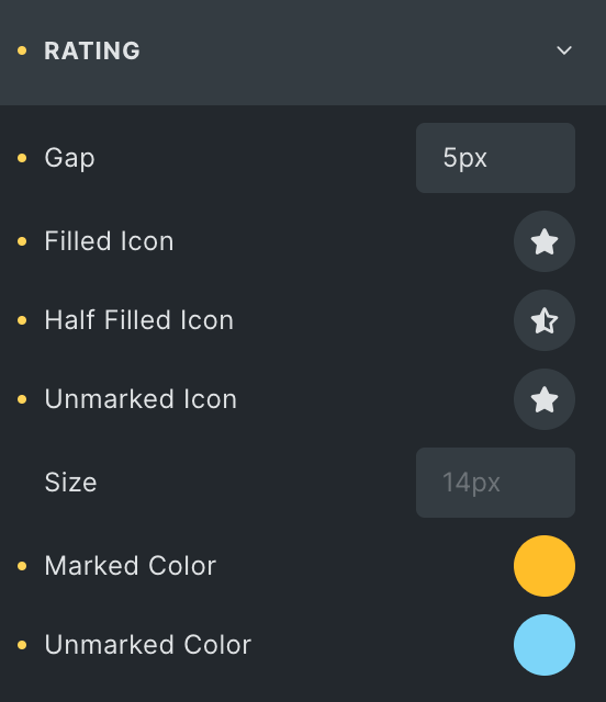
Rating
- Gap: Specify the gap between the rating icon.
- Filled Icon: Select the filled icon of the rating.
- Half Filled Icon: Select the half filled icon of the rating.
- Unmarked Icon: Select the unmarked icon of the rating.
- Size: Set the size of icons.
- Marked Color: Select the color of the marked icon.
- Unmarked Color: Select the color of the unmarked icon.
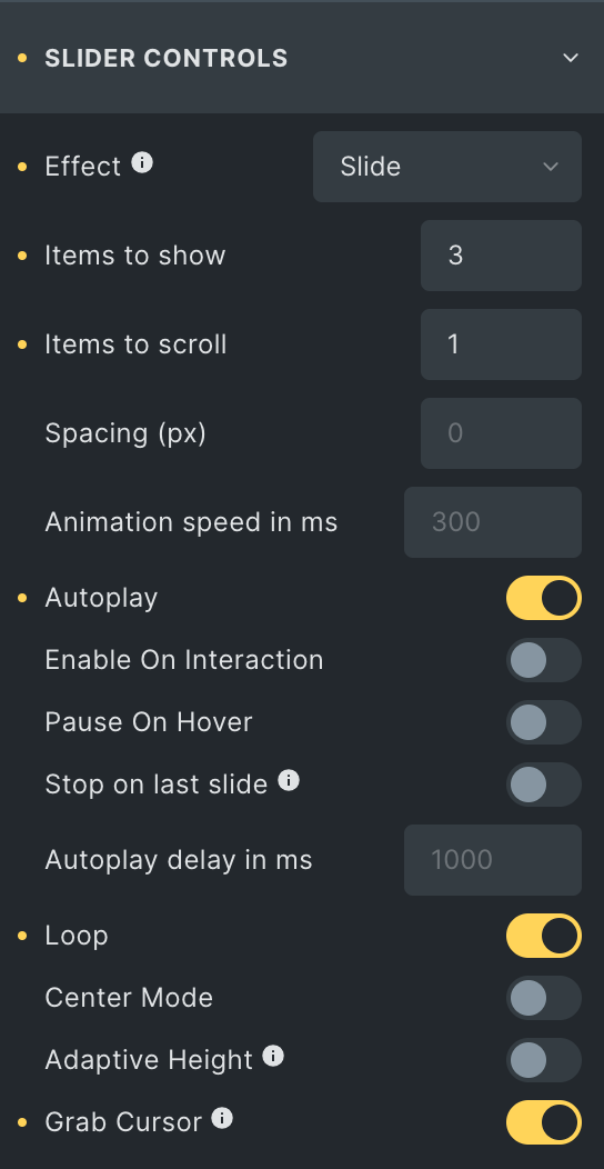
Slider Controls
Note: This section will only be visible when the Slider layout is enabled, and each effect comes with its own set of features.
- Effects: Select the effect to display the slider.
- Items to Show: Specify the number of products to display initially.
- Items to Scroll: Specify the number of products to scroll at one time.
- Spacing: Specify the gap in px.
- Animation Speed in ms: Enter the speed of the animation in ms.
- Autoplay: Enable the option to autoplay the slider.
- Enable On Interaction: Activate the option to stop autoplay while interacting on slider controls.
- Pause On Hover: Enable the option to pause the slider while hovering.
- Stop on Last Slide: Enable the option to automatically stop autoplay on the last slide(If the loop is enabled, this will not work).
- Autoplay Delay in ms: Specify the value in ms.
- Loop: Enable the option to loop the slider.
- Center Mode: Activate the option to display in center mode.
- Adaptive Height: By enabling this, the slider will adjust height automatically depending on the currently active slide.
- Grab Cursor: Enable the option to display the grab cursor while hovering over the slider.
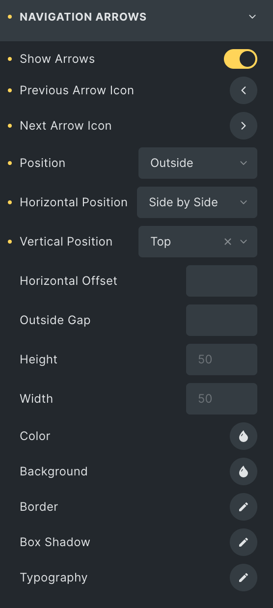
Navigation Arrows
Note: This section will only be visible when the Slider layout is selected.
- Show arrows: Enable the option to display navigation.
- Previous Arrow Icon: Select the icon for the previous navigation.
- Next Arrow Icon: Select the icon for the next navigation.
- Position: Choose the position of navigation.
- Horizontal Position: Select the horizontal position of navigation.
- Vertical Position: Select the vertical position of navigation.
- Horizontal Offset: Specify the horizontal offset.
- Outside Gap: Specify the gap from the outside(applicable for the outside position).
- Height: Enter the height.
- Width: Enter the width.
- Color: Select the color of the arrows.
- Background: Select the background color of the arrows.
- Border: Select the border properties.
- Box Shadow: Set the box shadow.
- Typography: Set the typography.
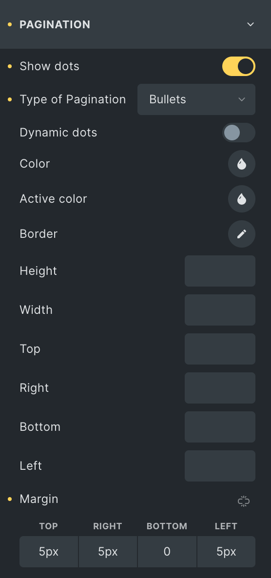
Pagination
Note: These options will only be visible when the Slider layout is selected.
- Show Dots: Enable the option to display pagination.
- Types of Pagination: Select the pagination style.
- Dynamic Dots: Enable the option to display dynamic dots(applicable for bullet pagination type).
- Typography: Set the typography(applicable for fraction pagination type).
- Color: Select the color of pagination.
- Active Color: Select the active color of pagination.
- Background: Select the background color of pagination(applicable for fraction pagination type).
- Border: Select the border properties.
- Box Shadow: Set the box shadow(applicable for fraction pagination type).
- Height: Enter the height(applicable for bullet pagination type).
- Width: Enter the width(applicable for bullets pagination type).
- Top: Specify the spacing from the top with the suffix.
- Right: Specify the spacing from the right with the suffix.
- Bottom: Specify the spacing from the bottom with the suffix.
- Left: Specify the spacing from the left with the suffix.
- Margin: Enter the margin(applicable for bullets pagination type).
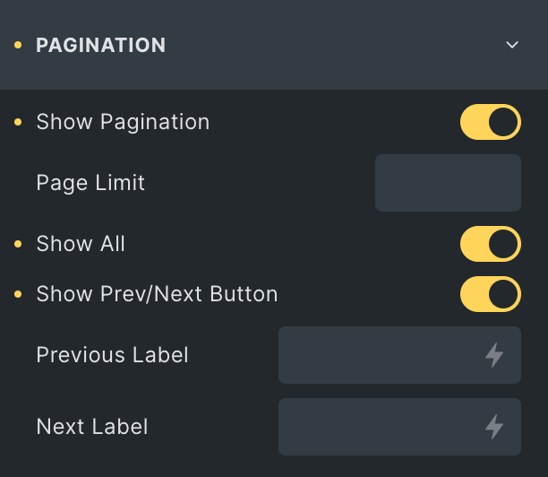
Note: These options will only be visible when the Grid or Masonry layout is selected.
- Show Pagination: Enable the option to display the pagination.
- Page Limit: Specify the number of page numbers you want to display.
- Show All: Enable the option to display all pages.
- Show Prev/Next Button: Enable the option to display the Prev and Next buttons.
- Previous Label: Enter the text for the previous label.
- Next Label: Enter the text for the next label.
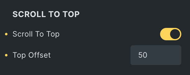
Scroll To Top
- Scroll to Top: Enable the option to scroll on top when you switch to a new page.
- Top Offset: Specify the top offset value.
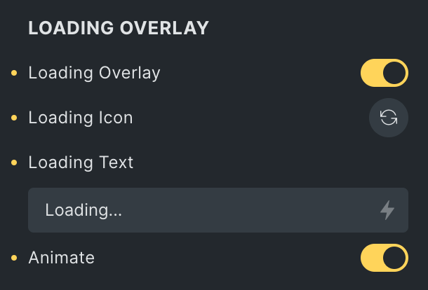
Loading Overlay
- Loading Overlay: Enable the option to display the loading overlay.
- Loading Icon: Select the loading icon.
- Loading Text: Enter the loading text.
- Animate: Enable the option to animate the loading icon.
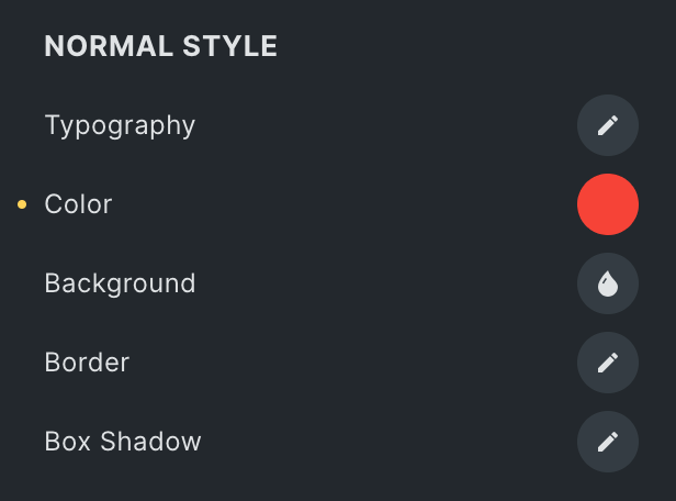
Normal Style
- Typography: Set the typography.
- Color: Select the color of pagination text.
- Background: Select the background color.
- Border: Set the border.
- Box Shadow: Set the box shadow.
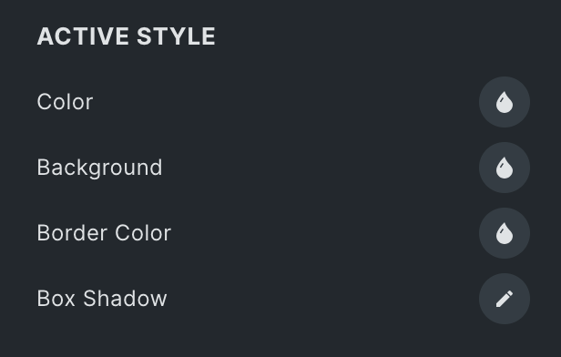
Active Style
- Color: Select the active color of pagination text.
- Background: Select the active background color.
- Border Color: Set the border color.
- Box Shadow: Set the box shadow.
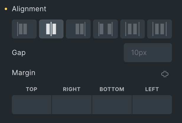
- Alignment: Select the alignment of pagination.
- Gap: Specify the gap between pagination.
- Margin: Set the margin.
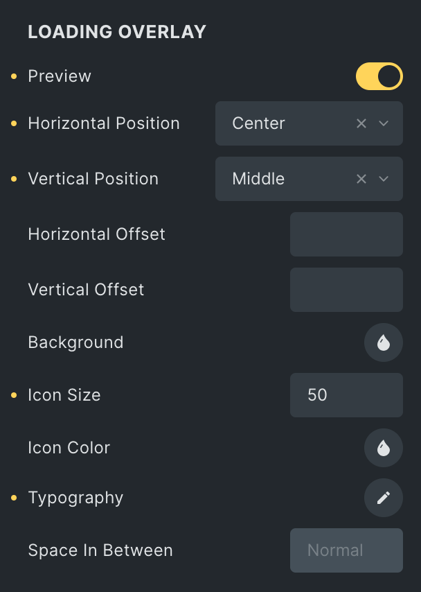
Loading Overlay
- Preview: Enable the option to preview the overlay loading.
- Horizontal Position: Set the horizontal position.
- Vertical Position: Set the vertical position.
- Vertical Offset: Set the vertical offset.
- Background: Select the background.
- Icon Size: Set the icon size.
- Icon Color: Select the icon color.
- Typography: Set the typography.
- Space in Between: Specify the gap between overlay items.
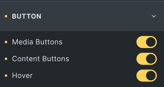
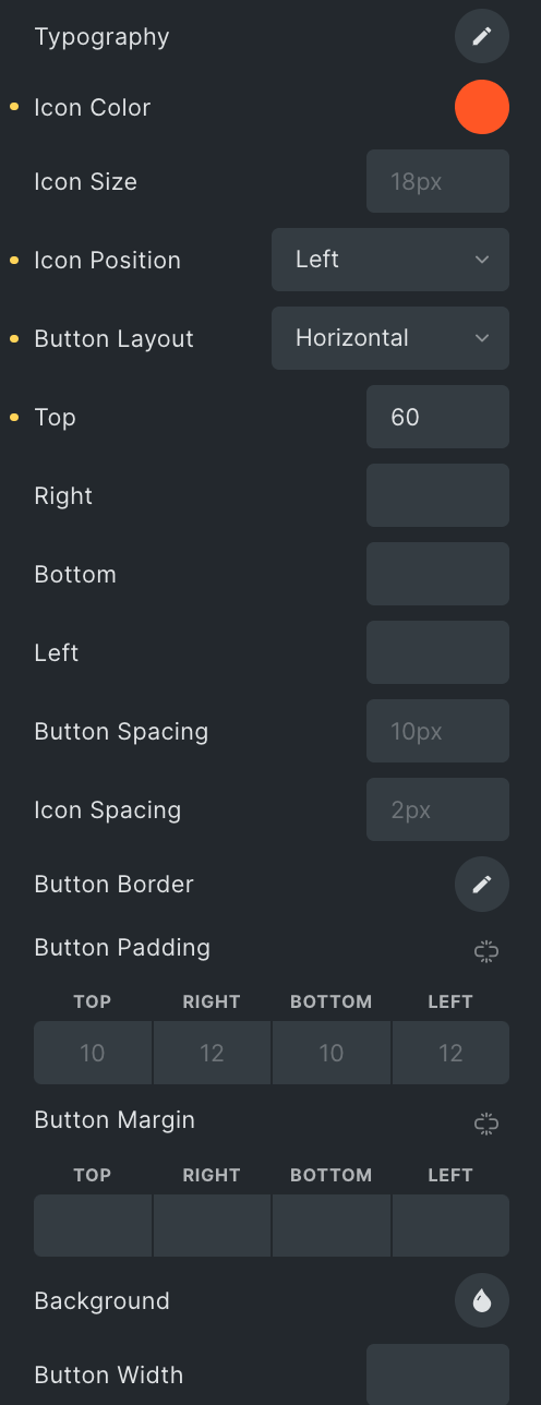
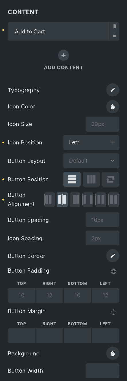
Button
- Media Buttons: Enable the option to display media buttons.
- Content Buttons: Enable the option to display content buttons.
- Hover: Enable the option to display media buttons on hover.
- Add Item: Used to add the buttons.
- Action: Select the button type you want to add.
- Title: Enter the title of the button.
- Icon: Select the icon for the button.
- Typography: Set the typography.
- Icon Color: Select the color of the icon.
- Icon Size: Set the size of the icon.
- Icon Position: Select the position of the icon.
- Button Layout: Select either Vertical or Horizontal.
- Top: Specify the button position from the top.
- Right: Specify the button position from the right.
- Bottom: Specify the button position from the bottom.
- Left: Specify the button position from the left.
- Button Spacing: Enter the gap between buttons.
- Icon Spacing: Specify the gap between icon to text.
- Button Border: Select the border.
- Button Padding: Set the padding.
- Button Margin: Set the margin.
- Background: Select the background color.
- Button Width: Set the width of the button.
Content
- Add Item: As previously mentioned, the styling features for this section can be accessed by clicking here.
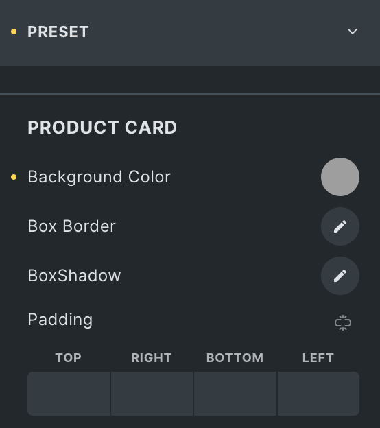
Preset
Product Card
- Background Color: Select the background color of the product card.
- Box Border: Set the border properties.
- Box Shadow: Set the box shadow.
- Padding: Set the padding.
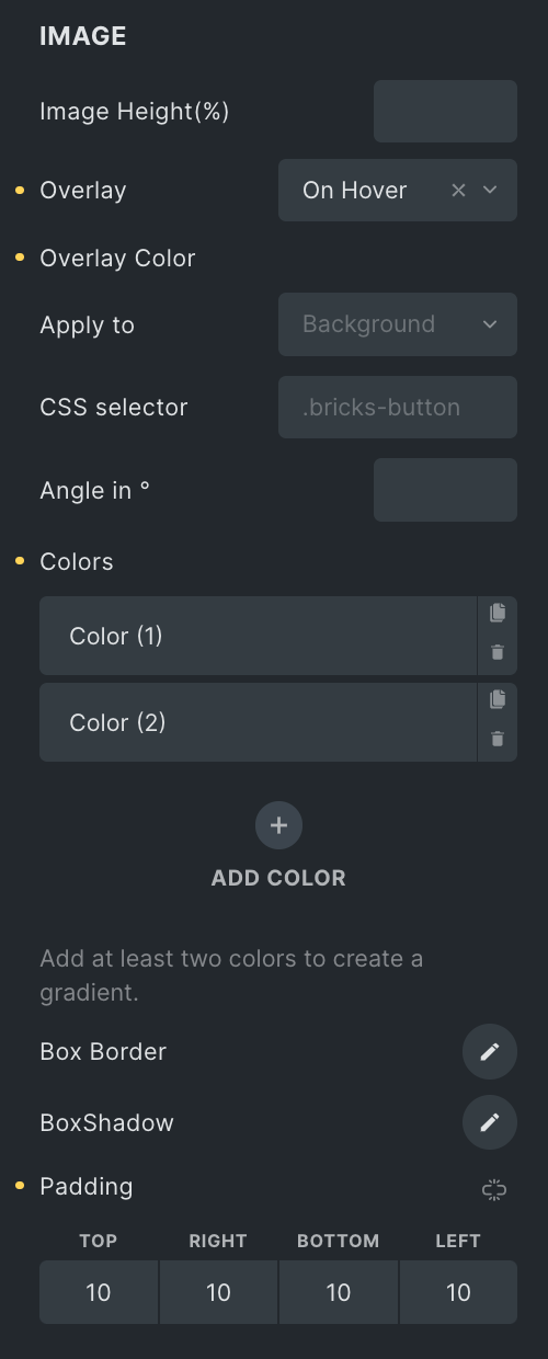
Image
- Image height: Enter the height of an image in %.
- Overlay
- Overlay Color: Select the appropriate option to display overlay.
- Apply to: Select the appropriate option to apply the overlay.
- CSS Selector: Enter the CSS selector, if any.
- Angle in: Enter the angle value.
- Color: Add multiple colors to make the gradient.
- Overlay Color: Select the appropriate option to display overlay.
- Box Border: Set the border properties.
- Box Shadow: Set the box shadow.
- Padding: Set the padding.
Content
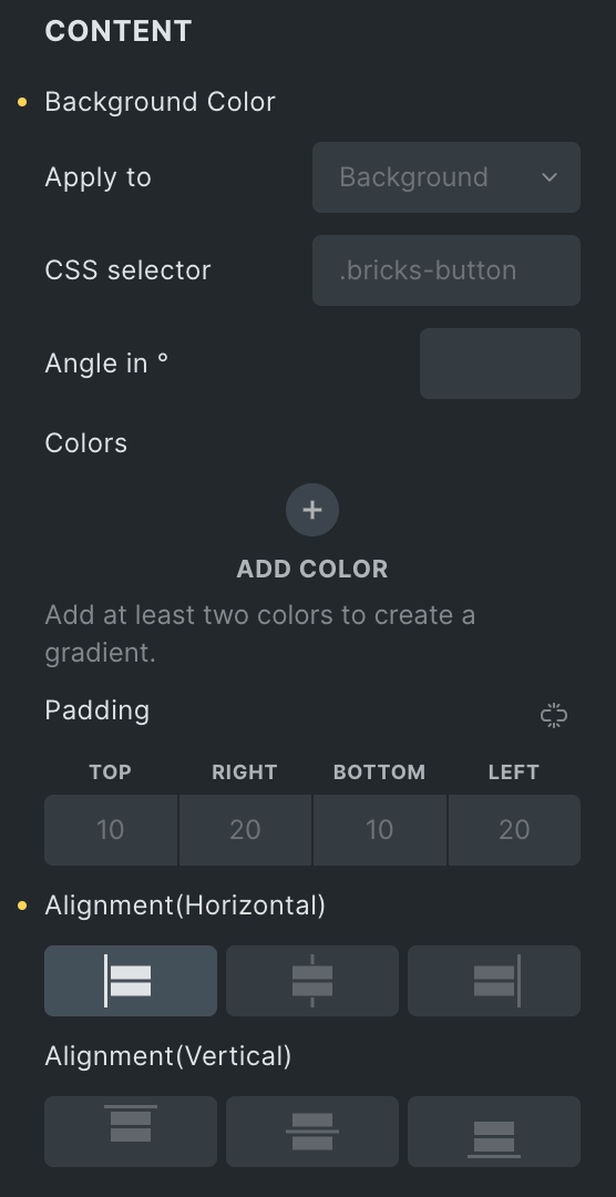
- Background Color
- Apply to: Select the appropriate option to apply background.
- CSS Selector: Enter the CSS selector, if any.
- Angle in: Enter the angle value.
- Color: Add multiple colors to make the gradient.
- Padding: Set the padding.
- Content Space: Select the appropriate option.
- Content Gap: Specify the gap between content and price.
- Alignment(Horizontal): Select the horizontal alignment.
- Alignment(Vertical): Select the vertical alignment.
Product Badges
- Hide Sale/Out of Stock badge: Enable the option to hide the Sale and Out of Stock badges.
- Hide Out of Stock badge: Enable the option to hide only the Out of Stock badge(applicable if Exclude Out of Stock option is not enabled)
- Low Stock Badge: Enable the option to display the badge on low stock products.
- Layout: Select the layout presets from available options(each style has its unique features)
- Position: Select the position of the badge.
- Sales Badge Text: Enter the text for the Sale badge.
- Out of Stock Text: Enter the text for the Out of Stock badge(visible only if the Hide Out of Stock badge is disabled).
- Low Stock Text: Enter the text that displays in the low stock badge.
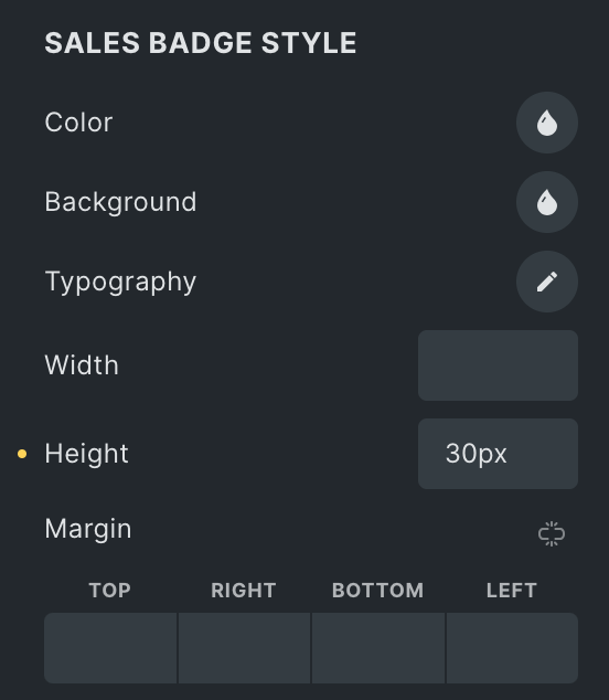
Sales Badge Style
Note: This section will only be visible when the “Hide Sales/Out of Stock badge” is disabled. The display of features will depend on the chosen layout preset, with each style offering unique attributes.
- Color: Select the color of the Sale Badge.
- Background: Select the background color of the Sale Badge.
- Typography: Set the typography.
- Width: Enter the width of the badge.
- Padding: Set the padding.
- Margin: Set the margin.
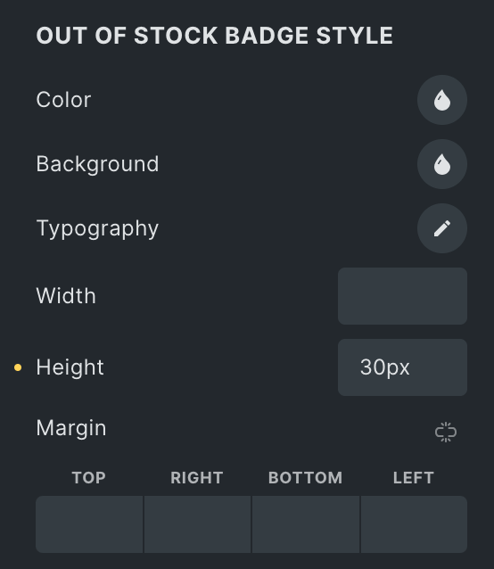
Out of Stock Badge Style
Note: These features will be visible only when the “Hide Sales/Out of Stock badge” is disabled. The display of features will depend on the chosen layout preset, with each style offering unique attributes.
- Color: Select the color of the Sale Badge.
- Background: Select the background color of the Sale Badge.
- Typography: Set the typography.
- Width: Enter the width of the badge.
- Height: Enter the height of the badge.
- Margin: Set the margin.
Low Stock Badge Style
Note: These settings will be visible only when the “Low Stock badge” is enabled.
- Color: Select the text color of low stock badge.
- Background: Choose the background.
- Typopgraphy: Set the typography.
- Border: Set the border properties.
- Box Shadow: Add the box shadow.
- Width: Specify the width of badge box.
- Height: Specify the width of badge box.
- Padding: Set the padding.
- Margin: Set the margin.
Infinite Scroll
- Enable: Turn on this option to use infinite scroll.
- Loader: Select a loading animation from the available options.
- Trigger Offset: Set how far from the top the loading should start.
- End Message: Enter the text to show when all products are loaded.

Load More Button
- Enable: Turn on this option to display the button.
- Load Offset: Enter the number to load that many pages of products before showing the “Load More” button. For example, if you enter 3, products equal to third pages will load automatically, and then the load more button will appear.
- Text: Enter the text for button.
- Icon: Select the button’s icon.
- Icon Position: Specify the position of icon.

Styling
- Preview: Enable to see the preview of the end message, load more button, and loader.
- Alignment: Set the alignment of message.
- Loader Color: Choose the loader color.
- End Message Typography: Set the typography of message.

Load More Button
- Typography: Set the typography of button.
- Icon Color: Choose the button’s icon color.
- Background: Select the background color of button.
- Border: Set the border.
- Box Shadow: Adjust the box shadow.
- Padding: Set the padding.
- Gap from Top: Specify the gap from the top.
- Icon Gap: Specify the gap between button text and icon.

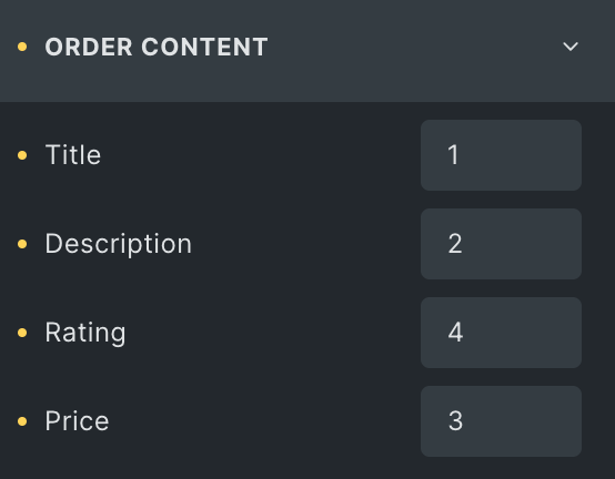
Order Content
Note: If any of these items have a lower priority than others, they can be placed first on the webpage. This feature gives you greater control over the visual hierarchy of your webpage.
Choose the order of displaying individual items, such as
- Title
- Description
- Rating
- Price(applicable when selecting Preset Layout 2 under Layout Section)