The Woo Product Gallery element helps you showcase your WooCommerce product gallery beautifully. With three layout options, Grid, Slider, and Mosaic, you can choose the style that suits your store best.
You can control the number of images displayed on the screen and add a feature that triggers a lightbox gallery. With this option, customers can click a button on the last image to view the remaining gallery images in a stunning lightbox format. This makes it easier for shoppers to view your products in detail, enhancing their browsing experience.
The Woo Product Gallery element features the following controls.
Content
Layout
- Layout: Select the layout from Grid, Slider, or Mosaic.
- Enable View More: Turn on this option to show the remaining gallery images in a lightbox view (applicable for Grid & Mosaic Layout)
- Number of Images to Show: Decide how many images you want to display in the gallery.
- Icon: Choose an icon to appear on the last product image.
- Text: Enter the text which is displayed on last product image
- Enable Lightbox: Activate this feature to allow images to open in a popup view.
- Column: Set how many columns you want in the Grid layout(applicable for Grid & Mosaic layout).
- Column Gap: Adjust the space between columns (applicable for Grid & Mosaic layout).
- Row Gap: Adjust the space between rows (applicable for Grid layout).
- Product Image Size: Select the size of the product images.
- Enable Thumbnail: Enable this to show image thumbnails in the slider (works with Slider layout).
- Padding: Set the padding around the gallery(works with Slider layout).

Slider
- Loop: Enable the option to display gallery images in a loop.
- Effects: Select the effect from the given options.
- Speed: Set the speed.
- Autoplay: Enable the option to play the carousel automatically.
- Pause on interaction: Activate the option to pause slides on interaction.
- Duration: Set the duration.
- Pause On Hover: Activate the option to pause slides on hover.
- Auto Height: Enable the option if needed.

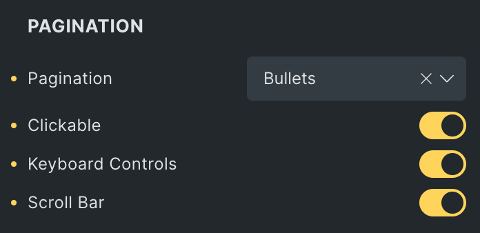
Pagination
Note: If you select the progress bar as pagination, please check the update on the frontend, as it will not display while editing in a builder.
- Pagination: Select the type of pagination from Bullets, Progress Bar, and Fraction.
- Clickable: Enable the option to make pagination clickable(applicable for Bullets Pagination type).
- Keyboard Control: Activate the option to enable keyboard control on pagination.
- Scroll Bar: Enable the option to display scroll bar.
Navigation
- Navigation: Enable the option to display the navigation on slider.
- Position: Select the position of navigation.
- Prev Icon: Select the icon for previous navigation.
- Next Icon: Choose the icon for next navigation.
- Horizontal Position: Set the horizontal position.
- Vertical Position: Set the vertical position.

Slider Style
Navigation
- Color: Choose the color of navigation icon.
- Background: Select the background of navigation icon.
- Border: Customize the border style for the icon.
- Box Shadow: Add a shadow effect to the icon.
- Size: Set the size of the navigation icon.
- Horizontal Offset: Adjust the horizontal offset of icon.
- Vertical Offset: Adjust the vertical offset of icon.
- Padding: Set the padding around the icon.

Pagination
- Background Color: Choose the background color(applicable for Fraction pagination type).
- Color: Select the color of pagination(applicable for Fraction pagination type).
- Typography: Set the typography(applicable for Fraction pagination type).
- Progress Bar Color: Select the color of progress bar(applicable when progress bar is selected as pagination).
- Progress Color: Select the color of progress(applicable when progress bar is selected as pagination).
- Size: Specify the size of pagination.
- Margin: Set the margin(applicable when progress bar is selected as pagination).
- Active Color: Choose the pagination color for active state.
- Inactive Color: Choose the pagination color for inactive state.
- Top Offset: Specify the offset value from top.
- Bottom Offset: Specify the offset value from bottom.
- Padding: Set the padding(applicable for fraction pagination type).

Scroll Bar
- Size: Set the size of scroll bar.
- Drag Color: Select the scroll bar color while dragging.
- Color: Select the color of scroll bar.

Thumbnail Style
Note: These settings will display when you select Slider Layout & enable to display the thumbnail in Layout Settings.
- Layout: Choose if the thumbnail should appear inside or outside.
- Thumbs Per View: You can set the number of images to see per view.
- Thumb Position: Select the position of thumbnail.
- Vertical Offset: Adjust the vertical offset.
- Horizontal Offset: Adjust the horizontal offset.
- Height: Specify the height of thumbnail.
- Width: Specify the width of thumbnail(Use pixels if you select ‘Left’ or ‘Right’ as the Thumb Position).

- Alignment: Set the alignment of thumbnails.
- Space Between Thumbs: This will set the space between thumbnails.
- Background: Choose the background color of thumbnail.
- Border: Set the border properties.
- Padding: Add padding inside the thumbnail area.
- Margin: Adjust the space around the thumbnails.

Navigation
- Enable Navigation Icon: Activate the option to display the navigation in thumbnail.
- Position: Select the position of navigation.
- Previous Icon: Choose the icon for previous navigation.
- Next Icon: Choose the icon for next navigation
- Icon Size: Specify the size of navigation icon.
- Color: Select the color of icon.
- Background: Set the background.
- Border: Set the border.
- Horizontal Position: Choose the horizontal position of icon(applicable when Navigation position is selected as inside).
- Vertical Position: Choose the vertical position of icon(applicable when Navigation position is selected as inside).

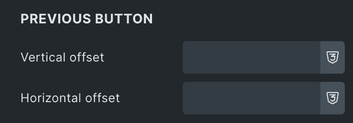
Previous Icon
- Vertical Offset: Choose the vertical offset of previous icon.
- Horizontal Offset: Choose the horizontal offset of previous icon.
Next Button
- Vertical Offset: Select the vertical offset of next icon.
- Horizontal Offset: Select the horizontal offset of next icon.
- Padding: Set the padding.

Image Style
These settings are for Thumbnail Images.
- Image Resolution: Choose the resolution of thumbnail image.
- Image Fit: Adjust the image fit from cover, contain and auto.
- Image Position: Set the image position.
- Image Repeat: Choose from the options like repeat, no-repeat, x-repeat, and y-repeat.
- Ratio: Set the image ratio.
- Alignment: Select the alignment of thumbnail.
- Border: Set the border.
- Active Border: Adjust the border properties for active state.
- Image Opacity: This will set the opacity value.
- Active Image Opacity: Specify the opacity value of active state.

Image Style
These settings are for the main product image.
- Max Height: Specify the size of image(applicable for Mosaic layout).
- Image Size: Choose the image size from cover, contain, and more options available(works with Grid layout).
- Alignment: Select the alignment of image(applicable for Slider layout).
- Background: Select the background for gallery image.
- Border: Set the border.
- Padding: Set the padding.

View More Style
Note: The View More Style settings are applicable for the Grid & Mosaic Layout.
- Icon Color: Select the icon color.
- Icon Size: Specify the size of icon.
- Position: Select the position of icon from top or bottom.
- Gap: Specify the gap between icon and view more button.
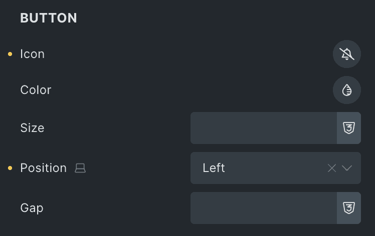
Button
- Icon: Select the button’s icon.
- Color: Choose the icon color of view more button.
- Size: Specify the icon’s size.
- Position: Adjust the position of button’s icon.
- Gap: Specify the gap between icon and text.
- Typography: Set the typography.
- Background: Select the background color of button.
- Border: Set the border properties.
- Box Shadow: Set the box shadow.
- Padding: Set the padding.

LightBox Settings
These settings are applicable when you enable the Lightbox feature.
- Loop: Enable the option to display gallery images in a loop upon lightbox.
- Speed: Set the speed.
- Slide Delay: Specify the value to delay the slide.
- Full Screen: Activate the option to display the Lightbox in full screen.
- Zoom: Enable the option to show Lighbox in zoom mode upon page load.
- Counter: Enable the option to display counter.
- Download: Activate the option to display download button.
- Media Overlap: Activate the option to enable the overlap.
- Close On Tap: Enable the option to close the gallery while tap on black area.
- Esc Key: Enable the option to close the lightbox gallery by pressing Esc key.
- Hide Gallery Controls: Enable the option to hide navigation and toolbar controls.
- Delay: Enter the duration in ms to hide controls

Video
- Autoplay: Enable the option to autoplay the slide.

Navigation
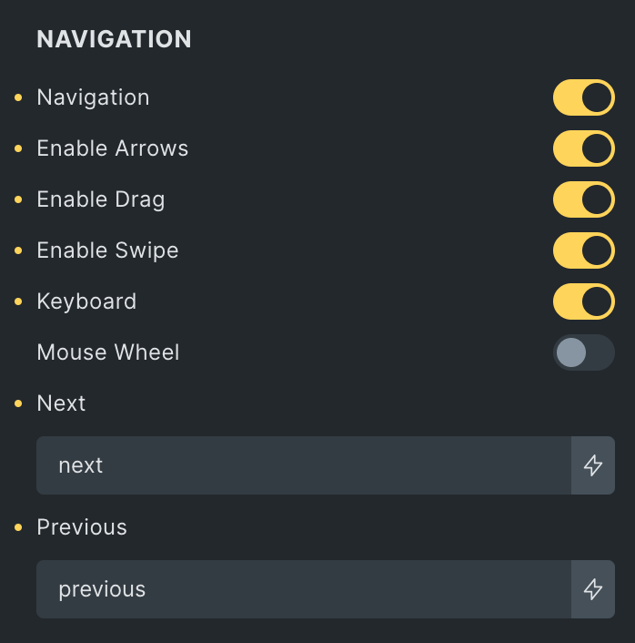
- Navigation: Enable the option to display navigation bar.
- Enable Arrows: Activate the option to display arrows in LighBox.
- Enable Drag: Activate the option to enable dragging.
- Enable Swipe: Activate the option to enable swipe(only for screen touch devices).
- Keyboard: Activate the option to enable keyboard control.
- Mouse Wheel: Activate the option to enable mouse wheel feature
- Next: Enter the text for next navigation(applicable when Enable Arrows option is activated).
- Previous: Enter the text for previous navigation(applicable when Enable Arrows option is activated).
Rotate
- Rotate: Enable the option to display rotation bar.
- Speed: Set the speed of rotation.
- Rotate Left: Activate the option to be displayed in Lightbox.
- Rotate Right: Activate the option to be displayed in Lightbox.
- Flip Horizontal: Activate the option to be displayed in Lightbox.
- Flip Vertical: Activate the option to be displayed in Lightbox.

Thumbnail
- Thumbnail: Enable the option to display the thumbnail.
- Alignment: Select the alignment of thumbnail.
- Toggle Thumb: Enable the option if needed(not applicable if Media Overlap is false).
- Width: Set the width of the thumbnail.
- Height: Set the height of the thumbnail.
- Margin: Set the margin.

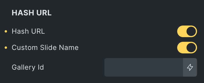
Hash URL
Note: Custom Slider Name will work as URL if the Hash Url plugin is installed.
- Hash URL: Enable the option to activate the setting of the hash URL.
- Custom Slide Name: Enable the option to give a unique name.
- Gallery ID: Enter the unique id.
- Custom Slide Name: Enable the option to give a unique name.
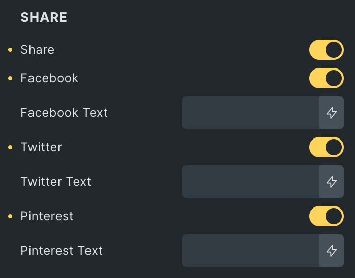
Share
- Share: Enable the option to display sharing buttons.
- Facebook:
- Facebook Text: Enter the text for Facebook share.
- Twitter:
- Twitter Text: Enter the text for Twitter share.
- Pinterest:
- Pinterest Text: Enter the text for Pinterest share
- Facebook: