An image hotspot is a fantastic element for sharing more information within a picture. Imagine them as tiny tooltips you can put on an image. When you hover your mouse over them or click on them, they reveal extra details, almost like a little pop-up message.
This hotspot element is super flexible. You can choose how they appear, whether they show up when you hover your mouse over them or when you click on them. Plus, you can even add little icons or images to make them more visually appealing.
You can also use Images, Icons, or Lottie animations as markers and also apply animation to them. You can place interactive buttons on the tooltip, and if you want to hide them, you can add a “close” icon. It’s a stylish and informative way to share information with your audience.
The Image Hotspot element features the following controls:
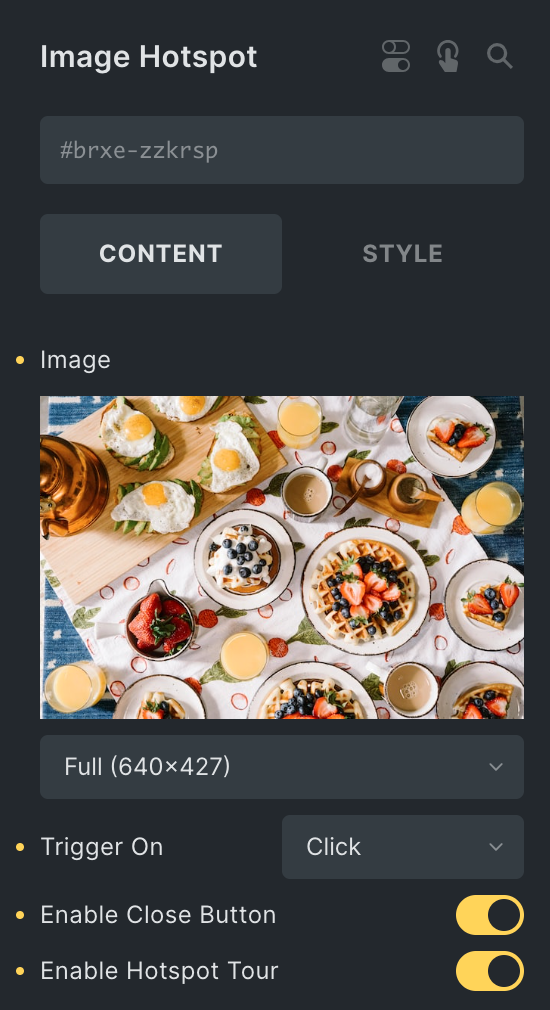
Content
Note: When you choose ‘hover‘ as the trigger On option, the button, close button, and Hotspot tour in the tooltip won’t work.
- Image: Upload an image to be shown.
- Size: Select the image size.
- Trigger On: Select the trigger option from Hover or Click.
- Enable Close Button: Select the option to display the close button.
- Enable Hotspot Tour: Select the option to display the Hotspot tour.
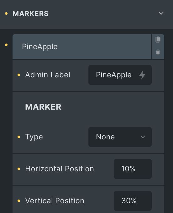
Markers
- Admin Label: Enter the label.
Marker
Note: Only the user administrator can add Lottie animations.
- Type: Select from Image, Text/Icon, and Lottie.
- Horizontal Position: Enter the horizontal position.
- Vertical Position: Enter the vertical position.
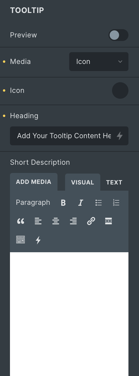
Tooltip
- Preview: Enable the option to preview the tooltip.
- Media: Select media from the Image or Icon to display in the tooltip.
- Heading: Enter the heading.
- Short Description: Enter the short description.
- Description: Enter the description.
- Button: Enter the text for button.
- Icon: Select the icon for button.
- Link: Enter the URL to be link with button.
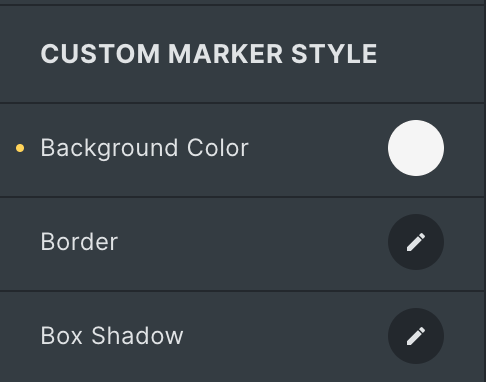
Custom Marker Style
- Background Color: Select the background color.
- Border: Set the border.
- Box Shadow: Set the box shadow.
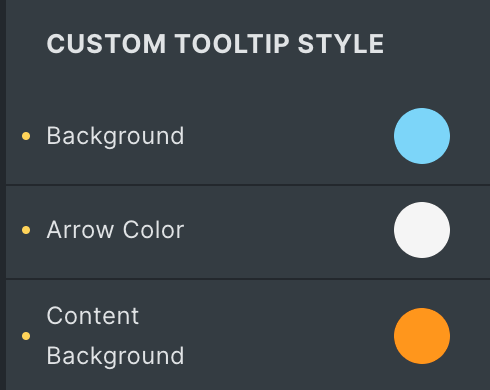
Custom Tooltip Style
- Background: Select the background color for the tooltip.
- Arrow Color: Select the arrow color.
- Content Background: Select the content background color.
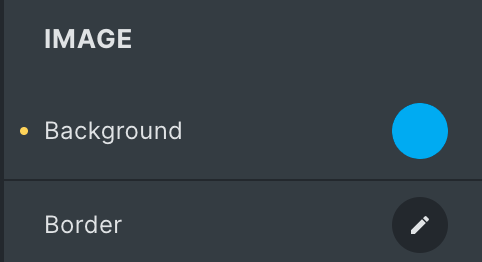
Image
Note: This option is applicable when Image is selected as Media under Tooltip Settings.
- Background: Select the background color of an image.
- Border: Set the border.
Note: Please remember that these options are based on the features you use or the information you provide within the Tooltip Settings.
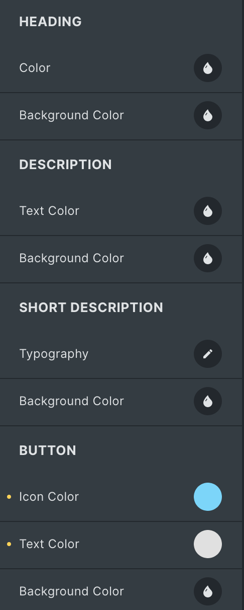
Heading
- Color: Select the text color of heading.
- Background Color: Select the background color of heading.
Description
- Color: Select the text color of description.
- Background Color: Select the background color of description
Short Description
- Color: Select the text color of short description.
- Background Color: Select the background color of short description
Button
- Icon Color: Select the color of button icon.
- Text Color: Select the button text color.
- Background Color: Select the background color of button.
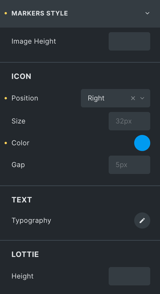
Markers Style
- Image Height: Specify the height of image.
Icon
- Position: Select position from Left or Right.
- Size: Specify the size of icon.
- Color: Select the color of icon.
- Gap: Set the gap between text and icon.
Text
- Typography: Set the typography.
Lottie
- Height: Specify the height.
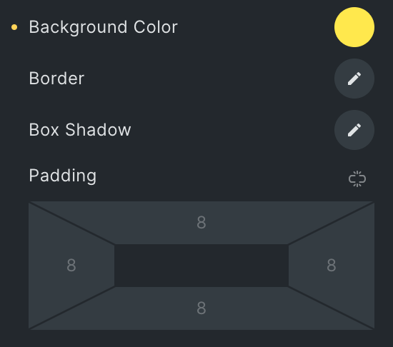
- Background Color: Select the background color of marker.
- Border: Set the border.
- Box Shadow: Set the box shadow.
- Padding: Set the padding.
Animation
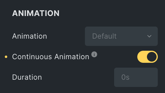
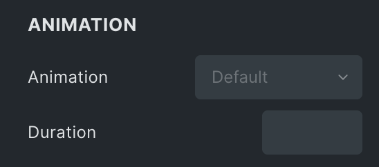
- Animation: Select the animation style.
- Continuous Animation: Enable the option to display animation continuously.
- Duration: Specify the duration of the animation.
Tooltip Style
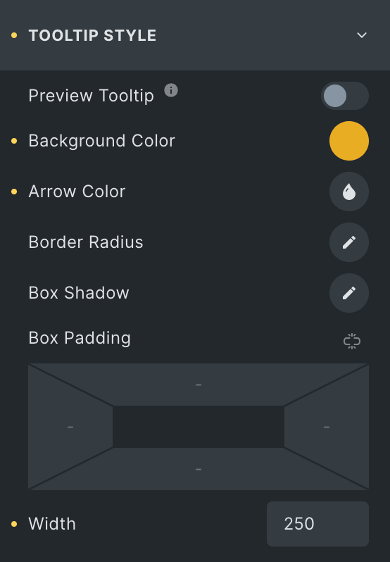
- Preview Tooltip: Enable the option to preview the tooltip.
- Background Color: Select the background color of the tooltip.
- Arrow Color: Select the arrow color.
- Border Radius: Set the border radius.
- Box Shadow: Set the box shadow.
- Box Padding: Set the padding.
- Width: Specify the width.
Content
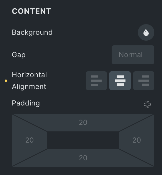
- Background: Select the background color of the content.
- Gap: Set the gap.
- Horizontal Alignment: Select the horizontal alignment.
- Padding: Set the padding.
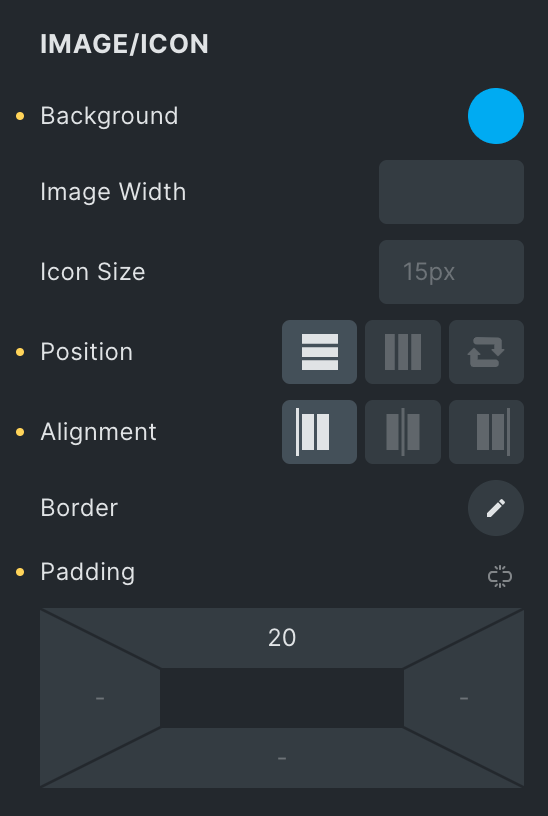
Image/Icon
- Background: Select the background color of an image.
- Image Width: Specify the width of image.
- Icon Size: Specify the size of icon.
- Position: Select a position from Vertical, Horizontal, or Reverse.
- Alignment: Select alignment from Start, Center, or End.
- Border: Select the border.
- Padding: Set the padding.
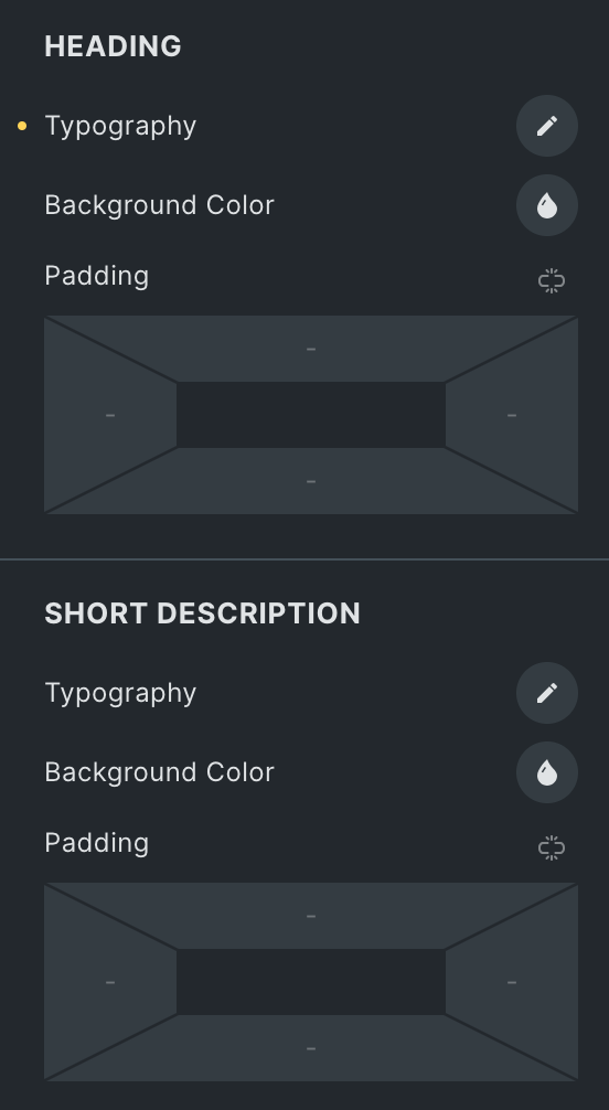
Heading
- Typography: Set the typography.
- Background Color: Select the background color of heading.
- Padding: Set the padding.
Short Description:
- Typography: Set the typography.
- Background Color: Select the background color of short description.
- Padding: Set the padding.
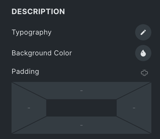
Description
- Typography: Set the typography.
- Background Color: Select the background color of description.
- Padding: Set the padding.
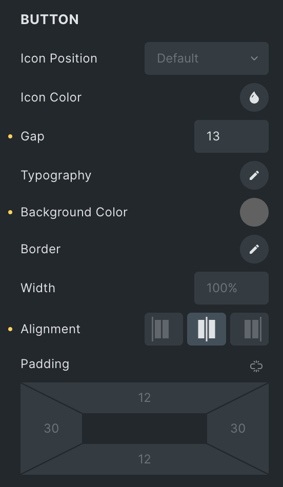
Button
- Icon Position: Select the position from left or right.
- Icon Color: Select the color of the icon.
- Gap: Specify the gap between icons or text.
- Typography: Set the typography.
- Background Color: Select the background color of a button.
- Border Width: Specify the width of border.
- Alignment: Select the alignment.
- Padding: Set the padding.
Animation
- Animation: Select the animation from the options available.
- Duration: Set the duration of animation.
Hotspot Tour
Note: These options are only applicable when the Hotspot Tour option is enabled.
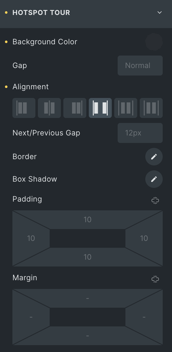
- Background Color: Select the background color.
- Gap: Set the gap between items.
- Alignment: Select the alignment.
- Next/Prev Gap: Specify the gap.
- Border: Select the border.
- Box Shadow: Set the box shadow.
- Padding: Set the padding.
- Margin: Set the margin.
Count
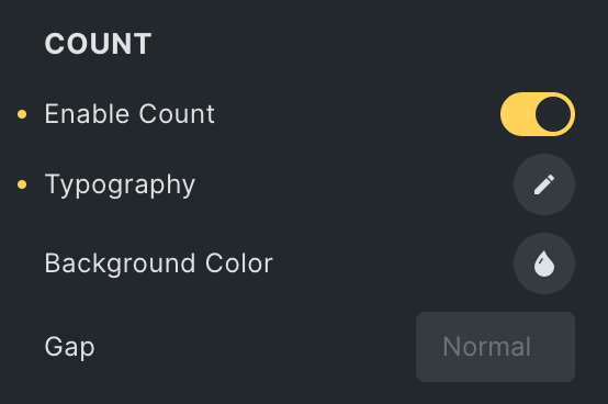
- Enable Count: Enable the option to display count.
- Typography: Set the typography.
- Background Color: Select the background color.
- Gap: Set the gap.
Next Tour
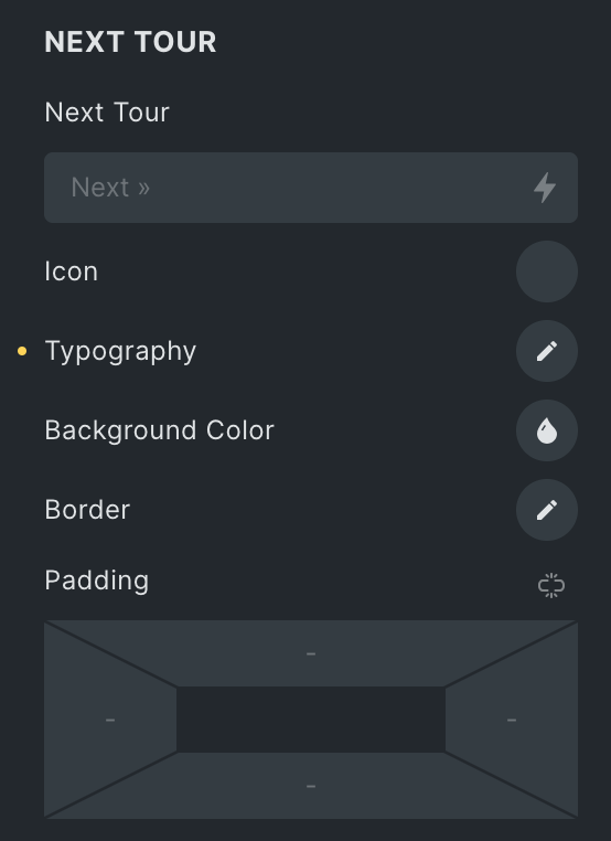
- Next Tour: Enter the text for next tour.
- Icon: Select the icon.
- Typography: Set the typography.
- Background Color: Select the background color of next tour.
- Border: Set the border.
- Padding: Set the padding.
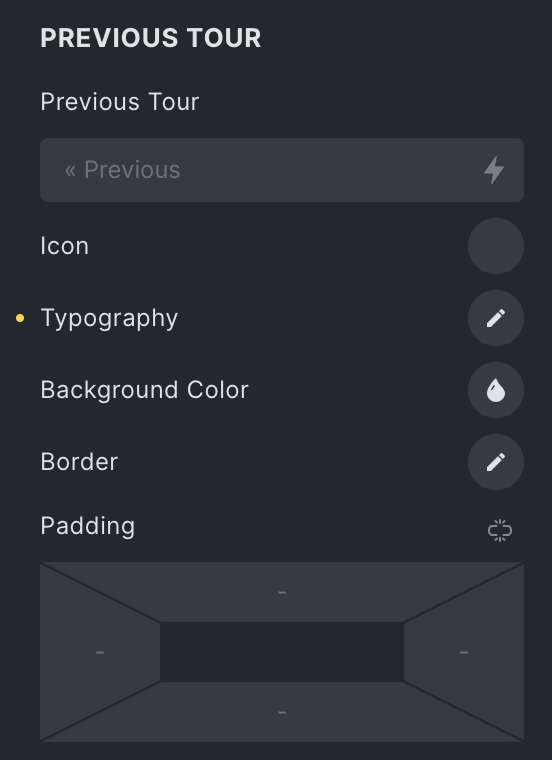
Previous Tour
- Previous Tour: Enter the text for previous tour.
- Icon: Select the icon.
- Typography: Set the typography.
- Background Color: Select the background color of previous tour.
- Border: Set the border.
- Padding: Set the padding.
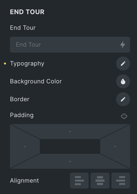
End Tour
- Enf Tour: Enter the text for end tour.
- Icon: Select the icon.
- Typography: Set the typography.
- Background Color: Select the background color of end tour.
- Border: Set the border.
- Padding: Set the padding.
- Alignment: Select the alignment from Left, Center, or Right.
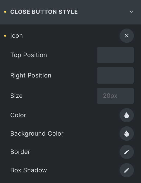
Close Button Style
Note: These options are only applicable when the Close Button option is enabled.
- Icon: Select the icon for close button.
- Top Position: Specify the space from the top.
- Right Position: Specify the space from the right.
- Size: Specify the size of icon.
- Color: Select the color of close button.
- Background Color: Select the background color of close button.
- Border: Set the border.
- Box Shadow: Set the box shadow.
Check out the Demo page of Image Hotspot element.