The “Image Accordion” is an excellent element for showing lots of information in a small, eye-catching way. It lets you collapse text, images, and icons into one element, saving space on the screen while still making the content easy to access and understand.
By displaying content in a compact, collapsed format, it helps use screen space efficiently without losing its visual appeal.
The “Image Accordion” element features the following controls:
Content
Content
These settings are applied to individual accordion panel.
- Skin: Select skin type from transparent or panel.
- Accordion Items
- Image: Select the image to display in accordion.
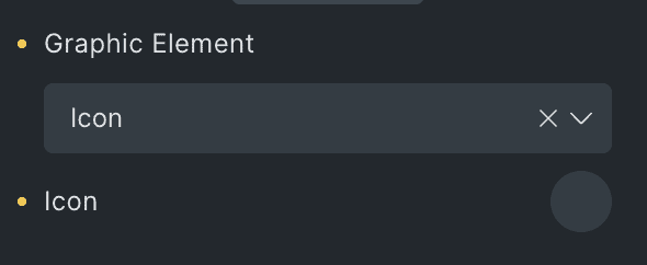
- Graphic Element: Choose either an image or icon to add to the accordion.
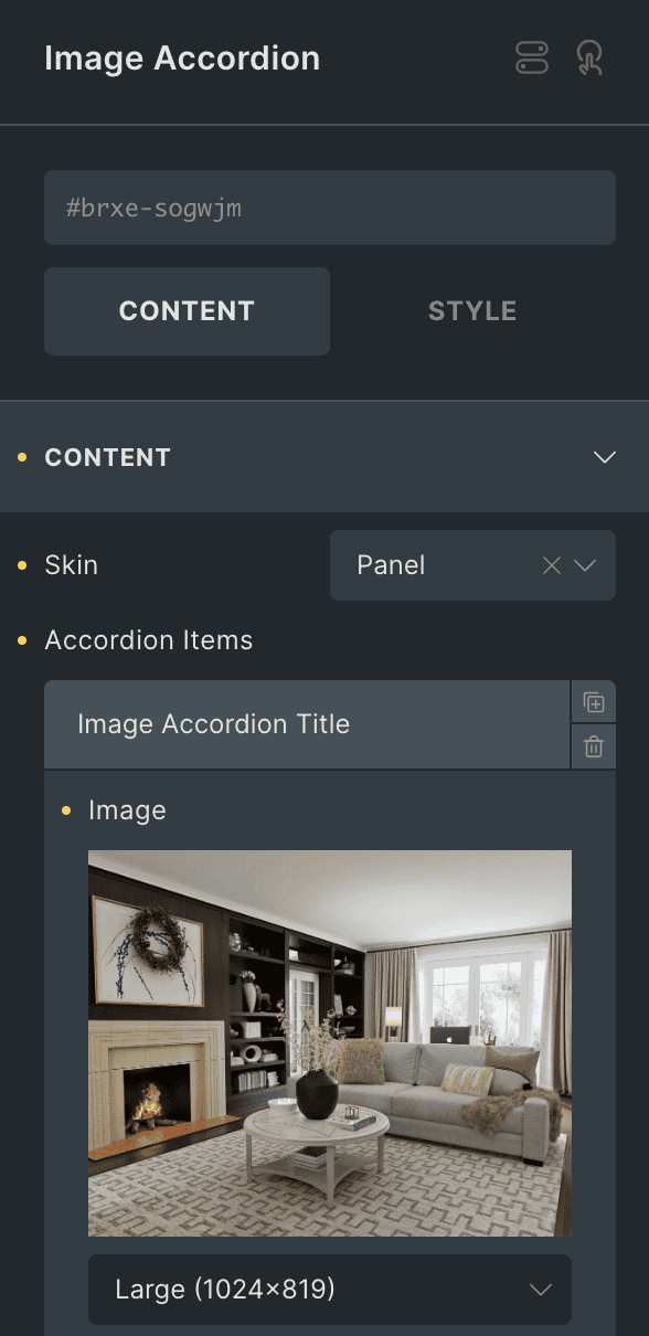
- Panel Title: Enter the panel title.
- Title: Enter the title.
- Title Tag: Select the tag for title.
- Content: Enter the content to display in accordion.
- Description Tag: Choose the tag for description.
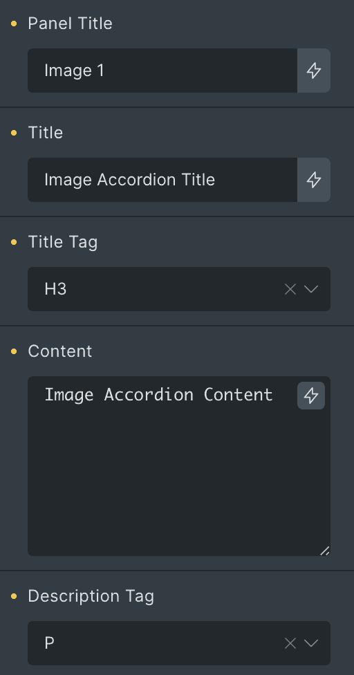
- Button: Enter the button text.
- Button URL: Specify the URL that is linked with the button.
- Button Icon: Choose the button icon.
- Button Icon Position: Select button icon position from left or right.
- Active on Load: Enable the option to display this panel upon OnLoad.
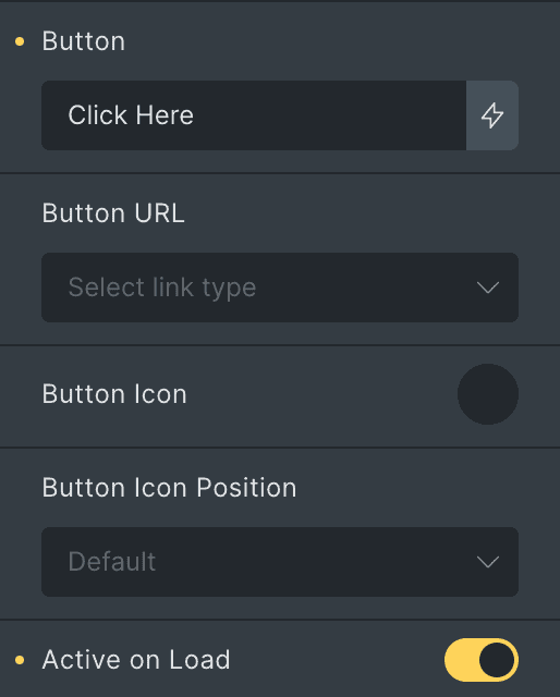
Panel
- Background: Select the background for panel.
- Border: Set the border.
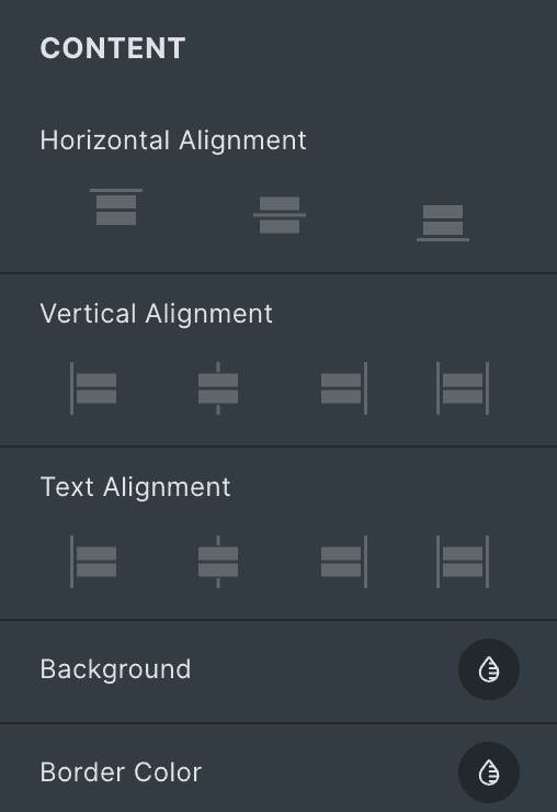
Content
- Horizontal Alignment: Select the horizontal alignment of content.
- Vertical Alignment: Select the vertical alignment of content.
- Text Alignment: Select the alignment of text.
- Background: Choose the background color.
- Border Color: Set the border color.
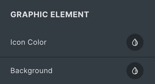
Graphic Element
- Icon Color: Select the icon color of graphic element.
- Background: Choose the background color of graphic element.
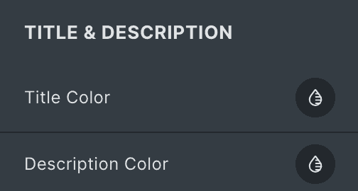
Title & Description
- Title Color: Select the title color.
- Description Color: Select the description color.
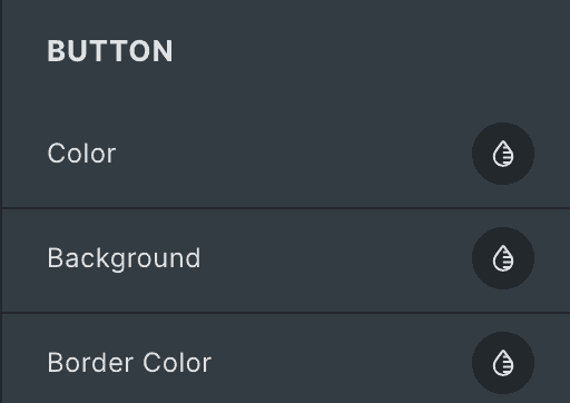
Button
- Color: Select the color of button text.
- Background: Choose the background color of button.
- Border Color: Set the border color.
Graphic Element
- Icon: Select the graphic element as icon.
- Image: Select the graphic element as image.
Settings
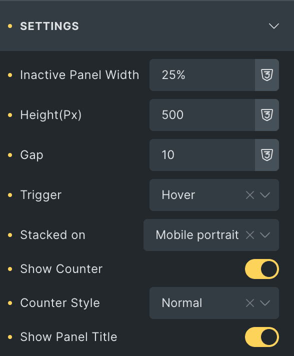
- Inactive Panel Width: Specify the width of inactive accordion panel.
- Height(px): Specify the height of panels in px.
- Gap: Specify the gap between panels(applicable when panel is selected as a skin type).
- Trigger: Select the trigger option from hover or click to open panel.
- Stacked On: Choose a stacked device.
- Show Counter: Enable the option to display the counter.
- Counter Style: Select the counter style from available options.
- Show Panel Title: Enable the option to display the panel title on closed panels.
Style
Panel
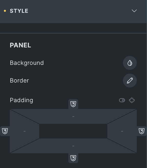
- Background: Choose the background color of panel.
- Border: Set the border.
- Padding: Set the padding.
Content
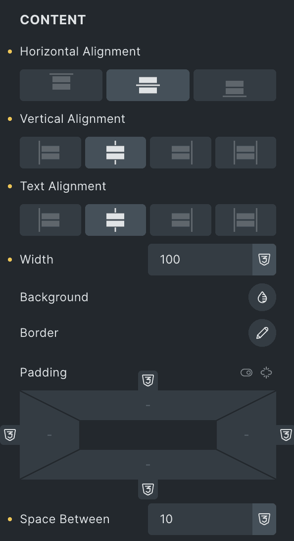
- Horizontal Alignment: Select the horizontal alignment of content.
- Vertical Alignment: Select the horizontal alignment of content.
- Text Alignment: Select the text alignment of content.
- Width: Specify the width of content box.
- Background: Choose the background color.
- Border: Set the border.
- Padding: Set the padding.
- Space Between: Specify the space between content.
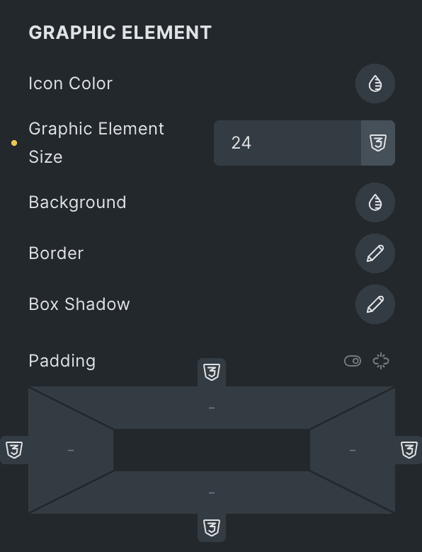
Graphic Element
- Icon Color: Select the icon color of graphic element.
- Graphic Element Size: Specify the size of graphic element.
- Background: Choose the background color of element.
- Border: Set the border.
- Box Shadow: Set the box shadow.
- Padding: Set the padding.
Title
- Color: Select the color of title.
- Typography: Set the typography.
Description
- Color: Select the color of description.
- Typography: Set the typography.
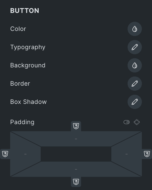
Button
- Color: Select the color of button text.
- Typography: Set the typography.
- Background: Choose the background color of button.
- Border: Set the border.
- Box Shadow: Set the box shadow.
- Padding: Set the padding.
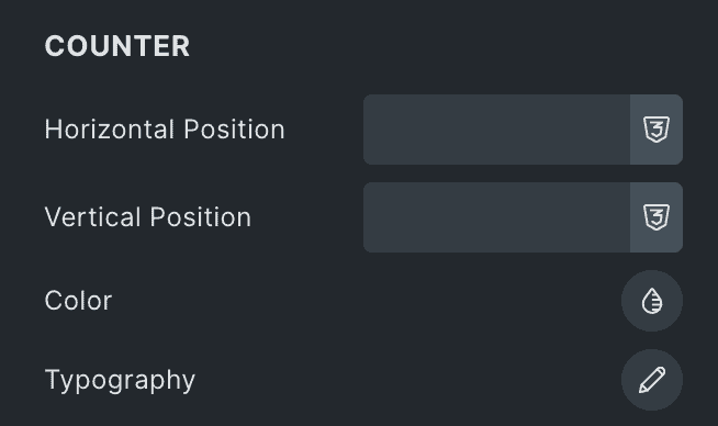
Counter
- Horizontal Position: Select the horizontal position of counter.
- Vertical Position: elect the vertical position of counter.
- Color: Choose the color of counter.
- Typography: Set the typography.
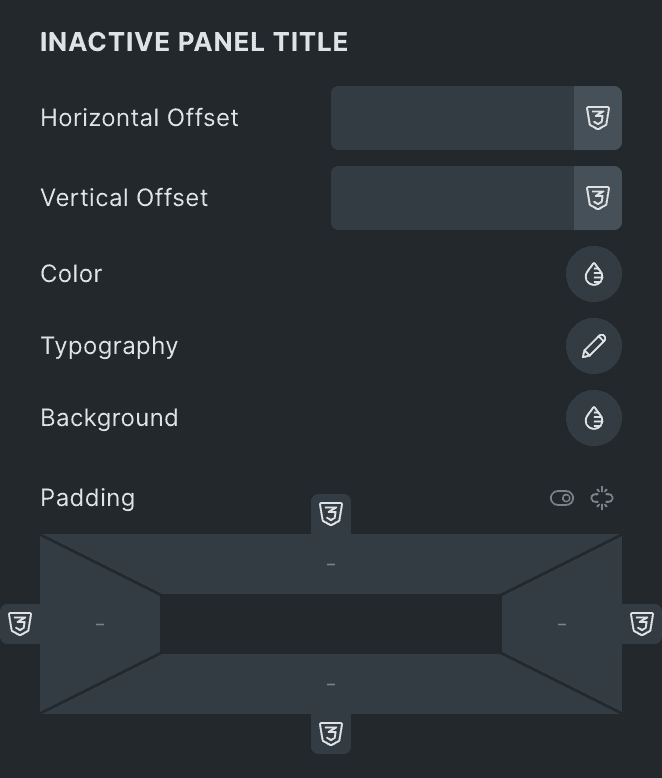
Inactive Panel Title
- Horizontal Offset: Specify the horizontal offset of inactive panel title.
- Vertical Offset: Specify the vertical offset of inactive panel title.
- Color: Select the color of title.
- Typography: Set the typography.
- Background: Choose the background color of title.
- Padding: Set the padding.
Check out the Demo page of Image Accordion element.