The Woo Product Reviews element helps you display customer reviews on your website in a stylish and organized way. It comes with multiple presets and styles, allowing you to choose the best look for your store. The element also includes a button that encourages users to write a review, making it easier for customers to share their feedback.
With built-in sorting options and pagination, users can effortlessly browse reviews. The element also offers multiple ways to display the product review form for users.
The Woo Product Reviews element features the following controls.
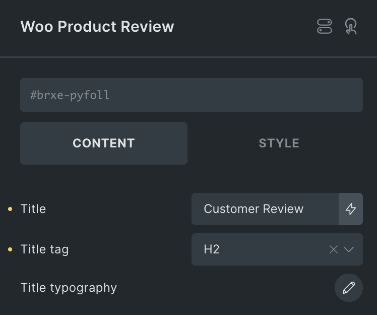
Content
- Title: Add the main heading for the widget. This is the primary title that will be displayed.
- Title Tag: Select the HTML tag for title.
- Title Typography: Set the typography.
Global Style Rating
Note: The icon you select for the rating will be used everywhere the rating appears. However, you can customize the styling for different sections.
- Icon: Choose an icon for the rating.
- Filled Color: Pick a color for the filled icons.
- Empty Color: Pick a color for the empty icons.

Review Summary Settings
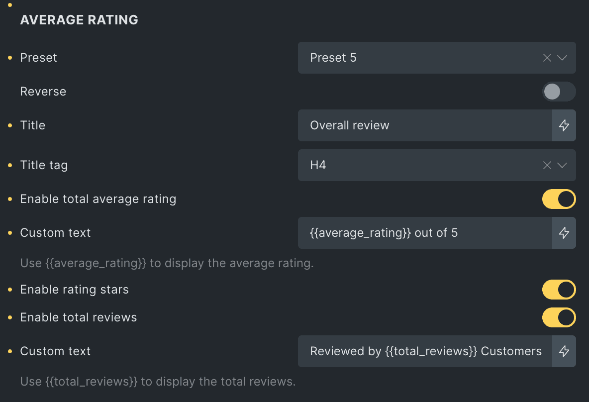
Average Rating
- Preset: Choose a style to display the average rating.
- Reverse: Enable this to flip the layout (works with preset 5).
- Title: Enter the heading for the average rating.
- Title Tag: Select a tag for the title (e.g., H1, H2).
- Enable Total Average Rating: Turn this on to show the overall average rating.
- Custom Text: Enter your own text for the total average rating. Also, use the {{average_rating}} shortcode to display the dynamic average rating within your text.
- Enable Rating Stars: Enable this option to display the rating stars in average rating.
- Enable Total Reviews: Enable this to show the total number of reviews.
- Custom Text: Enter your own text for the total reviews. Also, use the {{total_reviews}} shortcode to display the overall number of reviews dynamically within your text.
Rating Breakdown
- Enable Rating Breakdown – Turn this on to show the rating breakdown.
- Layout – Select how you want the breakdown to look.
- Star Indicator Type – Choose how to display ratings: as an icon, number, text, or a mix of these.
- Reviews Stats Type – Decide whether to show ratings as a percentage, review count, or both (works for progress & bubble layouts).

Custom Label & Color
Note: The settings below are the same for a 1st to 5th start rating. For each rating, you can select a label and color.
1 Star Rating
- Label: Enter the label for 1 1-star rating(applicable when text & number with text selected in star indicator type).
- Fill Color: Select the color that fills the progress bar of 1-star rating.

Write a Review Button
- Position: Choose where to show the review button.
- Heading Text: Enter the title for the section.
- Label: Enter the text for the review button.
- Icon: Pick an icon for the button.
- Icon Position: Set the icon on the left or right.
- Action: Select how the review form will appear when someone clicks the “Write a Review” button. You can choose to open it in a popup, display it in a cascading style, or keep it always visible.

Review Summary Styling
- Background: Choose the background color for the summary box.
- Border: Add or adjust the border.
- Box Shadow: Customize the shadow effect.
- Justify Content: Adjust the content alignment.
- Align Items: Set how items are positioned.
- Padding: Control the space inside the box.
- Margin: Adjust the space around the box.

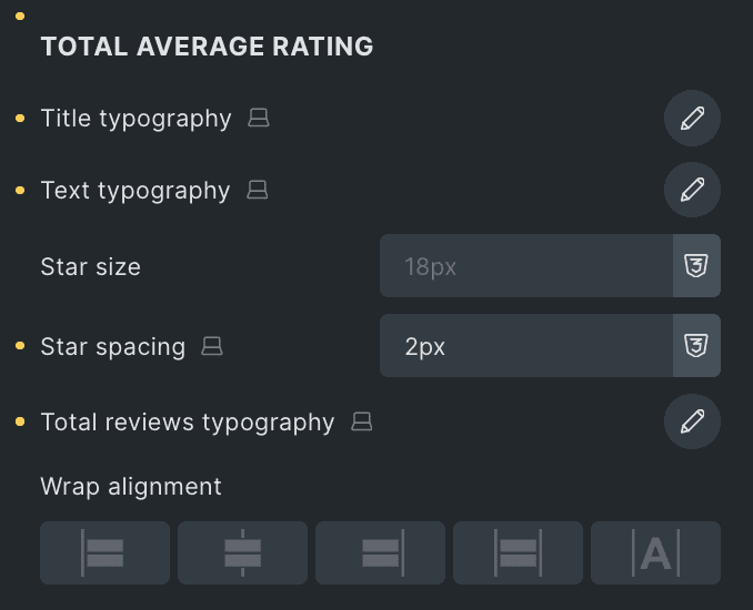
Total Average Rating
- Title Typography: Customize the typography for the title.
- Text Typography: Customize the typography for the text.
- Star Size: Set the size of the star icon.
- Star Spacing: Adjust the gap between stars.
- Total Reviews Typography: Customize the typography for total reviews.
- Alignment: Choose how the total average rating is aligned.
Separator Styling
These settings are applicable for Presets 3,4, & 5.
- Color: Pick the color of separator.
- Height(in px): Specify the height of separator in pixels.

Rating breakdown
- Star Indicator Typography: Customize the typography of the star indicator.
- Review Count Typography: Set the typography for review count(applicable for circular rating).
- Percentage Typography: Adjust the typography of percentage(applicable for circular rating)
- Review Stats Typography: Change the typography of the review stats(applicable for progress bar & bubble rating).
- Vertical Spacing: Adjust the space between breakdown items.

Progress Bar
- Progress Bar Height: Change the height of the progress bar.
- Filled Background Color: Choose the color for the filled part of the progress bar.
- Empty Background Color: Choose the color for the empty part of the progress bar.
- Border: Add or customize the border.
- Filled Border Radius: Adjust the roundness of the filled area.

Circular Progress Bar
These settings are applicable when you select Circular Rating as Layout in Rating Breakdown.
- Size: Adjust the size of the circular progress bar to make the circle bigger or smaller.
- Filled Color: Choose the color for the filled part.
- Empty Color: Choose the color for the empty part.
- Border: Add or adjust the border.

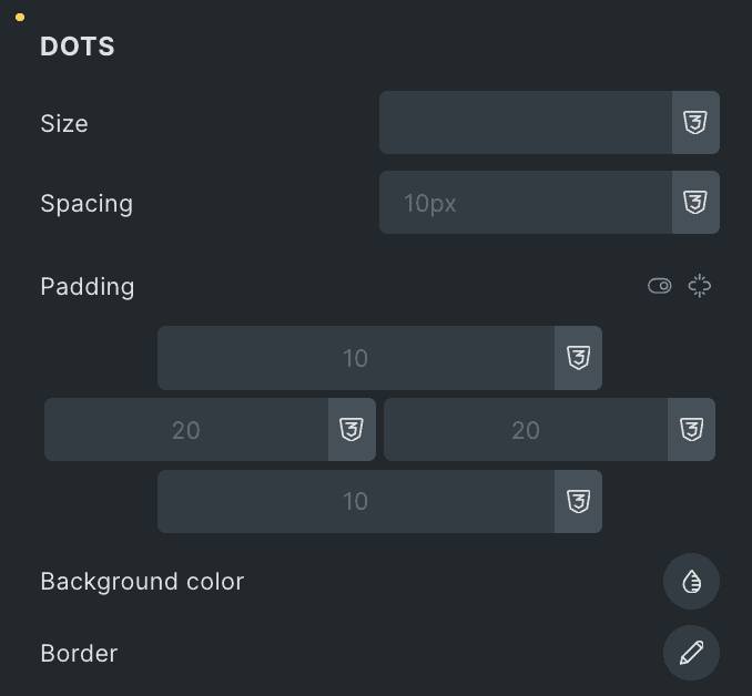
Dots
These settings are applicable when you select Bubble Rating as Layout in Rating Breakdown.
- Size: Specify the size of dots.
- Spacing: Adjust the spacing.
- Padding: Set the padding.
- Background Color: Select the background color.
- Border: Set the border.
Write a Review Button
- Heading Typography: Customize the typography of heading.
- Typography: Set the typography of button.
- Background: Select the background color of button.
- Border: Set the border.
- Box Shadow: Adjust the box shadow.
- Padding – Control the space inside the box.
- Margin – Adjust the space around the box.
- Icon Color: Select the button’s icon color.
- Icon Size: Specify the size of icon.
- Icon Spacing: Adjust the spacing between icons.

Sorting Settings
- Enable: Turn on this option to enable the sorting feature.
- Dropdown Label: Enter the label for dropdown.
- Reset Button Icon: Choose the icon for reset button.

Styling
- Alignment: Select the alignment of sorting section.
- Label Typography: Set the typography of label.

Dropdown
- Typography: Adjust the typography of dropdown.
- Background: Choose the background.
- Border: Set the border.
- Box Shadow: Adjust the box shadow.

Reset Button
- Reset Icon Color: Select the color of reset icon.
- Reset Icon Size: Choose the size of reset icon.

Reviews Settings
Layout
- Layout: Choose how to display customer reviews – Grid, List, or Slider.
- Preset: Pick a preset design style from the available options.
- Columns: Set how many columns to show in one row (for Grid layout).
- Column Gap: Adjust the space between columns (for Grid layout).
- Row Gap: Adjust the space between rows (for Grid & List layout).
- Content Gap: Set the space between content items (for List layout).

These settings are applicable when you select Slider as layout.
- Loop: Enable the loop option to display the slides continuously.
- Effects: Select effects from Slide, Coverflow, Fade, or Flip.
- Slides Per View: Specify the number of slides to be displayed in a row.
- Slides Per Group: Specify how many slides should move together when navigating through the slider.
- Speed: Set the transition speed when moving one slide to the next.
- Autoplay: Activate the option to enable autoplay while onload.
- Pause On Interaction: Enable the option to pause slides during interaction.
- Duration: Set the duration for transition.
- Pause On hover: Enable the option to pause slides during hover.
- Auto Height: Enable the option to set the auto height.

Pagination
These settings are applicable when you select Slider as layout.
- Pagination: Set the pagination type.
- Clickable: Enable the option to make arrows clickable(only applicable for Bullets Pagination type).
- Keyboard Control: Activate the option to enable keyword control.
- Scroll bar: Enable the option to display the scroll bar.

Navigation
These settings are applicable when you select Slider as layout.
- Navigation: Enable the option to display navigation.
- Position: Choose either from Outside or Inside.
- Previous Icon: Set the previous icon from available icons.
- Next Icon: Set the next icon from available icons.
- Horizontal Position: Select the horizontal position of navigation.
- Vertical Position: Select the vertical position of navigation.

Content Settings
Note: The Verified Buyer Badge follows the WooCommerce settings. If you enable or disable it in WooCommerce, the changes will be reflected in the element. You can also control this setting directly by using the Show Verified Buyer Badge option.
- Enable Avatar: Show the user’s profile picture with their review.
- Avatar Size: Set the size of the profile picture.
- Show Author Name: Display the reviewer’s name.
- Show Verified Buyer Badge: Show a badge for verified buyers.
- Verified Buyer Text: Enter the text for the badge.
- Verified Badge Icon: Choose an icon for the badge.
- Show Date: Display the review date.

Description
- Read More Text: Enter the text that will be shown for “Read More.”
- Description Word Limit: Choose the maximum number of words for the description.
- No Reviews Text: Set the text to show when there are no reviews.

Pagination
These settings are applicable for Grid & List layout.
- Enable Pagination: Turn pagination on or off.
- Reviews Per Page: Set how many reviews to show per page.
- Show Prev/Next Button: Choose whether to display previous and next buttons.
- Prev Button Text: Set the text for the previous button.
- Prev Button Icon: Choose an icon for the previous button.
- Next Button Text: Set the text for the next button.
- Next Button Icon: Choose an icon for the next button.
- Loading Overlay: Enable or disable a loading overlay.
- Loading Preset: Select a loading animation style.

Slider Styling
These settings are applicable when you select Slider as layout.
Navigation
- Color: Select the color of navigation icon.
- Background: Select the background color of navigation icon.
- Border: Set the border.
- Box Shadow: Set the box shadow.
- Size: Specify the size of icon.
- Horizontal offset: Enter the horizontal offset value.
- Vertical Offset: Enter the vertical offset value.
- Padding: Set the padding.

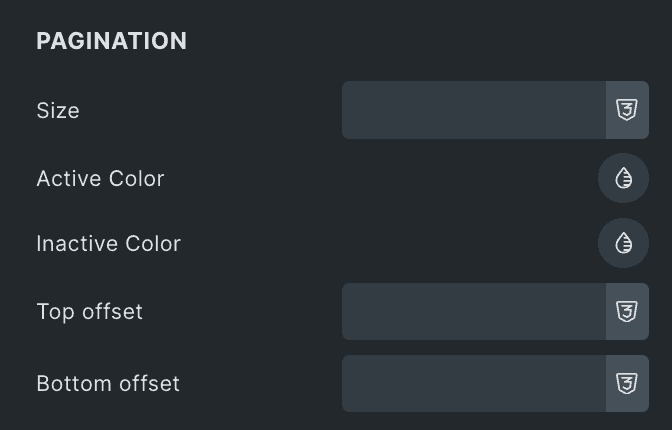
Pagination
- Size: Specify the size of pagination.
- Active Color: Select the pagination active color.
- Inactive Color: Select the pagination inactive color.
- Top Offset: Specify the top offset value.
- Bottom Offset: Specify the bottom offset value.
Scroll Bar
- Size: Specify the size of scroll bar.
- Drag Color: Select the drag color of scroll bar.
- Color: Select the color of scroll bar.

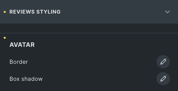
Review Styling
Avatar
- Border: Set the border.
- Box Shadow: Adjust the box shadow.
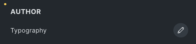
Author
- Typography: Set the typography of author.
Verified Buyer
- Typography: Adjust the typography of verified buyer badge.
- Background Color: Select the background color of badge.
- Border: Set the border.
- Padding: Adjust the padding.

Description
- Typography: Set the typography of description.
- Read More Typography: Set the typography of read more text.

Date
- Typography: Customize the typography of date.
- Background Color: Select the background color of date.
- Border: Set the border.
- Padding: Adjust the padding.

No Review Text
- Typography: Customize the typography of no review text.
Review Box
- Background Color: Customize the background color of review box.
- Border: Set the border.
- Box Shadow: Adjust the box shadow.
- Padding: Set the padding.

Pagination Styling
These settings are applicable for Grid & List layout.
- Gap: Specify the gap between pagination.
- Alignment: Select the alignment of pagination.
Numbers
- Typography: Set the typography.
- Background Color: Adjust the background color.
- Border: Set the border properties.
- Box Shadow: Set the box shadow.
Current Page
- Color: Specify the color of current page.
- Background Color: Select the background color.
- Border Color: Specify the border color.
- Padding: Set the padding.

Prev Button
- Typography: Set the typography.
- Background Color: Select the background color of previous button.
- Border: Set the border.
- Box Shadow: Set the box shadow.
- Padding: Adjust the padding.

Next Button
- Typography: Set the typography of next button.
- Background Color: Customize the background color.
- Border: Set the border.
- Box Shadow: Set the box shadow.
- Padding: Set the padding.

Loading Overlay
- Background Color: Customize the background color of overlay.
- Icon Color: Select the icon color.

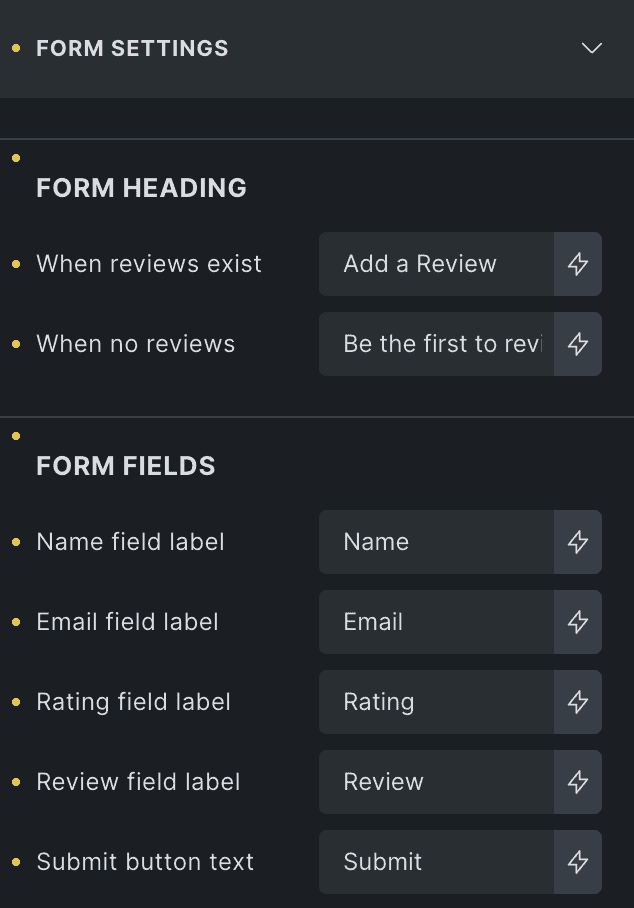
Form Settings
Form Heading
- When Reviews Exist: Title shown when there are reviews for the product.
- When no Reviews: Title shown when no reviews are available.
Form Fields
- Name Field Label: Specify the label of name field.
- Email Field Label: Add the label of email field.
- Rating Field Label: Enter the field label of rating.
- Review Field Label: Specify the label of review field.
- Submit Button Text: Enter the text for submit button.
Form Styling
- Form Title: Customize the styling of form title.
- Form Note: Style the form’s note.

Form Fields
- Label Typography: Adjust the typography of labels.
- Field Typography: This will set the typography of form fields.
- Background: Select the background color of form fields.
- Border: Set the border.

Star Rating
- Star Size: Specify the size of star icon.
- Star Gap: Specify the gap between star icons.
Submit Button
- Typography: Set the typography of submit button.
- Background Color: Select the background color of button.
- Border: Set the border.
- Box Shadow: Set the box shadow.
- Padding: Adjust the padding.
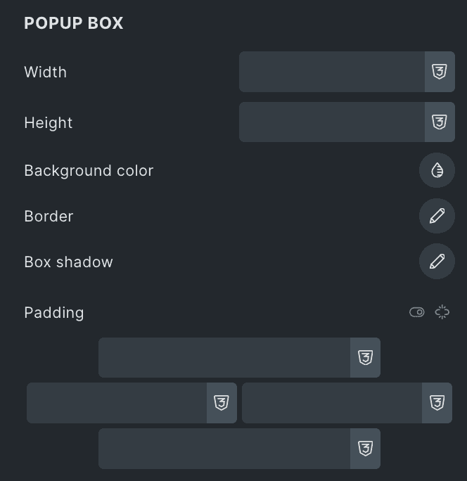
Popup Box
These settings are applicable when selecting Popup as Action in Review Button Settings.
- Width: Specify the width of popup box.
- Height: Specify the height of popup box.
- Background Color: This will change the background color.
- Border: Adjust the border.
- Box Shadow: Set the box shadow.
- Padding: Set the padding.
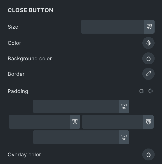
Close Button
These settings are applicable when selecting Popup as Action in Review Button Settings.
- Size: Specify the size of close icon.
- Color: Select the color.
- Background Color: This will change the background color of close button.
- Border: Set the border.
- Padding: Set the padding.
- Overlay Color: Select the overlay color.