The “Unfold (Nestable)” element is a helpful tool that allows you to show visitors an initial snippet of content while saving valuable space on your webpage. This element is convenient if you want to provide your audience with just a preview of the content on page load while still allowing them to read the entire content by clicking on the button. It includes a Separator option that appears on the content when it is viewed in a condensed form.
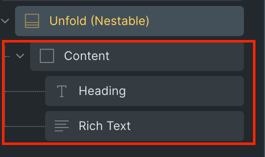
Initially, It comes with two nestable elements: Heading and Rich text. However, these elements are fully customizable, allowing you to choose from a wide range of other elements that meet your specific requirements.
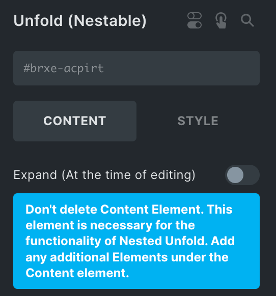
It’s essential to keep in mind that the Content element in the elements’ structure manages all of the added elements. Therefore, it’s highly recommended that you do not delete this element. If you want to add any additional elements, please add them under the content element.
The Unfold (Nestable) Element features the following controls:
Content
- Expand: Enable the option to show expand mode while editing.
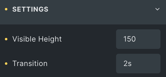
Settings
- Visible Height: Set the content’s visible height in a condensed mode without giving any unit.
- Transition: Set the transition duration for expand mode.
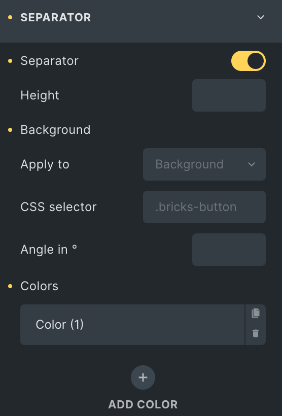
Separator
Separator: Enable the option to display the Separator.
- Height: Enter the height to manage the height of the separator without giving any unit.
- Background: Select the background option to apply background to the Separator.
- Apply To: Select the background option to apply background to the Separator.
- CSS Selector: Enter the CSS selector, if any.
- Angle in: Enter the angle.
- Colors: Choose multiple colors to apply a gradient background.
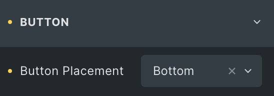
Button
- Button Placement: Select either from the Top or Bottom.
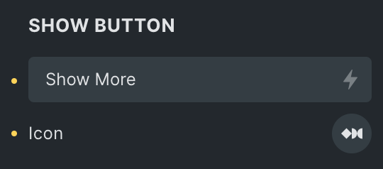
Show Button
- Text: Enter the text for show button.
- Icon: Choose from a list of available options.
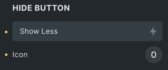
Hide Button
- Text: Enter the text for hide button.
- Icon: Choose from a list of Fontawesome – Brands, Fontawesome – Regular, or Fontawesome – Solid, Themify, and Ionicons.
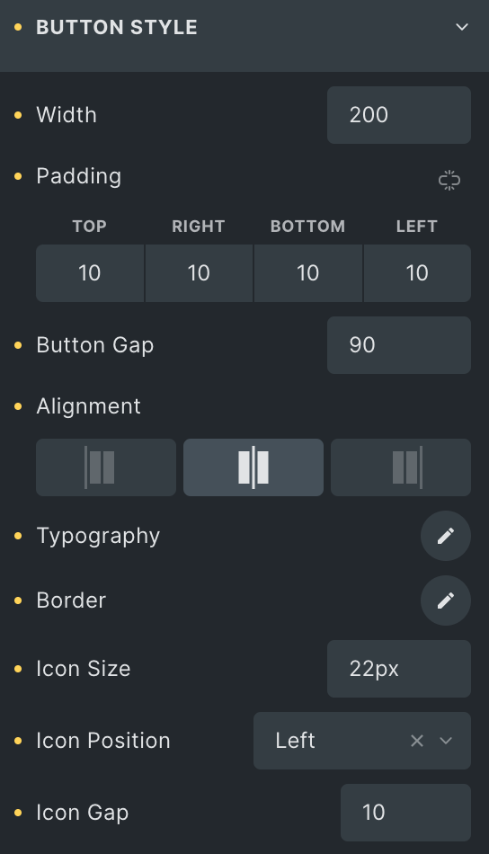
Button Style
- Width: Enter the width of the button.
- Padding: Set the padding for the button.
- Button Gap: Enter the gap of the button to the content.
- Alignment: Select from Start, Center, or End.
- Typography: Set the typography of button text.
- Border: Set the border properties for the button.
- Icon Size: Enter the size of the icon.
- Icon Position: Select either from Right or Left.
- Icon Gap: Set the gap of the icon to the button text.
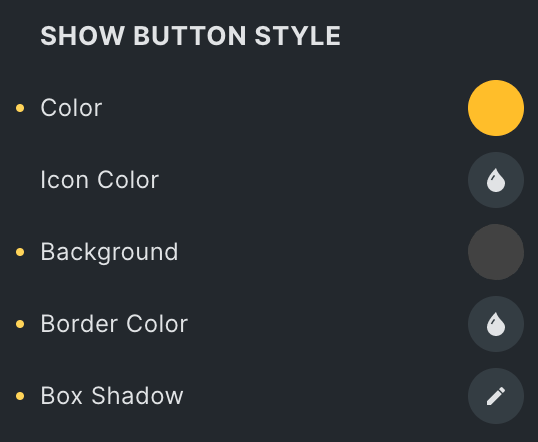
Show Button Style
- Color: Choose the color for button text.
- Icon Color: Select the color for icon.
- Background: Select the background color for show button.
- Border Color: Set the border color for show button.
- Box Shadow: Add a shadow around the show button.
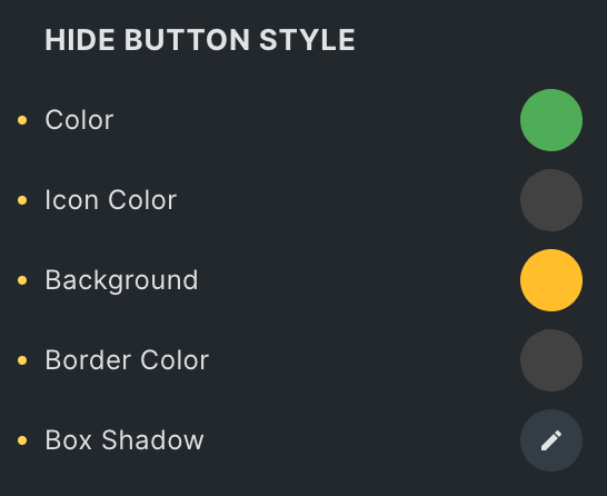
Hide Button Style
- Color: Choose the color for button text.
- Icon Color: Select the color for icon.
- Background: Select the background color for hide button.
- Border Color: Set the border color for hide button.
- Box Shadow: Add a shadow around the box.
Check out a demo page of Unfold(Nestable) element.