The “Call To Action” Element is a tool that offers a group of features to enhance the user experience.
The hover animation feature adds a touch of interactivity to the Element, allowing users to highlight and interact with the content and box dynamically. Additionally, this element’s ribbon feature provides an eye-catching way to display important information or promotions.
The Call To Action Element features the following controls:
Content
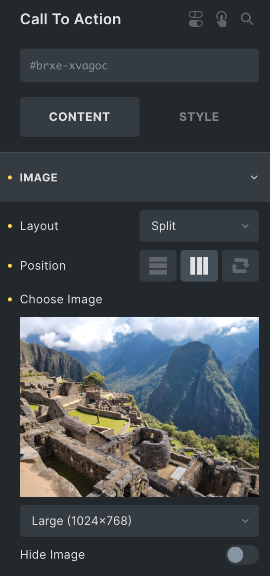
Image
- Layout: Choose from Split or Cover.
- Position: Select from Vertical, horizontal, and reverse layout options(for Split layout only).
- Choose Image: Select the image and set the size.
- Hide Image: Enable the option to hide the image if needed.
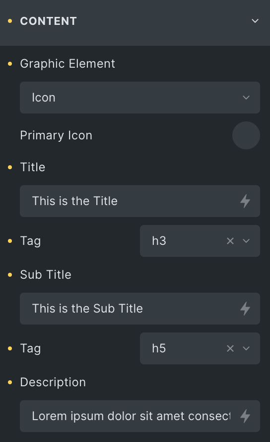
Content
- Graphic Element: Choose from a list of options, from Image, icon, or none.
- Image
- Image: Select an image for the content section, and set its size.
- Icon
- Primary Icon: Choose from the given options.
- Title: Enter the title.
- Tag: Select the HTML tag for title.
- Sub Title: Set the subtitle.
- Tag: Select the HTML tag for subtitle.
- Description: Enter the description.
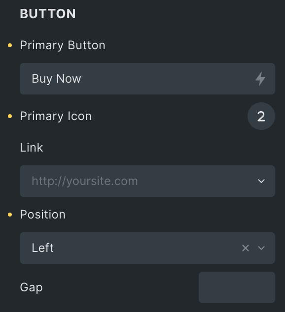
Button
- Primary Button: Enter the text for the primary button.
- Primary Icon: Choose from the given options.
- Link: Select from a range of choices to associate with the button.
- Position: Select the position of the icon, either right or left.
- Gap: Set the gap between the icon and the button text.
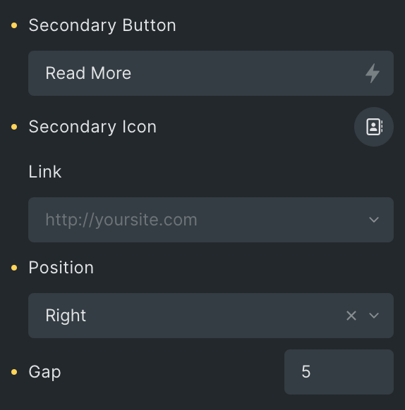
- Secondary Button: Enter the text for the secondary button.
- Secondary Icon: Choose from a list of Fontawesome – Brands, Fontawesome – Regular, or Fontawesome – Solid, Themify, and Ionicons.
- Link: Select from a range of choices to associate with the button.
- Position: Select the position of the icon, either right or left.
- Gap: Set the gap between the icon and the button text.
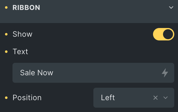
Ribbon
- Show: Enable the option if desired.
- Text: Enter the text for the ribbon.
- Position: Select either left or right.
Box Style
Box
- Width: Set the width in %.
- Height: Set the height in px.
- Box Alignment: Select from Start, Center, or end.
- Border: Set the border of the box.
- Box Shadow: Add a shadow around the box.
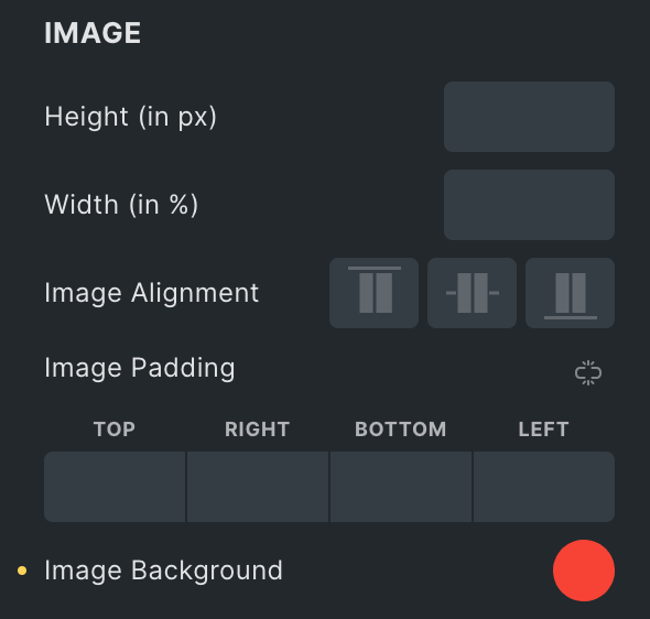
Image
- Height: Set the height of the image in px(applicable for split layout only).
- Width: Set the width of the image in %(applicable for split layout only).
- Image Alignment: Set the alignment of the image(applicable for split layout only).
- Image padding: Set the padding of the image.
- Image background: Set the background of the image.
Hover
- Hover Animation: Select the hover animation for the box.
- Transition Duration: Set the duration of the transition.
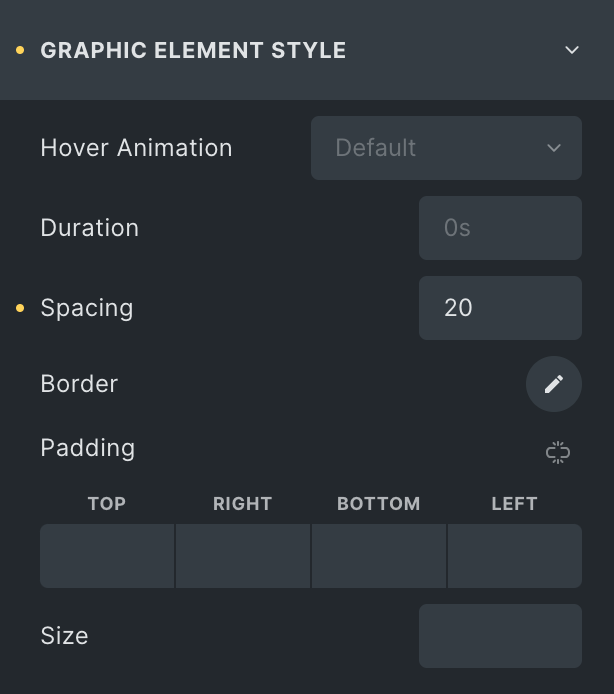
Graphic Element Style
- Hover Animation: Select the hover animation for the graphic element.
- Duration: Set the duration to animate.
- Spacing: Set the spacing of the graphic element to the content.
- Border: Set the border.
- Padding: Set the padding.
- Size: Set the size of the element.
- Primary Color: Set the color(applicable on the icon only).
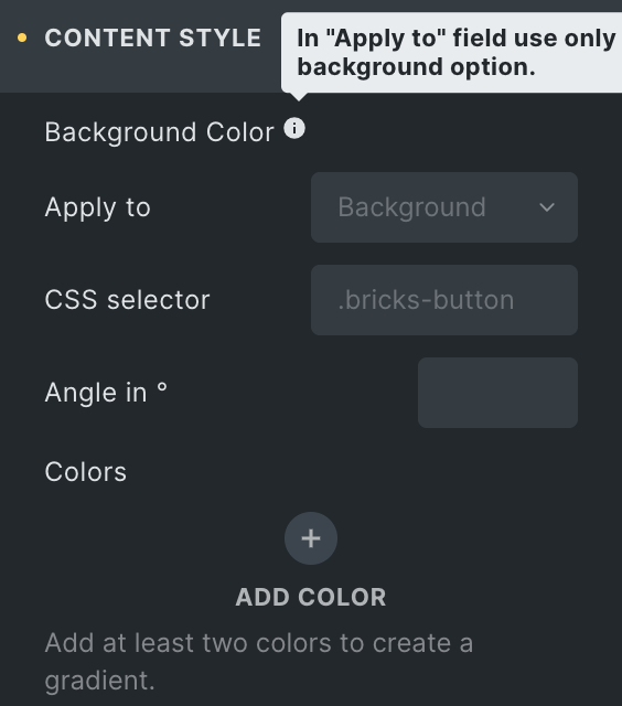
Content Style
- Background Color: Choose the background color for the content.
- Border: Set the boder properties for content box.
- Box Shadow: Set the box shadow.
- Alignment: Set the alignment of content(applicable for split layout).
- Vertical Alignment: Enter the vertical position of the content(applicable for split layout).
- Vertical Position: Enter the vertical position of the content(applicable for cover layout).
- Horizontal Position: Enter the horizontal position of the content(applicable for cover layout).
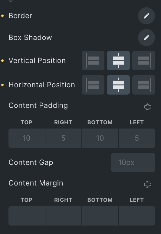
- Content Padding: Set the padding.
- Content Gap: Set the gap between content using this format:(10px).
- Content Margin: Set the margin of content.
Title
- Typography: Set the typography of the title.
- Spacing: Set the spacing of the title.
- Padding: Set the padding of the title.
Sub Title
- Typography: Set the typography of the sub-title.
- Spacing: Set the spacing of the subtitle.
- Padding: Set the padding of the subtitle.
Description
- Typography: Set the typography of the description.
- Spacing: Set the spacing of the description.
- Padding: Set the padding of the description.
Hover Effects (Only applicable on Default layout)
- Hover Animation: Select the hover animation.
- Transition Duration: Set the duration of the transition.
Button Style
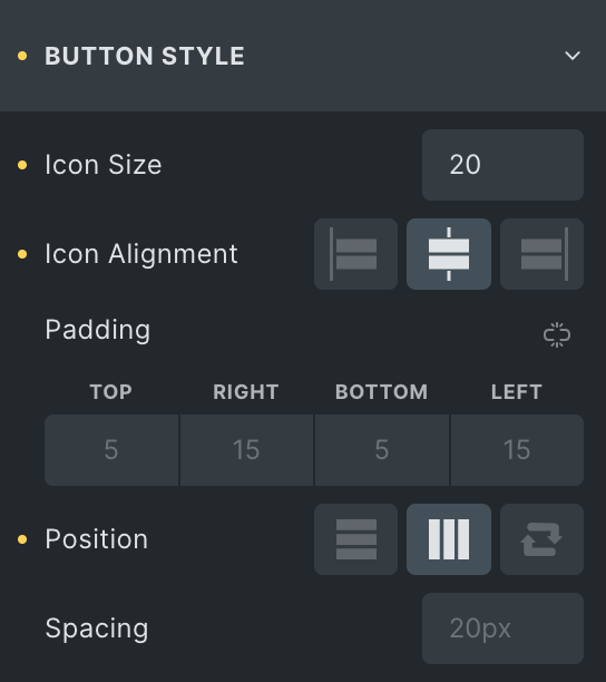
- Icon Size: Set the size of the icon.
- Icon alignment: Select from Start, center, or end alignment.
- Padding: Set the padding of a button.
- Position: Select from Vertical, horizontal, and reverse options.
- Spacing: Set the spacing between the buttons.
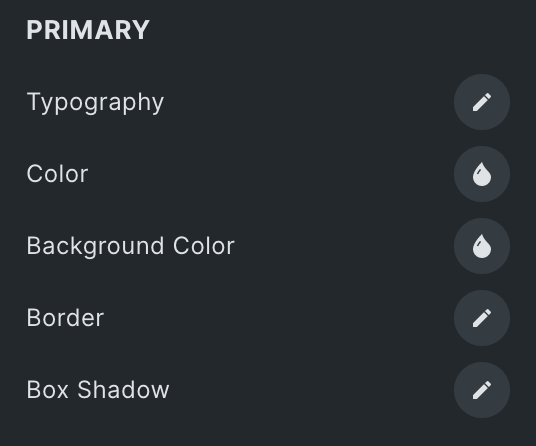
Primary
- Typography: Set the typography of the button.
- Color: Select the color for Primary button.
- Background Color: Set the background color for the primary button.
- Border: Set the border properties for the button.
- Box Shadow: Set the box shadow for primary button.
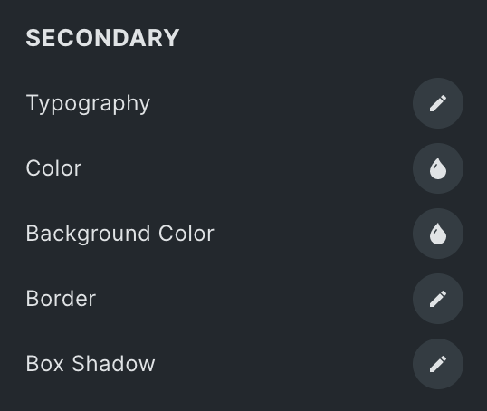
Secondary
- Typography: Set the typography of the button.
- Color: Select the color for Secondary button.
- Background Color: Set the background color for the secondary button.
- Border: Set the border properties for the button.
- Box Shadow: Set the box shadow for secondary button.
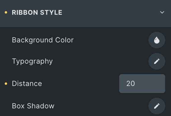
Ribbon Style
- Background Color: Set the background color for the ribbon.
- Typography: Set the typography.
- Distance: Set the distance of the ribbon(Max Value is 50).
- Box Shadow: Add a shadow around the box.
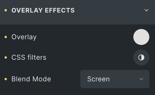
Overlay Effects
- Overlay: Set the overlay.
- CSS filter: Set the CSS filter.
- Blend mode: Choose the blend mode.
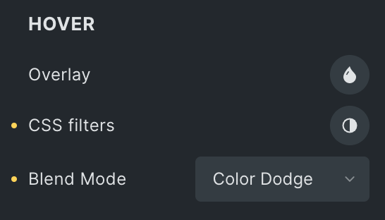
Hover
Styling controls for the hover state are available under this section. These settings will be applied when Someone hovers the box.
Note: In the default layout, the overlay effects will be applied to the entire box, while in the split layout, it will only be applied to the image.
Click here to check out a demo page of the Call To Action element.