This widget makes it easy for users to add an event to their favorite calendar, like Google Calendar, Outlook, ICS, or Yahoo Calendar. You can offer multiple calendar options so users can choose the one they prefer. With just a click, they can add the event to their calendar without needing to enter any details manually. It’s a quick and hassle-free way to keep track of events.
The Add to Calendar element features the following controls.
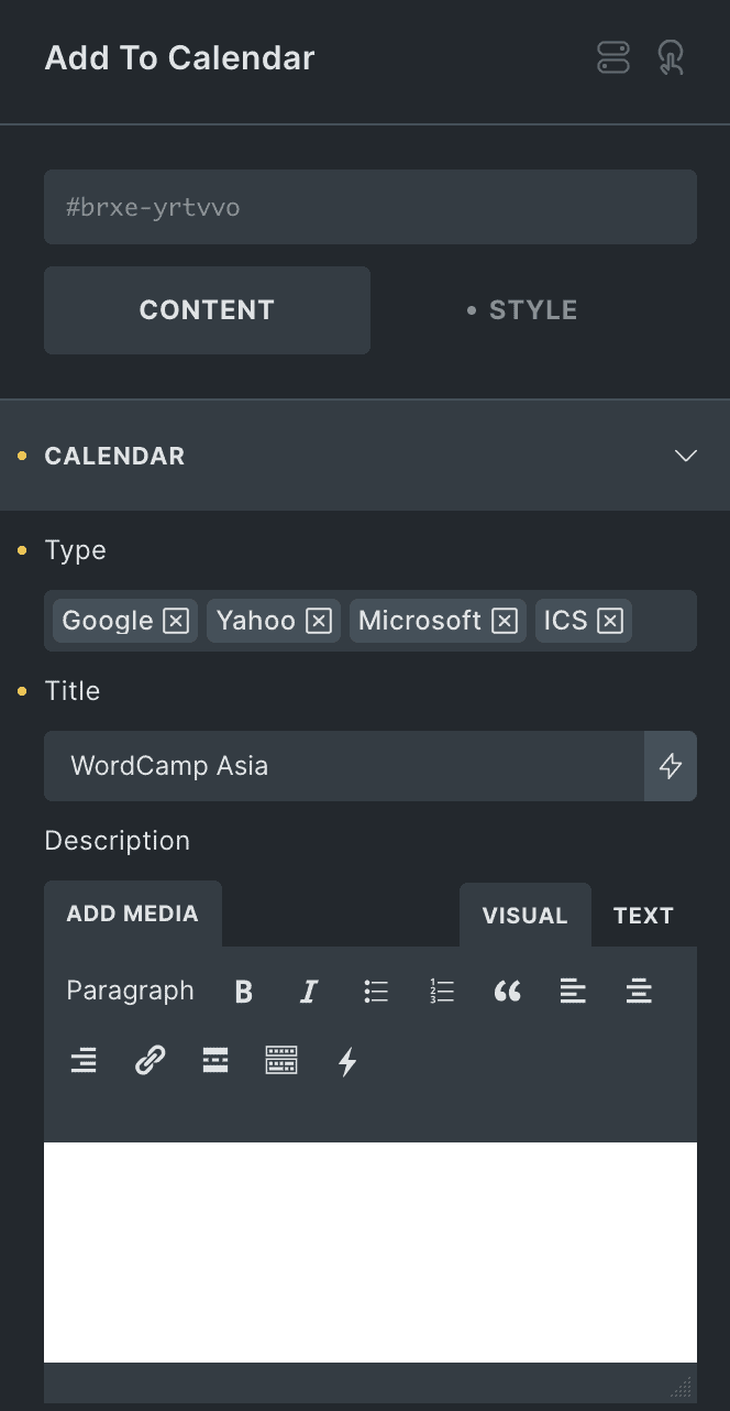
Content
Calendar
- Type: Select either one or multiple calendar types from Google, ICS, Microsoft, and Yahoo.
- Title: Enter the title of event.
- Description: Enter the description of the event.
- Address: Set the event location.
- Date Field: Select the date field from either date time picker or enter dynamic string.
- Start Date Time: Specify the event start date & time.
- End Date Time: Specify the event end date & time.

Button
- Text: Enter the text for button.
- Icon: Select the button icon.
- Position: Choose button position from left or right.
- Gap: Specify the gap between button icon or text.

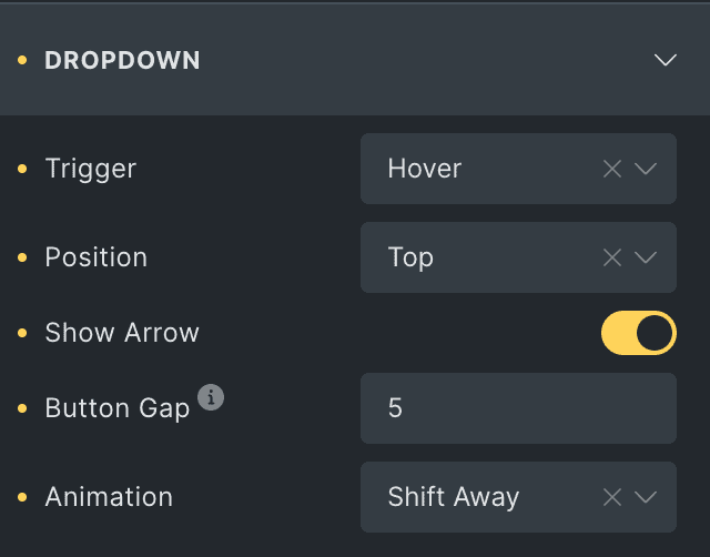
Dropdown
Note: The position you choose is not fixed. If there is no space available at the selected position, it will automatically adjust and appear where there is space.
- Trigger: Select either hover or click to trigger the dropdown.
- Position: Choose the position of dropdown.
- Show Arrow: Enable the option to display the arrow in dropdown.
- Button Gap: Specify the gap between dropdown & button.
- Animation: Select the animation.
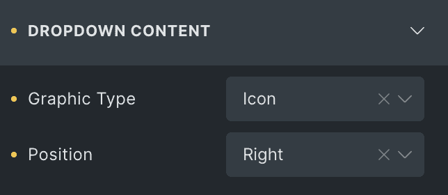
Dropdown Content
Note: If you choose either icons or images as the graphic type, you can use only that option for all calendar types—you can’t use both.
- Graphic Type: Choose either image, icon, or none.
- Position: Select the position of graphic type.
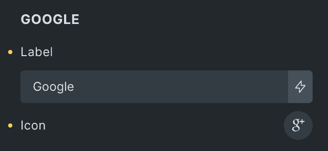
- Label: Enter the label for Google type.
- Icon: Select the icon for Google type.
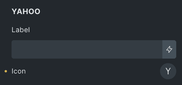
Yahoo
- Label: Enter the label for Yahoo type.
- Icon: Select the icon for Yahoo type.
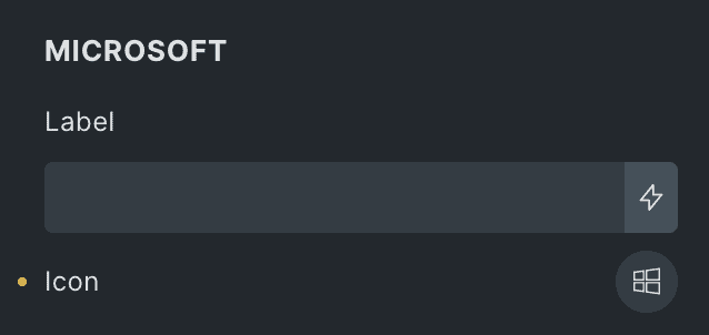
Microsoft
- Label: Enter the label for Microsoft type.
- Icon: Select the icon for Microsoft type.
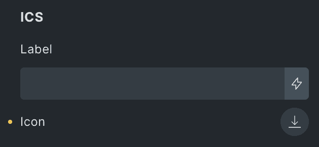
ICS
- Label: Enter the label for ICS type.
- Icon: Select the icon for ICS type.
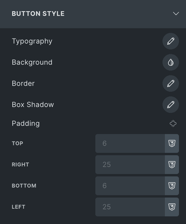
Button Style
- Typography: Set the typography of button.
- Background: Choose the background of button.
- Border: Set the border.
- Box Shadow: Set the box shadow.
- Padding: Set the padding.
Icon
- Color: Select the icon color of button.
- Size: Specify the button icon’s size
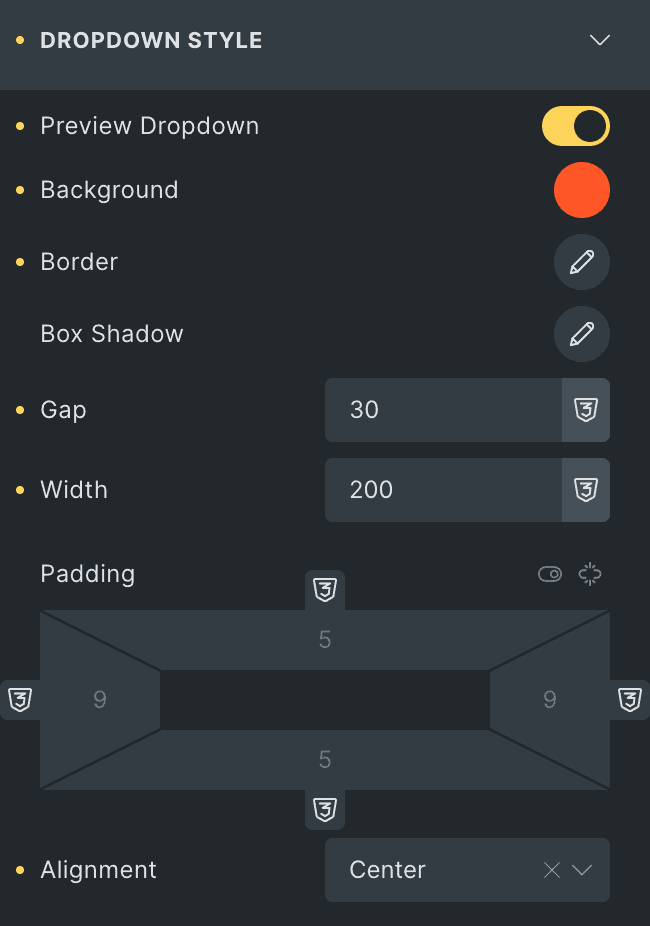
Dropdown Style
- Preview Dropdown: Enable the option to preview the dropdown while editing,
making it easier to style. - Background: Select the background of dropdown.
- Border: Set the border.
- Box Shadow: Set the box shadow.
- Gap: Specify the gap between calendar types in dropdown.
- Width: Specify the width.
- Padding: Set the padding.
- Alignment: Select the alignment of dropdown content.
Options Styling
- Options Typography: Set the typography of dropdown content.
- Icon Color: Select the icon color.
- Graphic Size: Specify the size of graphic.
- Graphic Gap: Specify the gap between graphic & content.
- Graphic Border: Set the border.
- Graphic Padding: Set the padding.
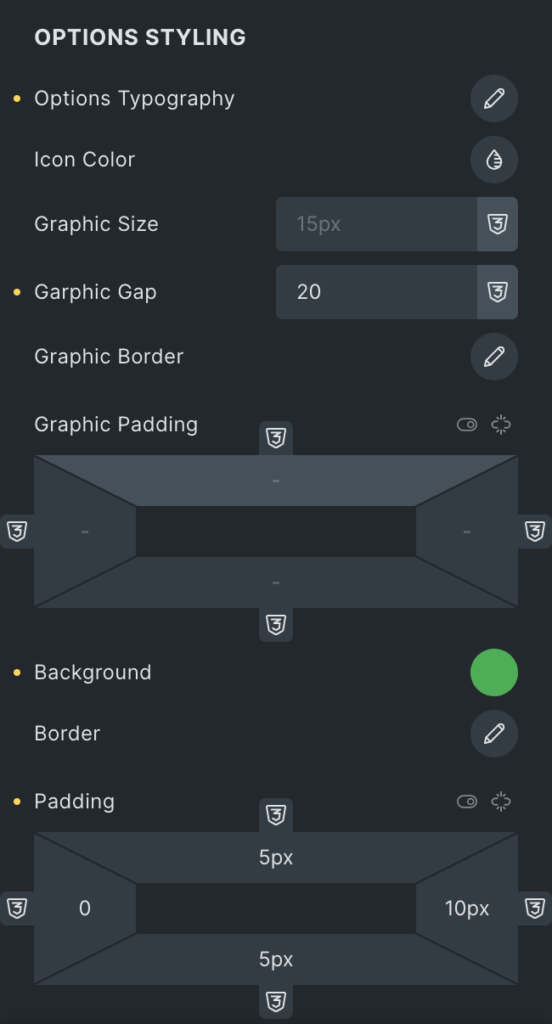
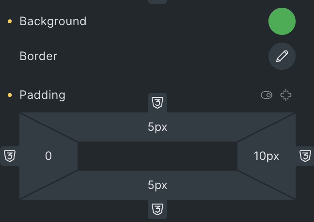
- Background: Select the background of calendar type box.
- Border: Set the border.
- Padding: Set the padding.
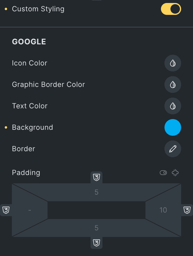
Custom Styling: Allow the option to apply custom styles to each type of calendar.
Google
Note: These options are applicable for Google Calendar Type.
- Icon Color: Select the Google’s icon color.
- Graphic Border Color: Select the border color.
- Text Color: Select the text color.
- Background: Select the background color.
- Border: Set the border.
- Padding: Set the padding.
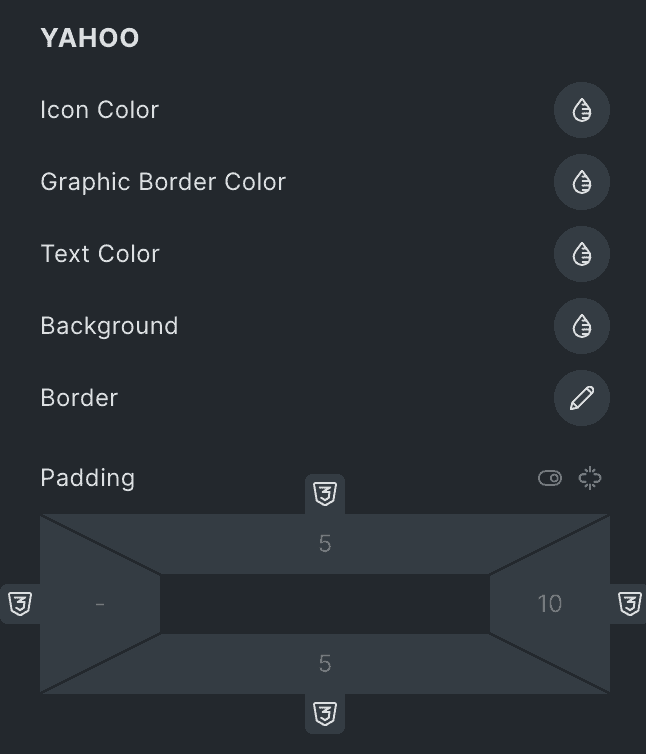
Yahoo
Note: These options are applicable for Yahoo Calendar Type.
- Icon Color: Select the Yahoo’s icon color.
- Graphic Border Color: Select the border color.
- Text Color: Select the text color.
- Background: Select the background color.
- Border: Set the border.
- Padding: Set the padding.
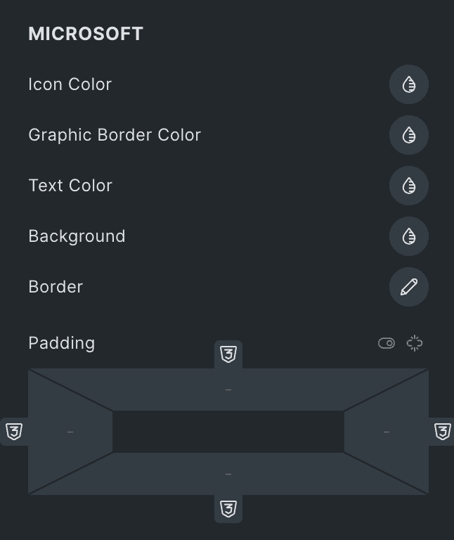
Microsoft
Note: These options are applicable for Microsoft Calendar Type.
- Icon Color: Select the Microsoft’s icon color.
- Graphic Border Color: Select the border color.
- Text Color: Select the text color.
- Background: Select the background color.
- Border: Set the border.
- Padding: Set the padding.
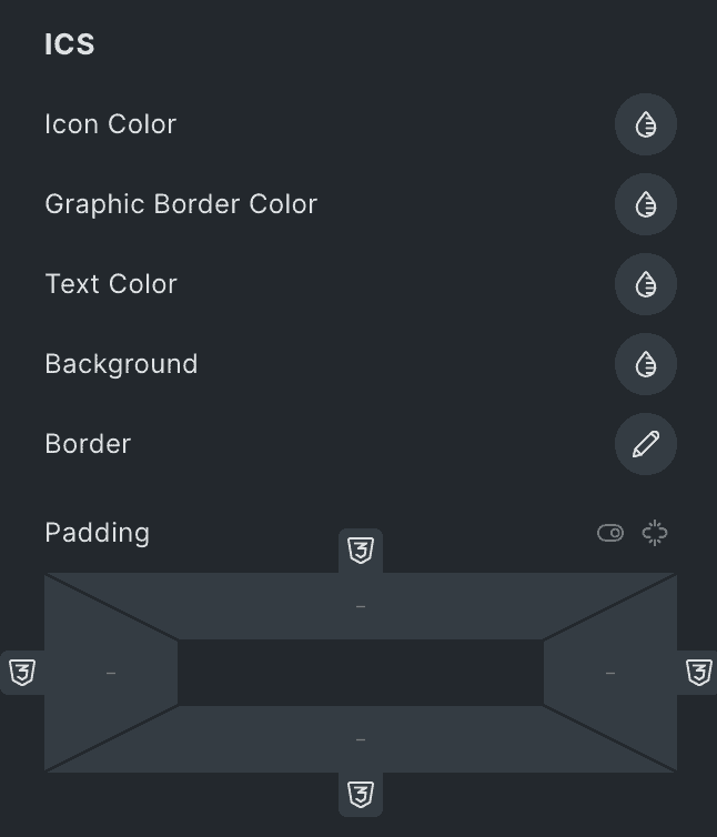
ICS
Note: These options are applicable for ICS Calendar Type.
- Icon Color: Select the ICS’s icon color.
- Graphic Border Color: Select the border color.
- Text Color: Select the text color.
- Background: Select the background color.
- Border: Set the border.
- Padding: Set the padding.
Check out the Demo page of Add to Calendar element.