The message box can be used to create an attractive message box. You can use this to display important notifications, announcements, alerts, GDPR and privacy notifications. You can make the notification appear each time the user opens a page, or appear once only and also use this element to display dismissable special offers that can reappear after some delay according to your given time. This contains various customization options for building the message box.
Content
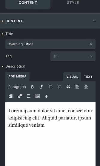
- Title: Add your title in the text field.
- Description: Provide a description in the description box.
- Alert Icon: Choose the icon according to your need.
- Alert Icon Position: Choose the alert icon position either vertical, horizontal or reverse.
- Gap: Set the Gap between icon and title.
- Content Gap: Set the gap between the content of the message box.
- Is Dismissible: Enable to make it dismissible, if disabled you won’t get the option to close the message box.
- Close icon: Change the close button as per your need that displays on the top-right.
- Enable CTA: Enable/disable to control the CTA button section.
CTA (Call To Action)
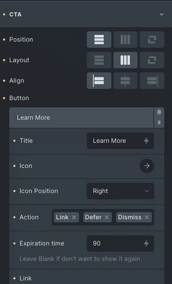
- Position: Set the position of CTA as vertical, horizontal and reverse.
- Layout: Set the layout position vertical, horizontal and reverse.
- Align: Change the alignment of the button Start, center and End.
Button
- Title: Set the title of the button.
- Icon: Select the library and choose any icon among those options.
- Icon Position: Change position to be displayed either left or right.
- Action: Choose from provided options links, defer and dismiss.
- Dismiss Option – It will dismiss the Message Box.
- Links Options: It will link your button to an external or internal page.
- Link: Mention the link it can be any external link or any internal post, page.
- Rel attribute: It defines the relationship between the current and linked document.
If you want to open it in a new tab, select the open in new tab option. - Aria label: Aria label is for the users who use assistive technology to specify extra information about the structure.
- Title: Provide the title to the linked page, which opens in the new tab.
- Differ Option: It will set the expiration time of The Message Box.
- Expiration Time: Set the expiration time, after a given delay the message box appears again.
- Color: Choose the color of the title for the CTA button.
- Background Color: Apply colors to the background.
- Typography: Set the typography of the CTA.
- Border: Set the Border of the CTA button.
- Icon spacing: Set the space between the icon and the title.
Title Style
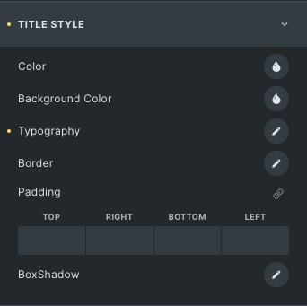
- Color: Set the color of the title.
- Background Color: Apply different colors to the background.
- Typography: Set the typography of the title, like font family, size etc.
- Border: Set the Border of the Title.
- Padding: Adjust the padding to the title.
- Box shadow: Add a shadow effect around the text.
Description Style
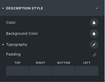
- Typography: Set the typography of the Description, like font family, size etc.
- Color: Choose the color of the Description.
- Background Color: Set the background, from color and image options.
- Padding: Adjust the padding to the description.
CTA Style
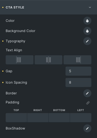
- Color: Choose the color of the CTA.
- Background color: Choose the background of CTA
- Typography: Set the typography of the CTA, like font family, size etc.
- Gap: Set the space between two CTA buttons.
- Icon Spacing: Set the space between the Title and CTA icon.
- Border: Set the Border of the CTA button
- Padding: Adjust the padding to the CTA.
- Background color: Set the background, from color and image options.
- Box shadow: Add a shadow effect around the CTA button.
Icon Style
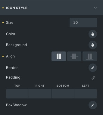
- Size: Set the icon size.
- Color: Choose the icon color.
- Background: Set the icon background.
- Align: Set the alignment of the icon to either start, Center or end.
- Border: Set the Border of the Icon.
- Box shadow: Add a shadow effect around the icon.
Close Icon Style
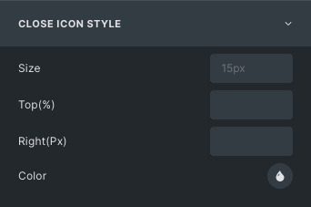
- Size: Set is the close icon size.
- Top: Set the close icon position from the top.
- Right: Set the close icon position from the right.
- Color: Choose the close icon color.
Box Style
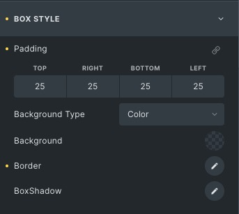
- Padding: Adjust box padding.
- Background Type: Select from the given options like image, color, or gradient.
- Background: Set the background to the box.
- Border: Set the Border of the message box.
- Box shadow: Add a shadow effect around the close box.
Click here to check out a demo page of Message Box element.