Theme styles in Bricks Builder are an excellent way to apply global styles throughout your website. Using this option, you can adjust the default style of your site layout like fonts, colors, links, typography, spacing of your elements, etc. Theme style is a consistent and easy-to-maintain design system for your site. In this article, we’ll show you how to use theme styles to customize the appearance of your site.
You can access the Theme Styles by clicking the Settings (gear) icon in the builder toolbar. Then go to Theme Styles.
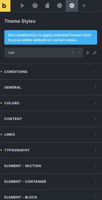
To customize your theme style, just click on the “Create (plus)” icon and provide a name (anything of your choice). Then apply any styling changes you want in the control groups below — like setting different fonts under ‘Typography,’ etc.
How to use Conditions of Theme Styles in Bricks Builder?
Open the Conditions control group to tell Bricks where this theme style should be used on your site.
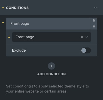
To apply a theme style to your entire website, open the Conditions control group, click Add Condition, and choose the Entire website option. You can set as many Theme Style conditions as you want. You can create conditions according to your need from the available options and put dynamic conditions as well. For example, if you want to apply a Theme style to two specific service pages and on the front page, you can simply add a condition, click on the individual, and select your desired service pages. And create another condition and select Front Page. And you are all set.
Exclude Condition
You can also exclude conditions for any theme style. To exclude a specific condition, you need to toggle the exclude control. Excluding a certain condition will let Bricks know that if the condition applies in a specific scenario, then that theme style won’t be used.
Theme Style: General
General settings of theme style change the site layout. You can view the site in a boxed or wide layout. In the site background, you can add the site’s background color and set the background image for the theme.
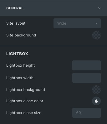
Using theme styles, you can set the lightbox height and width, choose its background color, and even set the color of the lightbox when closing. You can also set the width of the lightbox when closing.
Theme Style: Colors
You can use your own global colors through your own custom “color palette”. For example, many color options are available, like Primary color, Secondary color, Light color, Dark color, Muted color, etc.
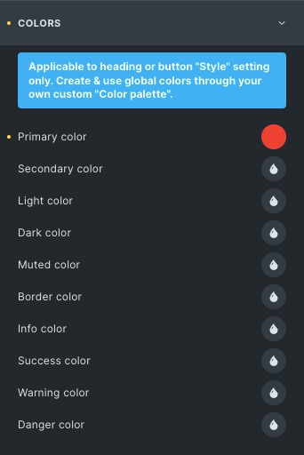
You can set the color combination according to your choice.
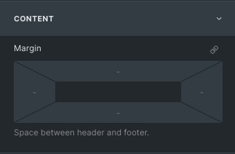
Theme Style: Content
You can set the spacing between the header, footer, and content. For this, you can use the margins option available in theme styles. You can set individual margins for left, right, Top, and bottom.
Theme Style: Link
You can customize the look and feel of your link through the website, such as Typography, background, border, etc. You can also set theme styles to some specific pages using conditions.
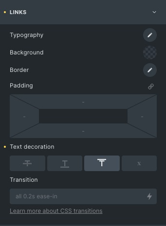
When you create a link on your page, it will follow the default theme styles, but if you want to alter them, you can create your custom theme styles option without entering the code. Several other options are available to give your link a stunning look, including text decoration and transitions. This property will make the transition smooth and give an astonishing experience to your users.
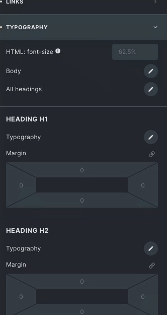
Theme Style: Typography
In this section, you can set typography for your headings, blockquote, and miscellaneous, which will reflect on the desired page according to your set conditions. You can adjust the typography to all your heading from H1 to H6.
Miscellaneous: This option contains Hero and lead section, which is available only for heading and text elements.
Block quote: Set the block quote margin from all sides and paddings. Set the border settings like border type, width, and color. With that, you can set its blockquote typography also.
Theme Style: Element Section
This is a very useful option for your theme styles. You can style every section according to your need. Here are a few options available to adjust your section, such as Height, width, Margin, and Padding. Similarly, you can give each container, block, and div style.
*There are various elements available on which you can set global styles that will reflect on your styled element throughout the website.
Import & Export Theme Styles in Bricks Builder
You can click the Export (download) icon next to the selected theme style to export a theme style. And this will download a . JSON file to your system.
To import your Theme style.JSON file, you can click the Import (upload) icon next to the selected theme style. And If one of the name(s) of your imported styles already exists, the import will fail. So please make sure before importing you don’t have any theme styles with identical names.
Wrap up
Theme styles are a great way to customize the style of your Bricks Builder site on desired pages. This option will reduce your time of doing similar work on multiple pages. In this post, we’ve shown you how to use theme styles in Bricks Builder and how to change the style of an individual element or the entire theme. We hope you found this post helpful!
If you want to know more about Bricks Builder, you can check our A Complete Guide To Bricks Builder article.