In the world of web design, creating websites that not only look great but also work smoothly is super important. To make this happen, web designers and developers use different pieces of code to organize and improve the content. Bricks Builder, a website builder tool, has four primary building elements you can use to create your website: Sections, Containers, Divs, and Blocks. These are the building blocks you use to make a strong and good-looking website.
These elements play a big part in building web pages. They are helpful for web designing, providing structure, organization, and style to content. It helps designers achieve a balanced layout while maintaining a clear hierarchy and user-friendly interface.
By the end of this article, you’ll know exactly how Containers, Divs, Sections, and Blocks in Bricks Builder can help you make websites that impress people and function really well.
So, let’s begin this exciting adventure into the world of web design and learn how to improve your website-making abilities with these basic building blocks!
| Element | Tag | Display | Width | Where To Use |
| Section | Section | flex | 100% | Root Level |
| Container | div | flex | 1100px | Inside Section |
| Div | div | block | – | Anywhere |
| Block | div | flex | 100% | Inside Section or Container |
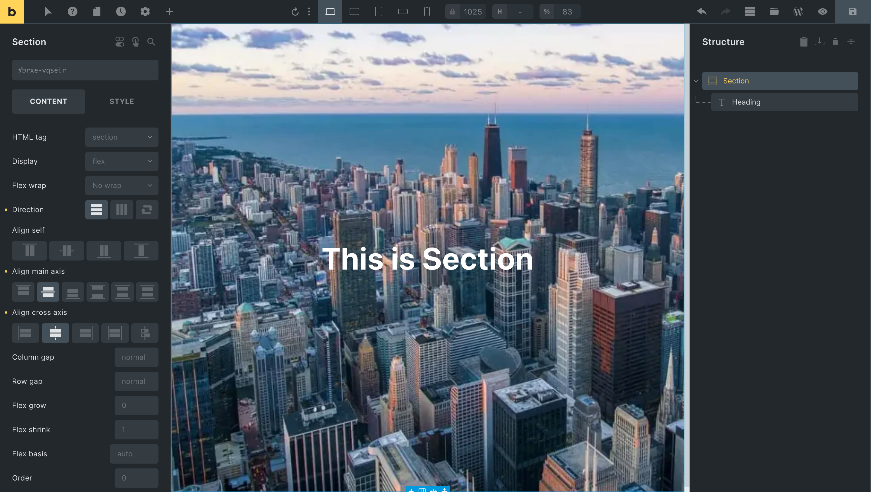
Section
In Bricks Builder, a “Section” refers to a specific content block or segment within a webpage. It helps you to organize and structure your content effectively. A section can contain various elements like text, images, videos, and more. Think of sections as distinct parts of your webpage that focus on specific topics or information.
A section consumes the entire webpage width, utilizing 100% of the available space. Its height adjusts based on the content you place within it. When you add multiple sections, they automatically stack on top of one another, creating a seamless flow.
Here are some important points to keep in mind regarding the “Section” element:
- Sections are like dividers for your webpage. They create clear boundaries between different topics or content segments, making your page easy to read and navigate.
- A section in Bricks Builder consists of two components: the main “Section” itself and an automatically added “Container” within it. This duo provides both structure and customization options. You can also take it out if you don’t need a Container.
- When using sections, your content will stretch from the left edge to the right edge of the webpage. It creates a modern and creative appearance.
- They offer padding control, allowing you to add padding at the top and bottom. The left and right sides maintain consistent spacing for a balanced layout.
- Sections are like the bosses of containers and divs. They’re the parent element that holds everything together. You put containers and divs inside sections to organize your content neatly.
Imagine you’re building a puzzle, each piece needing its exceptional spot. Well, that’s what “Sections” do in Bricks Builder – they give every part of your webpage its own space. Sections help you keep things tidy and organized, like having separate rooms for different activities.
In simple words, a section is like a box that holds your content. It stretches to fit the whole width of your webpage and adjusts its height based on what’s inside.
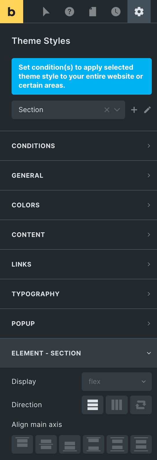
You can modify the default settings by accessing the Bricks Builder interface’s settings at Settings → Theme Styles → Element → Section.
For adjusting the spacing between your sections, you can customize the margin or padding according to your preferences. Moreover, you can also change the default display and height values to achieve the desired look.
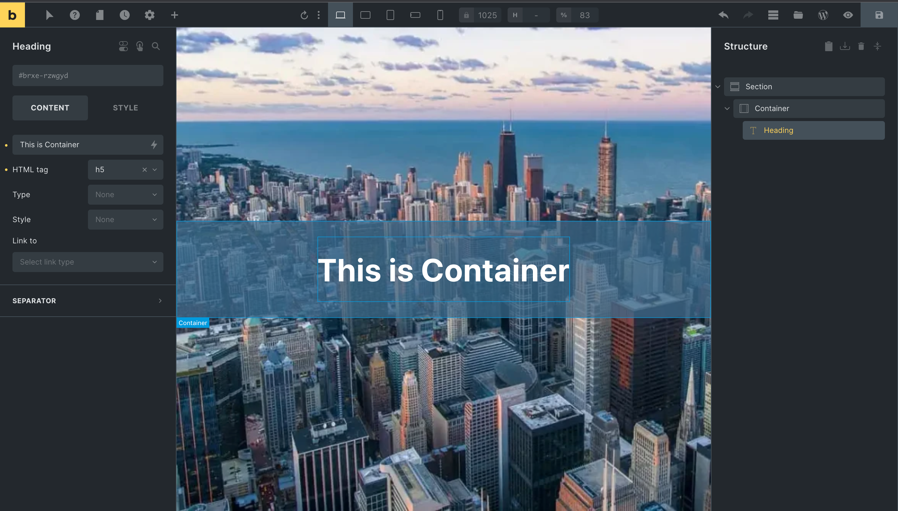
Container
Containers in Bricks Builder are like virtual boxes that you can use to gather and organize your content in an innovative and structured way. Imagine them as your trusty tool to neatly group related elements, making your webpage look clean and professional.
Containers play an essential role in responsive design, too. They ensure that your content looks great on different devices by automatically adjusting their size to fit. So whether your visitors are using big desktop screens or tiny smartphones, your content remains readable.
When you add a container, you’re setting the stage for the elements inside it. You can place text and images inside, arranging them just as you want. It’s like placing furniture in a room – you can decide where the sofa goes, where the table sits, and where the plants add a touch of life.
Bricks Builder even lets you nest containers within each other, creating more complex designs. Just like you might have a room within a room, you can have a container within a container, providing layers of organization and design possibilities.
Here are some important points to keep in mind regarding the “Container” element:
- Containers serve as the foundation for your web page’s structure. They help you organize and systematically arrange content.
- When you add a container, it’s automatically set to match the width of the page using the <div> tag. It ensures that your content aligns neatly with the rest of your webpage’s design.
- Sections can hold multiple containers within them. This nested approach lets you group related content together and maintain a clear hierarchy within your design.
- Containers often act as the parent element for other content elements like text, images, buttons, etc. They provide a structured environment for these elements to reside in.
- Containers contribute to responsive design by automatically adjusting their width to fit various screen sizes. It ensures a seamless user experience across devices.
- Containers are helpful, but you should only use them when needed. Only use containers within the section, as it might make the arrangement look more complicated than it needs to be.
The container is automatically centered and comes with a default width of 1100px. You can personalize this by navigating to Bricks Builder Settings → Theme Styles → Element → Container.
Div
The “div” element is essential in creating web layouts in Bricks Builder. It serves as a container or block-level element that you can use to structure and organize content within your webpage.
You can customize each div element according to your design needs in Bricks Builder. You can adjust its size, positioning, background color, typography, and other visual attributes. Additionally, you can use the div element to create responsive designs that adapt seamlessly to various screen sizes and devices.
Unlike some other unique elements for layout, the Div element in Bricks is plain and simple by default. It means you have complete control over how it looks and behaves.
Imagine it as a blank canvas you can paint any way you want. You can decide how it looks, its colors, and where it goes on your webpage. When you put a Div element inside another layout element, it adjusts its size to fit what you put inside it. It can get bigger or smaller based on what you place in it. It’s like a box that grows or shrinks as you put more things in it. It helps you make sure everything looks friendly and organized on your website.
For instance, let’s say you’re creating a “Testimonials” section for your webpage. Inside this section, you use a to hold each individual testimonial. As you add testimonials – some short, some long – the elements have them grow or shrink to ensure everything fits nicely. You don’t need to worry about each testimonial box being the same size – the takes care of that for you.
- When you use the <div> tag without any unique styling, it automatically stretches across its entire container width. It makes it perfect for creating full-width sections that span the whole screen.
- You can adjust its width based on your needs. You can set the div’s width to a specific value for a narrower content area. This adaptability is fantastic for creating different layouts within a webpage.
- You can change its role and appearance by applying CSS styles. For instance, with the proper styling, a div can become an eye-catching article, a clickable link, an organized list, or an interactive menu.
- The <div> element is like a parent – it can hold other elements inside it. You can place images, text, videos, buttons, and more within a <div>. It helps keep things organized and makes applying styles to groups of elements easier.
- Because the <div> element is so common and well-understood, it makes your code easier to manage. Other developers (or future you) will be able to understand the purpose and function of <div> containers in your code.
Block
Think of the Block element for creating website sections. It does similar things as the Container element, like helping with arranging items using Flexbox and getting dynamic content. However, the Block is a bit different because it distinguishes itself by employing a default width of 100%, in contrast to the predefined 1100px width of the Container.
You can use the Block to make rows or columns of content in a way that looks neat and even. It’s like arranging things side by side or up and down in a well-organized manner within a bigger box on the webpage. This helps make your webpage look great without needing a coding expert.
Here are some important points to keep in mind regarding the “Block” element:
- Block-level elements can be styled and manipulated individually and contain other elements, including inline-level elements.
- Organizing your content using blocks gives you the power to arrange content the way you want, making your store look great without coding. You can have up to 25 sections in each template for maximum customization.
Please check our detailed article on Top 12 Tips & Tricks in Bricks Builder.
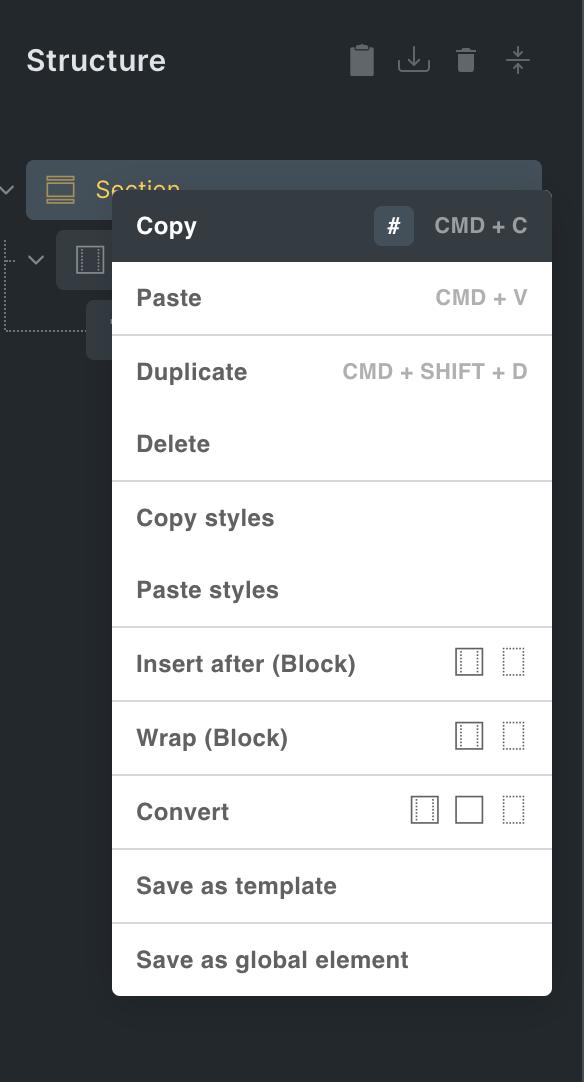
Insert, Wrap, and Convert Layout Elements
You can use the right-click on a layout part to open a menu. In that menu, you can easily “Add,” “Wrap,” or “Change” layout parts by just clicking on them.
The screenshot below demonstrates how to change a main Container to a Section. You can do this by right-clicking on the Container in the list of structures and then choosing the “Section” option under “Change.”
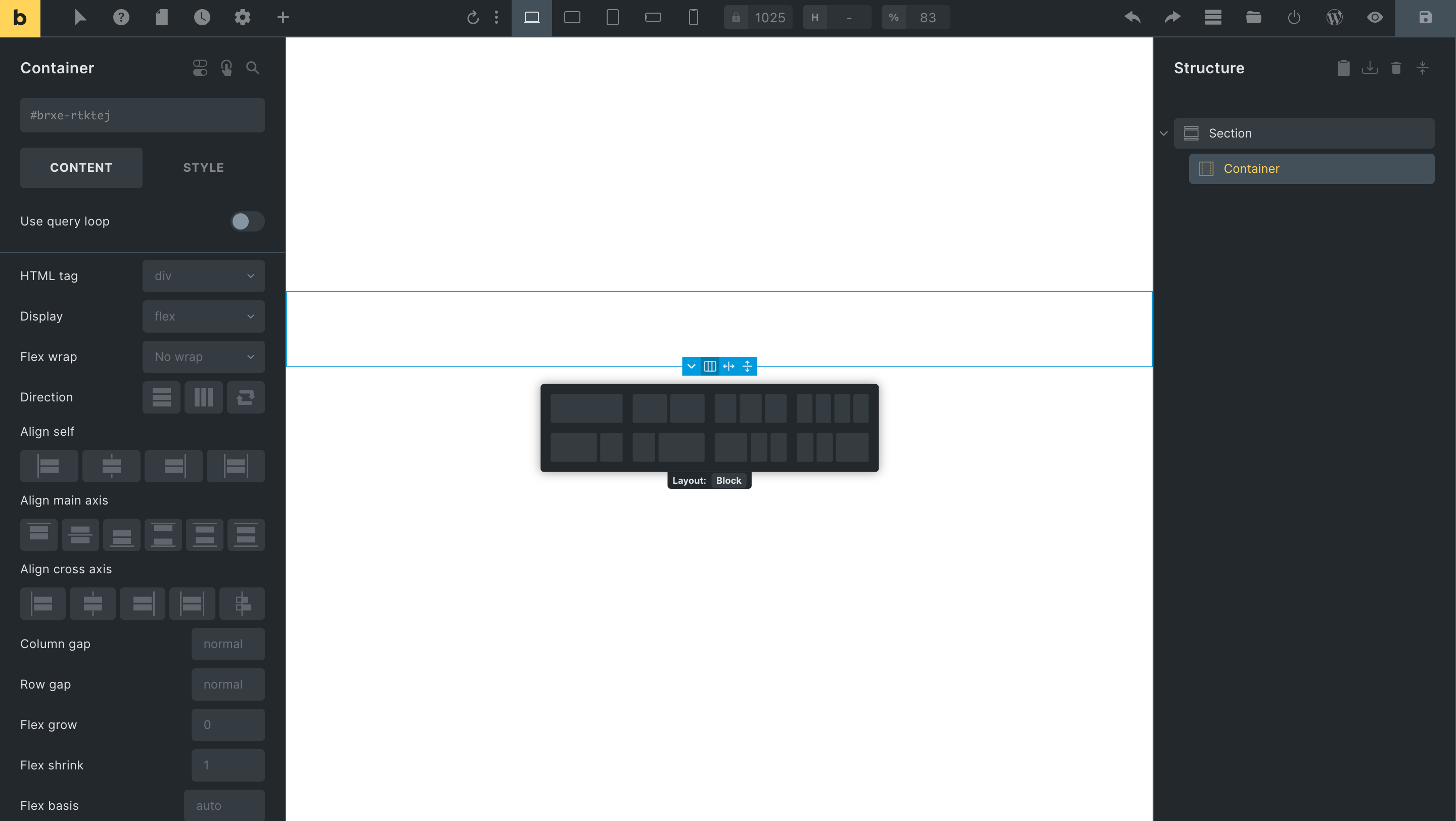
Create Multi-Column Layout
The fastest way to create a multi-column layout is to choose the Container and then click the small icon on the canvas representing a “column” layout. From there, you can select the pre-defined column layout of your choice.
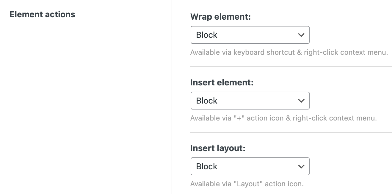
Managing Element Functions by Choosing Default Element
Within the “Bricks → Settings → Builder → Element Actions” section, you have the ability to modify the layout element that is automatically selected for actions like “Insert,” “Wrap,” and when using the “Layout” tool.
Wrap Up
In summary, understanding when to use Containers, Divs, Blocks, and Sections in the Bricks Builder can really help you design layouts better. Containers are great for handling overall content and formatting with ease. Divs let you customize specific parts precisely, giving you more control. Sections help keep your design organized and make sure everything flows nicely.