In the world of making websites look great and work well is a big challenge. Designing responsive layouts that look good on different devices like mobile phones, tablets, and laptops can be challenging. But developers always look for smart ways to create modern web designs that fit everywhere. That’s where Grid Layout and Flex Layout come in. These two special layouts have changed how we organize things on websites.
Brick Builder is a famous tool used by web developers. It uses these layout methods to help designers and developers create websites more efficiently.
This article will teach you about Grid Layout and Flex Layout in Bricks Builder. We’ll see how they work and make it possible for people to create amazing websites that work well and look awesome.
Understanding Grid Layout
It is used in web design and user interface development to create organized and structured layouts for displaying content. It provides a two-dimensional grid design allowing designers and developers to arrange elements, such as text, images, and other media, in columns and rows.
Imagine you’re creating a design for a website or an app. Sometimes you must show many different things, like pictures, text, buttons, etc. Grid Layout helps you put everything in the right places on the page, just like placing items on a grid.
It’s like making a neat and organized blueprint for your page. This is super helpful when dealing with a bunch of information or things you want to show because you can control where each piece goes. So, if you’re working with a lot of stuff and want them to fit together nicely, Grid Layout is like your design superhero!
How to Create Grid Layout in Bricks?
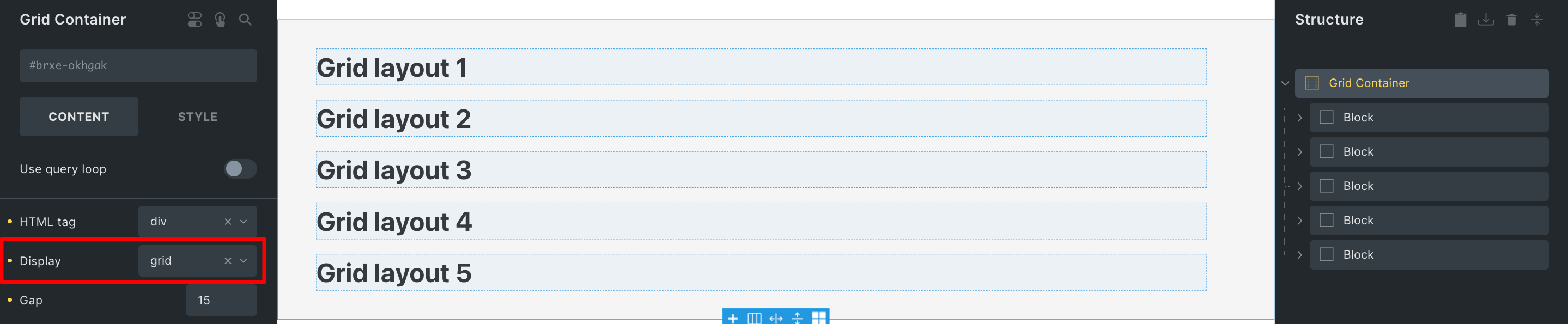
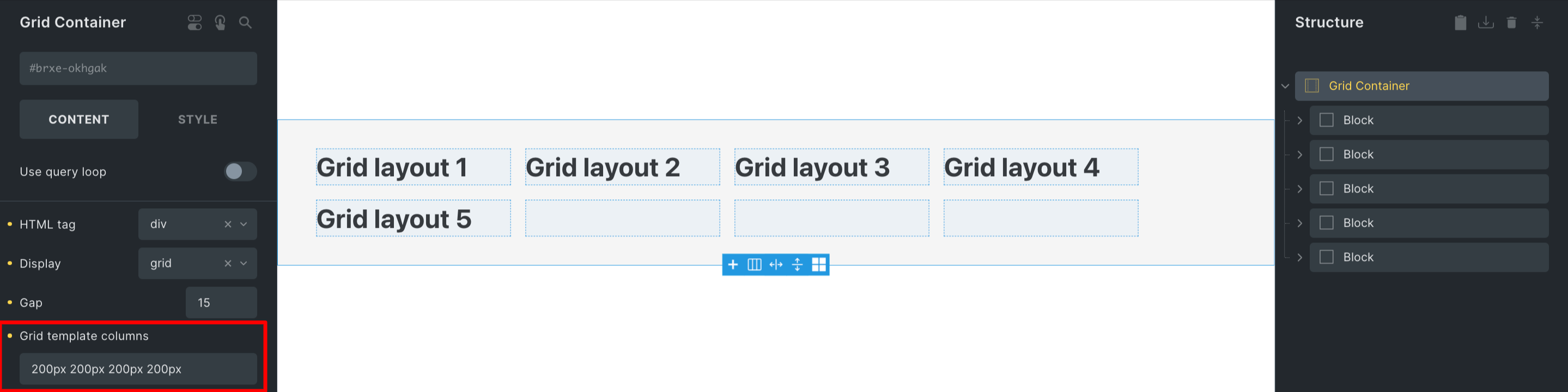
By applying the CSS property select display as Grid to any layout element, such as a section, container, block, or div, you can transform it into a Grid layout. This designated element now acts as your Grid Container.
Each immediate child element residing within the Grid Container becomes a Grid Item. These Grid Items possess extra attributes for specifying their placement within the grid, including settings for both the Grid column and Grid row.
How to Configure Column and Row Tracks (Explicit Grid)?
Grid Layout: Column Configuration
Once our grid container is in place, the next step involves defining the specific tracks for our grid’s columns and rows. This task is carried out explicitly using the properties “grid-template-columns” and “grid-template-rows” within our grid container’s settings.
Let’s discuss a few illustrative examples together grid-template-columns: 300px 2fr 1fr;
Each value assigned to the “grid-template-columns” property corresponds to the creation of a distinct column track.
In the provided example, we construct a grid layout of three columns:
- Column 1 is set with a fixed width of
300px. - Column 2 occupies “
2fr.” - Column 3 is “
1fr.”
Note: “fr“ is a fractional unit that occupies a portion (x parts) of the available space.
How to calculate fr?
Let’s consider a grid container with a width of 1500px (its default width). To calculate fr, we start by deducting the non-fr values and gaps. Given the fixed 300px width of column 1, the remaining available width becomes 1200px.
In this case, we have a total of 3 fractional units (2fr from column 2 and 1fr from column 3) to distribute among the available space.
As a result, 1fr is equivalent to 400 px (calculated as 1200 px divided by 3). Consequently, column 2 occupies 800px (2fr x 400px), and column 3 spans 400px (1fr x 400px) in width. This mechanism ensures the appropriate allocation of space within the grid.
Grid Layout: Row Configuration
Every value assigned to the “grid-template-rows” property corresponds to the creation of a row track.
For example, grid-template-rows: 200px 300px
In the above example, the initial two rows are explicitly defined. The first row has a height of 200px, while the second row has 300px in height.
Since we’ve only set the heights for the initial two rows, any row beyond the second one will automatically adjust its height based on the content it contains. This default behavior can be changed by creating an implicit grid.
What is Implicit Grid?
When your grid items don’t fit within the grid you’ve defined, the grid container creates extra columns and rows for them automatically. This is referred to as the “Implicit Grid.“
You have the ability to set the sizes for these additional columns and rows using the “grid-auto-columns” and “grid-auto-rows” settings in your grid container.
Grid Layout Keywords: auto-fit & auto-fill
To solve the problem of making grids fit well on different screens without using special codes, we have two useful words: “auto-fill” and “auto-fit“. Instead of saying exactly how many columns to use, we use these words like this:
Imagine we want each column to be at least 300 pixels wide but not more than the screen width.
For example, repeat(auto-fill, minmax(200px, 1fr)). It means that these columns will expand and fill the space when the screen is wide. But if the screen is not wide enough, these columns won’t get bigger than the screen, and they will stay the same size.
The difference between the two words is simple: “auto-fit” makes columns expand to fill the space, while “auto-fill” keeps the space as it is, not letting columns get bigger than it. So, depending on what you want, you can pick the right word to use!
Grid Layout: Repeat function
The repeat CSS function simplifies how you specify a pattern for track sizes in a grid.
It takes two inputs. The first one indicates how many times the track size should be repeated, and the second one defines the size of each track.
For instance,grid-template-columns: repeat(4, 1fr), you’re creating a clear 4-column grid.
Similarly, with grid-template-rows: 200px repeat(2, 1fr) 300px, you’re setting up a clear 4-row grid. The first row is 200px tall, the second and third rows each take up 1fr of the available space, and the fourth row is 300px tall.
Grid Layout: Max & Min Size
The minmax CSS function provides a way to establish both a minimum and maximum size for grid tracks. This function requires two parameters: the first one sets the minimum size, and the second one sets the maximum size for the grid track.
For instance, consider the following grid-template-columns: repeat(3, minmax(300px, 1fr)); .
In this example, a fixed 3-column grid is created, where each grid item’s minimum width of 300 pixels and a maximum width of 1fr.
However, it’s important to note that this kind of fixed grid can pose responsiveness challenges. For instance, if the viewport width drops below 900px (which can accommodate 3 columns of a minimum of 300px), the grid overflows. Additionally, the number of columns remains constant across different screen sizes, which might not be ideal for various breakpoints without additional adjustments.
Arrangement of Grid Items
Imagine a grid like a map with lines. These lines mark where columns and rows begin or end. The counting of these lines starts from 1.
These lines aren’t just for show – they’re like coordinates that help us place things on the grid. If we want to put something in a certain spot, we can use these line numbers to guide us.
In this example, we’ve created a grid container with four columns, each having an equal size defined by grid-template columns. The sizes are in pixels, but you can use other units as well.
This lets you easily position elements on the grid using the defined grid lines as coordinates. The numbers you mentioned (starting from 1) correspond to the indices of the columns or rows you’ve defined in the grid-template-columns or grid-template-rows properties, respectively.
Benefits of Grid Layout
- Precise Alignment: Grid layout enables you to achieve pixel-perfect alignment of elements on your webpage. This is particularly useful when you need to create complex designs where elements need to align perfectly both horizontally and vertically.
- Responsive Design: Grid layout in Bricks provides built-in responsiveness. You can easily set up different grid configurations for various screen sizes, ensuring your design remains visually appealing and functional on desktop and mobile devices.
- Efficient Spacing: The Grid layout makes creating consistent spacing between items easy without relying on complex margins or padding adjustments. It is beneficial when you want to maintain equal spacing between rows and columns.
- Interactive Designs: If you’re building interactive elements such as image galleries or product showcases, the Grid layout offers a foundation to align and present these elements attractively.
Understanding Flex Layout
It is a smart and efficient way used in web design to create layouts that adapt gracefully to different screen sizes and devices. Unlike the traditional layout methods that deal with horizontal or vertical arrangements, the Flex layout is a one-dimensional layout system focusing on distributing and aligning elements along a single axis. This approach simplifies allocating space and organizing content within a container.
Suppose, You’re building a webpage with a row of boxes. Each box contains some content like text or images. These boxes must be arranged in a line and spaced evenly, regardless of the screen size. This is where the Flex layout comes in handy.
Flex is like a layout that helps you arrange these boxes neatly. It’s especially great when you want to create layouts that work well on different devices like laptops, tablets, and phones without making things too complicated in your code.
How to Create Flex Layout in Bricks?
Flex is a layout that focuses on arranging items in one direction, like a row or a column. It’s great for dividing and arranging space inside a container. This comes in handy when you’re designing web pages that need to look good on different devices and screen sizes. It simplifies the process of making web pages that adapt well without needing lots of complex CSS instructions like floats and positions.
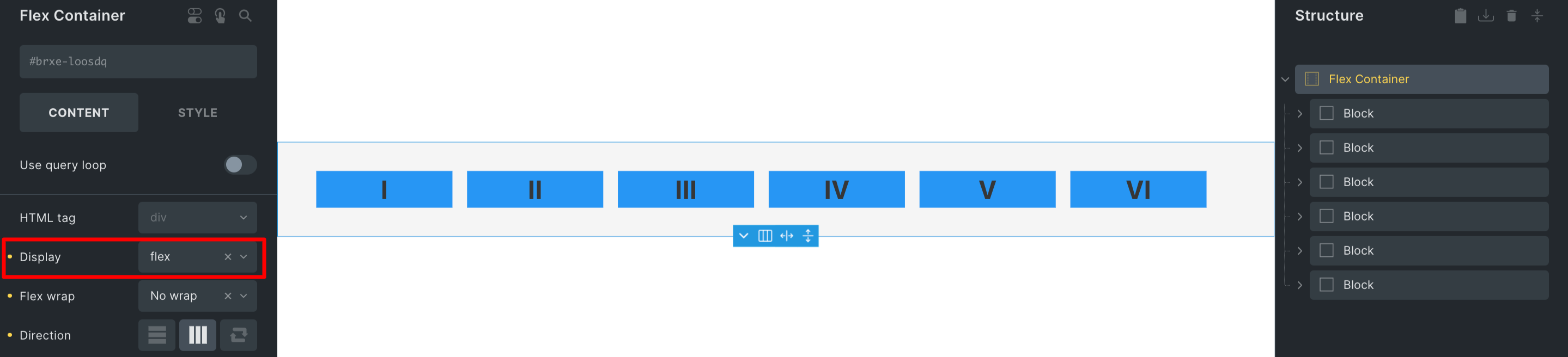
When you want to use Flex layout, you start by creating a special container by selecting Flex under the display property. Everything inside this container will become a flex item, and Flexbox will automatically organize these items according to your design intentions. It’s like a magic tool that helps you build flexible and responsive web pages without getting confused by difficult CSS tricks.
Properties of Flex Layout
Multiple Flex Direction
Flexbox introduces the “flex direction” property, which allows you to define the orientation of the main axis along which flexbox children are arranged. By default, this property is set to “row,” causing the children to be positioned horizontally in a sequence that aligns with your browser’s default language orientation.
- Row (default): This places elements left to right (but switches if RTL is applied).
- Row-reverse: It flips the element order within a row arrangement.
- Column: Elements are organized from top to bottom.
- Column-reverse: The sequence of elements in a column layout is reversed.
Flex: Content Wrapping
The default setting for the flex wrap property is nowrap. This implies that if the flex items within a container are wider than the container itself, they will overflow. To induce wrapping behavior when the items exceed the container’s width, you need to apply the flex wrap property with a value of wrap . Subsequently, the items will wrap within the container to accommodate the available space.
There are three choices:
- Nowrap (default): Ensures that elements within a flex container do not wrap to the next line.
- Wrap: Automatically wrap items into multiple rows (or columns, based on the flex direction) when necessary.
- Wrap-reverse: Similar to “wrap,” but the rows (or columns) expand in the opposite direction as items are wrapped.
Flex: Justify Content
This property governs the horizontal alignment of child elements:
- Flex-start (default): Aligns elements to the left, resembling inline elements with “text-align: left.”
- Flex-end: Aligns elements to the right, similar to inline elements with “text-align: right.“
- Center: Center elements, much like inline elements with “text-align: center.”
- Space-around: Equally distributes space around every element. It’s important to note that the space between consecutive child elements is twice the space between the outermost elements and the container’s edges.
- Space-between: Similar to space-around, but the elements are evenly separated, with no space near the container’s edges.
- Space Evenly: Distributes elements evenly along the main axis, including space between the items and the container’s edges.
Flex: Align Items
This property resembles “justify-content,” but its impact is on rows within the container:
- Flex-start: Vertically aligns elements to the top of the container.
- Flex-end: Vertically aligns elements to the bottom of the container.
- Center: Vertically centers elements within the container.
- Stretch (default): Makes elements occupy the entire height (for rows) and width (for columns) of the container.
- Baseline: Vertically aligns elements according to their actual baselines.
Flexible Layout: Flex Grow
This property determines a flex item’s ability to expand when needed. It uses a unitless value as a ratio, indicating the portion of available space within the flex container that the item should occupy.
When all items have a flex-grow value of 1, any remaining space in the container is evenly distributed among them. If one child has a value of 2, it will aim to occupy double the space of another child (or at least make an attempt to do so).
Adjustable Content: Flex Shrink
The concept of flex-shrink becomes relevant when the flex items within a container exceed the available space. In such a scenario, this property determines the degree to which an item can reduce size, aiming to prevent any content overflow.
In simpler terms, imagine you have a flexbox container holding multiple items. If the total size of these items is too large for the container, the flex-shrink value comes into play. It dictates how much each item is willing to shrink proportionally so that everything fits within the container without spilling over.
Optimal Layout: Flex Basis
The flex-basis property defines the starting main size of a flex item. This size corresponds to the content box’s dimensions unless otherwise altered using the box-sizing property. When the width is naturally determined by the content itself, the default behavior is similar to using width: auto;.
In this scenario, the item occupies space according to its contained content. Additionally, you can explicitly set a specific value, as demonstrated in flex-basis: 15em; . This property essentially offers control over how flex items establish their initial sizes along the main axis, and it’s particularly useful when arranging flex layouts.
Benefits of Flex Layout
- Effortless Alignment: The Flex layout excels at aligning items within a container, whether horizontally or vertically. This is particularly useful for creating centered elements, evenly spaced content, and navigation bars.
- Simplified Coding: Using Flex in Bricks simplifies the process of creating complex layouts. You won’t need to rely on floats, positioning, or complex calculations in your CSS code, resulting in a cleaner and more manageable style.
- Even Distribution of Space: Flex layout distributes space evenly among items, making it an excellent choice for creating grids or lists where you want consistent spacing between elements.
- Saves Development Time: Flex layout streamlines the design process, resulting in quicker development cycles and reduced need for manual adjustments.
Comparison between Grid and Flex Layout
The difference between Grid and Flex Layouts are:
- Dimensionality and Flexibility: Grid and Flex are widely used for responsive web design. The key distinction lies in dimensionality. Grid offers two-dimensional layout control, arranging elements both horizontally and vertically, while Flex provides flexibility with a focus on a single axis, either horizontal or vertical. These tools empower developers to manage complex and flexible web designs.
- Alignment: Aligning elements in web design is crucial, and Grid and Flex layouts offer effective solutions. Grid works as two-dimensional layouts, while Flex is ideal for one-dimensional designs. Grid employs numerical coordinates, whereas Flex uses relative positioning and margins, making element adjustments smoother.
- Item Management: Flex and Grid excel in item management. Flex allows easy manipulation of element size, position, and order. Grid, with its numerical coordinates, offers precise placement within a two-dimensional space. The choice between the two depends on project requirements and desired outcomes.
For instance, one of the benefits of choosing a Flex layout is that it makes handling items on a page simpler. Unlike Grid, which needs you to set the size and position of each element manually, Flexbox does this automatically by adjusting the gaps and positions between elements. This means you need less code to get the look you want, especially in bigger projects. Flexbox also makes it easier to move things around when you change the page’s size, ensuring your design works well on different screens.
Wrap Up
In conclusion, both Grid and Flexbox are powerful layouts for creating responsive web designs, each with its own unique strengths. Grid offers precise control over two-dimensional layouts, while Flexbox simplifies item management and responsiveness. Choosing between the two depends on the specific needs of your project. Grid is ideal for complex layouts and structured designs, while Flexbox is used for simpler layouts where alignment and flexibility are key. By understanding the differences and advantages of these layout systems, you can optimize your web design process and create visually appealing and user-friendly websites.