This element helps you display images of products on your website. You can either display a single product image or a list of images for multiple products. It gives you different modes to arrange and showcase these images, making them more visible and attractive to your website visitors. It’s perfect for highlighting individual products or showing off a whole range of product images on your webpage.
The “Woo-Product Image” element features the following controls.
Note:
- This element functions seamlessly across all pages within the query loop, adjusting settings accordingly. However, when it comes to displaying a single product image, a single product template needs to be created.
- For Image Swap and Picture in Picture mode, if the images in the product gallery are present, they will be used as the second image.
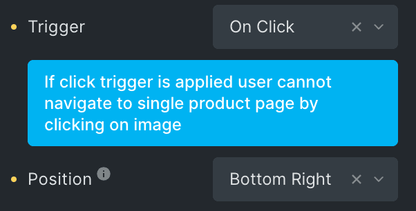
- If the “On Click” option is chosen as the trigger users won’t be able to navigate to the single product page by clicking on the image.
- When you use the Single Image or Image Swap Mode, clicking on the image will open the single product page. However, this won’t happen if you’re using the “Gallery Slider” mode.
Content
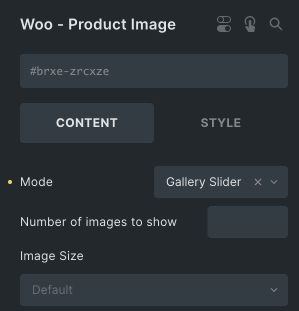
- Mode: Select the mode to display product images from Single Image, Image Swap, Picture in Picture, or Gallery Slider.
- Number of Images to Show: Specify the number of images to be shown in gallery slider(applicable for Gallery Slider Mode).
- Image Size: Select the size of an image.
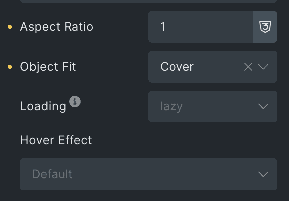
- Aspect Ratio: Enter the aspect ratio of image.
- Object Fit: Select from cover, contain, Fill, or scale down.
- Loading: Select from eager or lazy.
- Hover Effect: Choose the hover effect(applicable for Single Image & Image Swap Mode).
- Trigger: Choose the on-click or on-hover trigger option to switch images(applicable for Picture in Picture Mode).
- Position: Select the position of second image(applicable for Picture in Picture Mode).
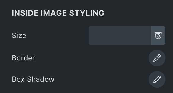
Inside Image Styling
Note: These options are applicable when you select Picture in Picture as Mode.
- Size: Specify the size of second image.
- Border: Set the border.
- Box Shadow: Set the box shadow.
Slider Settings
Note: These options are applicable when you select Gallery Slider as Mode.
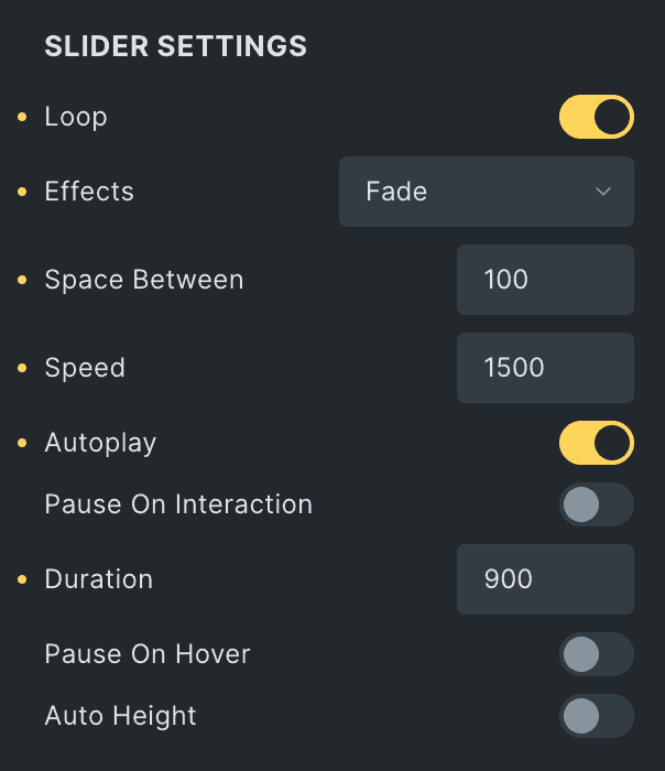
- Loop: Enable the option to start the slider looping.
- Effects: Select the slider effects from available options.
- Space Between: Specify the space between product images.
- Speed: Enter the speed of slider.
- Autoplay: Enable the option to play slider automatically.
- Pause on Interaction: Enable the option to pause the slider during interaction.
- Duration: Set the duration.
- Pause on Hover: Enable the option to pause the slider while hover.
- Auto Height: Enable the option for auto height.
Pagination
- Pagination: Select the pagination as bullets or none.
- Clickable: Enable the option to make the pagination clickable.
- Scroll Bar: Enable the option to display the scrollbar.

Navigation
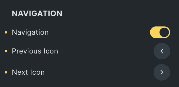
- Navigation: Enable the option to display the navigation.
- Previous Icon: Select the icon for previous navigation.
- Next Icon: Select the icon for next navigation.
Gallery Slider Styling
Navigation
- Color: Select the color of navigation.
- Background: Select the background color of navigation.
- Border: Set the border.
- Box Shadow: Set the box shadow.
- Size: Specify the size of navigation icon.
- Padding: Set the padding.

Pagination
- Size: Specify the size of pagination.
- Active Color: Select the color of pagination when active.
- Inactive Color: Select the color of pagination when inactive.
- Top Offset: Specify the space from top.
- Bottom Offset: Specify the space from bottom.

Scroll Bar
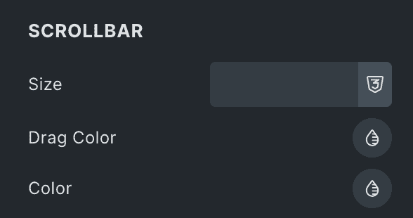
- Size: Specify the size of scrollbar.
- Drag Color: Select the drag color of scrollbar.
- Color: Select the color of scrollbar.
